50+ Explainer Video Examples in Different Businesses and Industries
Explainer videos offer a wide variety of design options and emotional tactics to communicate your worth-telling business’s message.
Whether you’re in a freshly-launched startup or a seasoned pro in a big enterprise, there’s always a perfect theme and style to bring your story to life.
Our explainer video services have a clear focus on quality in both content and form.
We make sure you’re on the cutting edge of telling stories, promoting products, and delivering compelling visual content– regardless of the industry you belong to.
Stuck on ideas? Check out these explainer video examples and swipe them for your next winning campaign!
 Tailor Your Own Experience By Choosing One of these Views


Use Case
Industry
App Demo Videos
Whatever we are building– be it an app, a website, or an enterprise-level solution, demo sessions are crucial. In the app industry, product demos help develop better solutions and collect feedback.
When the video format is used to give the demonstration, potential users get a solid grasp of the app’s UI/UX, value proposition, and how they will benefit from using it.
App demo videos provide a more engaging way to introduce users to the app, show it in action, and familiarize them with all the features compared to plain text-based instructions. It visualizes what they will experience with the actual product once they download it.
HealMate
App Demo Video, Video Ad
Apps & Software
Cartoon, 3D Animation
1:17
Website, Youtube
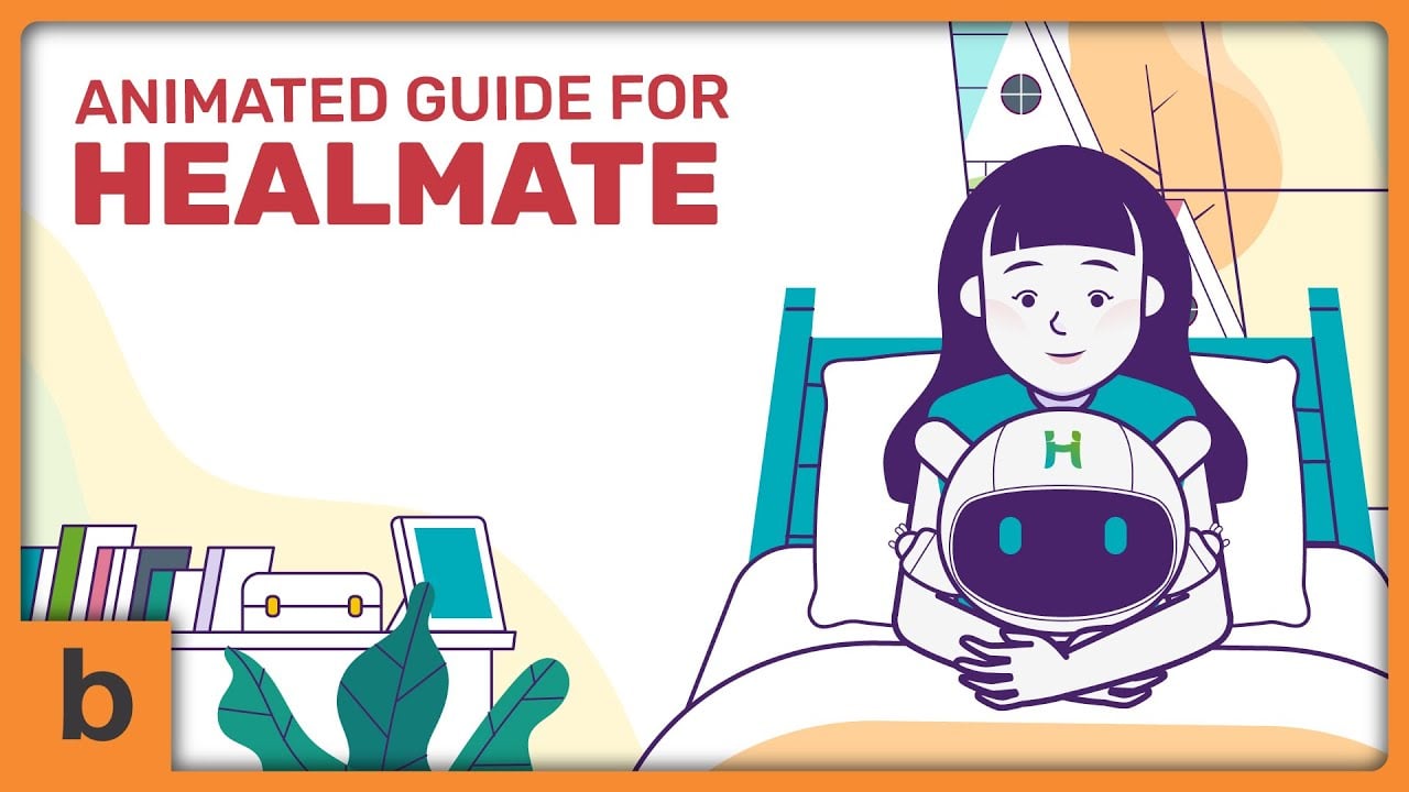
We are fully aware that healthcare products or services tend to have techy explanations. That's why we utilize the power of storytelling with a concise script in this explainer video. It makes the viewers retain crucial information about HealMate much better and faster.
With storytelling and narrative-driven characters, it doesn't waste time building up to a point or explaining a problem. This easy to follow flow makes the explanation make more sense even for a viewer that isn't familiar with any mobile healthcare app before.
We are also proud of how we use simple and minimal 3D elements to convey a powerful and personal message. Not to mention rich color palettes that enhance the visual, keeping the viewers' eyeballs attached to the screen until the video ends.
Telling your story with a video may boost your conversion rate by up to 81%
PawHi
App Demo Video, Video Ad
Apps & Software
Cartoon
1:03
Website, Facebook
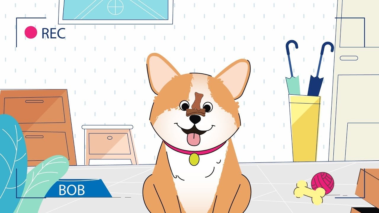
As dogs are cute, lovely creature and "professional" heart-stealers, we created a cute animated dog to grab viewers' attention. We chose this how-dare-you-ignore-me animal because it aligns with PawHi's target audience, who are mostly dog owners and lovers.
After getting their attention, we straightforwardly present a relatable problem at the start of the video, helping the viewers to keep watching. When emotional connections with the viewers are established, we introduced PawHi as the solution.
The playful explainer animations are perfected by the friendly and conversational voice-over style – making it easier for the viewers to follow the narration. This is usually done when you're confident your target audience won't have an issue deciphering and understanding the video's concept.
Telling your story with a video may boost your conversion rate by up to 81%
CitiBot
App Demo Video, Customer Onboarding Video
Apps & Software
Cartoon
1:36
Website, Youtube, Events & Trade Shows
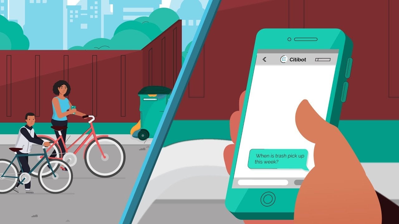
The high-level visuals in this video can be a powerful tool for viewers to retain the concept longer. As you can see, illustrations and accentuated colors do make a perfect combo. With these combinations, we created a stunning flow with motion graphics and made the viewers feel like they're floating across the frames.
The powerful and fine-tuned script is straight to the point, explaining how the service works without overwhelming the viewers. It also helps highlight CitiBot's unique selling proposition to attract and delight the viewers that fit like a glove.
The right palette of vibrant colors, a kickass concept, and our on-point execution gave this video all the marks of a top, professional explainer video.
Telling your story with a video may boost your conversion rate by up to 81%
Adwallet
App Demo Video, Product Demo Video
Apps & Software
Cartoon
0:36
Website
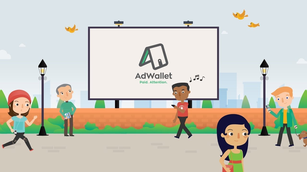
This app explainer video is incredibly straightforward and to-the-point. The first few seconds directly invites the viewers to experience what it is like to have Adwallet on their hands. No long-winded explanation or fluffs needed.
It doesn't take a minute to deliver a powerful message. The endearing characters and uplifting background music do an excellent job of making the narration clear and easy to follow.
The video includes the app's interface giving the viewers a preview on how it looks. This gives the viewers confidence and understanding of the service and how it benefits them.
Telling your story with a video may boost your conversion rate by up to 81%
Patchwork
App Demo Video, Product Demo Video
Apps & Software
Motion Graphic
1:06
Website
Patchwork brands itself as a service that simplifies healthcare workers' life. That simplicity is also exhibited in this explainer video. We rely on colorful characters and the environment to catch the viewers’ attention. We also designed them in the classic illustrated style that is a popular trend.
Another element we focused on in making this animated explainer video stand out is its 2D motion graphics highlights areas of inspection. The voice-over narration is in sync with the scenes, helping the viewers understand the crucial information better.
In the end, we included a prominent call to action to encourage the viewers to do the next step, downloading the app.
Telling your story with a video may boost your conversion rate by up to 81%
SimplyBrand
Product Demo Video, Video Ad
3D Animation, Motion Graphic
1:34
Website, Youtube
As SimplyBrand is all about technology, we tried to create a stunning explainer video that aligns with the brand image. We relied on a motion graphic that is overflowing with techy feels.
We used a dark background for this website explainer video that works great with glowing lines to explain the concept of the service. The music also has a futuristic tone and the elegant transitions are accompanied by the swish and chiming sounds to create a richer audiovisual experience.
Achieving a 3D look with a 2D illustrated animation isn’t always easy. With the finely-used gradients that create a futuristic and techy vibe, we can give it a sense of depth even if it’s 2D.
Telling your story with a video may boost your conversion rate by up to 81%
Tokky
Product Demo Video, Video Ad
Blockchain
Motion Graphic, Cartoon
1:34
Website
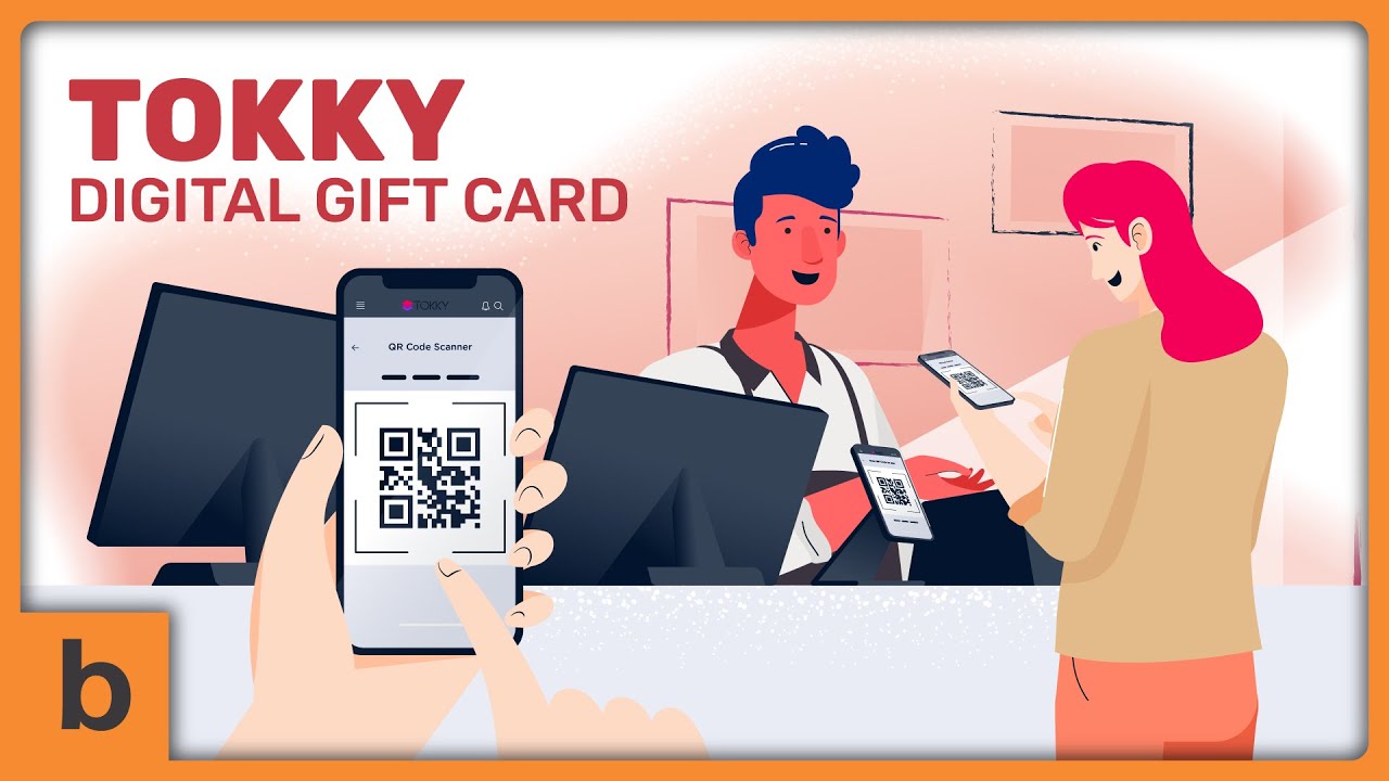
Cartoon explainer videos are one the most favorite animation style. The symbolic 2D illustrations and seamless soft muted colors calibrated with a solid sound design make this animated video one-of-a-kind and worth watching. Despite the intricate illustrations, we make sure the video still has a clean and minimal feel.
Since Tokky is a company that mostly deals with gift cards, we included some facts at the beginning of the video. It helps viewers to understand what the video is about from the get-go and why Tokky is a service that deserves their attention.
We did't forget to add Tokky's tagline and slogan at the end of the video. It leaves a branded message in viewers' minds making them recall the brand seamlessly.
Telling your story with a video may boost your conversion rate by up to 81%
Zeux Explainer Videos
App Demo Video, Product Demo Video
Blockchain
Motion Graphic, 3D Animation
1:35
Facebook
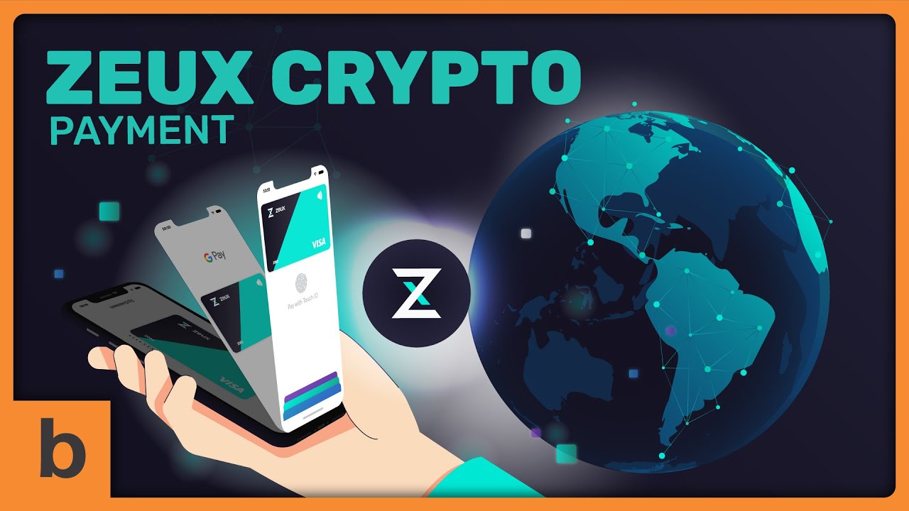
Its futuristic, modern appearance characterizes the Zeux explainer video style.
Considering that Zeux has a techy explanation about blockchain, we took the minimalist and simple approach with a concise but compelling script. The graphics itself help with engaging visuals.
We use motion graphics with fine lines drawn throughout the video. Graphics emerge one after the other. Instead of overwhelming the viewers, it forms a supporting element which leads the eye of them through the video.
Using the same colors from their brand predominantly gave the video a strong trademark identity.
Telling your story with a video may boost your conversion rate by up to 81%
Plutus
Product Demo Video, Customer Onboarding Video
Blockchain
Motion Graphic
1:14
Website, YouTube
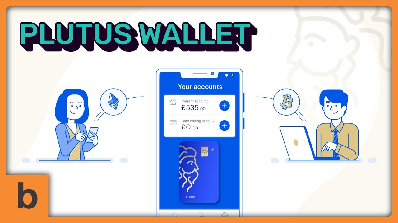
This animated explainer reiterates the importance of a powerful script. Plutus has a techy explanation about its blockchain-powered service, and not everybody is familiar with the terminology. That's why we rely on a straightforward and fine-tuned script to deliver the message in a light-hearted way.
The motion graphics animation also helps make the explanation easy to digest even for blockchain newbies. Using a minimalist design, we added a few elegant touches and made it digestible since there's no distracting fluff in it.
In less than 90 seconds, the viewers can easily have a solid grasp on how the brand makes its cryptocurrency integration much easier.
Telling your story with a video may boost your conversion rate by up to 81%
Multi
App Demo Video, Microinteraction
Blockchain
Motion Graphic
1:05
Website, Youtube
It's quite challenging for some viewers to understand margin trading right off the bat. That’s why we start lightly with a definition of terminologies and slowly introduced Multi's service.
This way, the viewers understand the basic concept of the brand, why it matters, and why Multi can be a solution for them.
Not to mention the stark white background offers the illusion of simplicity. We choose a solid white color since we need to break down Multi's brand to let the viewers quickly retain information.
Meanwhile, the full sound effects emphasize what's on the screen. It's an effective way to engage viewers, encouraging them to watch the video all the way through.
Telling your story with a video may boost your conversion rate by up to 81%
Centrl Inc Video Animation
App Demo Video, Product Demo Video
Cyber Security
Motion Graphic, Screencast
1:38
Website, Youtube, Events & Trade Shows
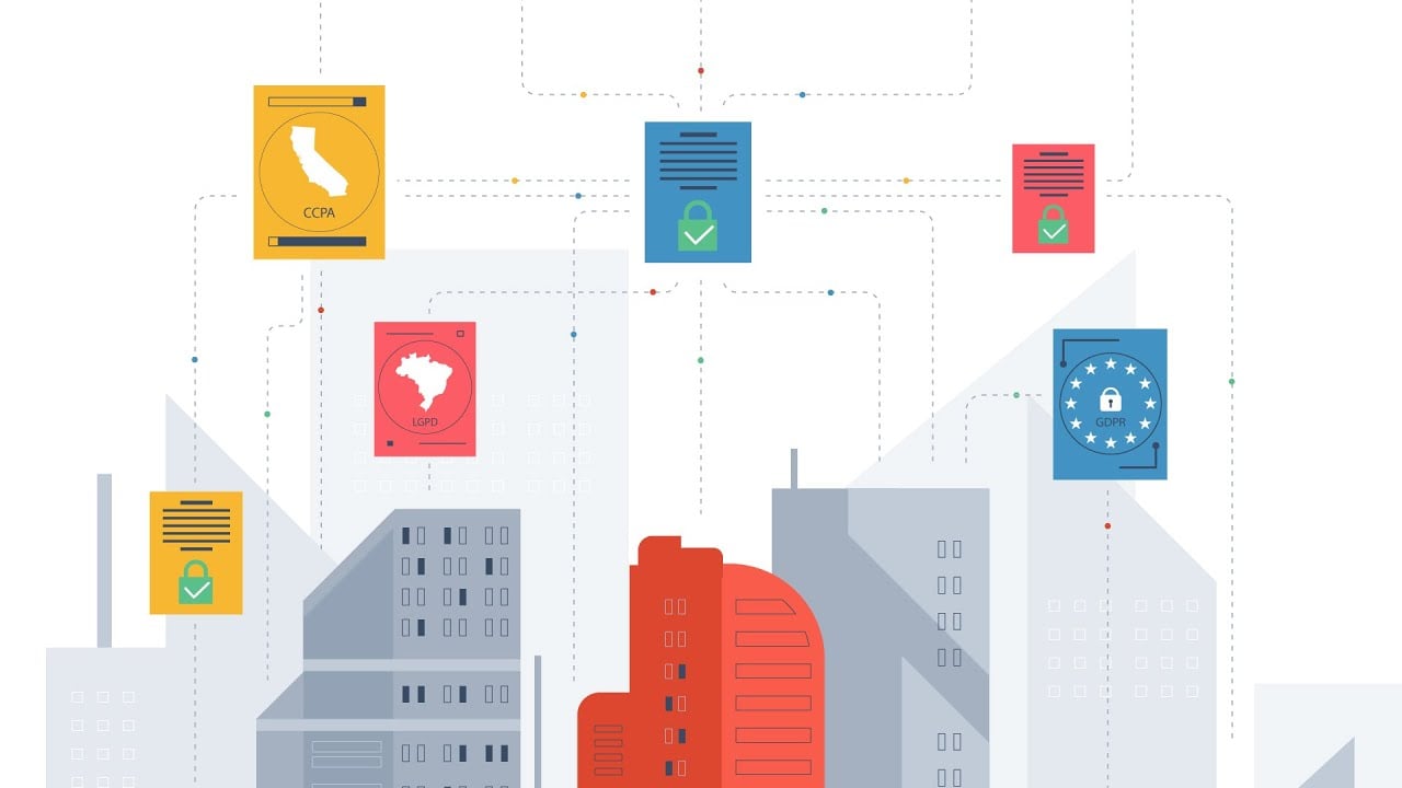
Using a minimalist approach, the illustrations of this explainer video focus on the essential, resulting in a clear and unambiguous visual language. From animation to transitions, this video does everything right graphically. We rely especially on the transition since we tried to give the viewers a pleasing viewing experience to focus on the content.
Thoroughly engaging, the straightforward script answers all the frequently asked questions about data privacy and how CENTRL Inc offers a solution without shoving the information down the viewers’ throat.
The voice-over is playing out at the exact perfect pace, making the viewers feel like they’re listening to everyday conversations. This way, the crucial information about CENTRL Inc is easy to digest.
Telling your story with a video may boost your conversion rate by up to 81%
Trustifi 2
Product Demo Video, Video Ad
Cyber Security
Cartoon, Motion Graphic
0:54
YouTube, Website
The video starts by highlighting target viewers' pain points to grab their attention and hold it. The animation’s flow accentuates the friendly tone of the narrator and goes so well with Trustifi 2 brand identity. Those combinations work effectively as a visual magnet making us watch the video until the end.
Since the video includes facts, statistics, and service features, we decided to keep the script minimal to make the narration easy to follow. Complemented by endearing animated characters, the techy explanation is more enjoyable and entertaining to absorb for the viewers-- without getting bogged down by the minutiae of how the service works.
The motion graphics used in this explainer video breathe life into static typography and icons, making the brand attractive and dynamic-looking for viewers.
Telling your story with a video may boost your conversion rate by up to 81%
Mobile Ensurity
Product Demo Video, Event Video
Cyber Security
Motion Graphic
1:00
Website, Youtube, Events & Trade Shows
Motion graphics are best used for passing complex ideas in a straightforward way where people grasp it quickly. We used it in this explainer video we crafted for Mobile Ensurity as the brand itself has unconventional terminologies.
The seamless and smooth transitions help the brand demystify the service, and make the viewers realize it's worthy of deserving their attention. Its clean design and refreshingly spare use of color make the video look elegant and easy on the eye.
By the time the video presents a call to action, the viewers convinced to sign-up for the service and share it with friends.
Telling your story with a video may boost your conversion rate by up to 81%
Pure IT
Product Demo Video, Customer Onboarding Video
Cyber Security
Motion Graphic, Cartoon
1:32
Website, Youtube
The video focuses on work from home problems instead of hard-selling their service, which makes viewers relate to the current situation. It’s an excellent way to captivate the viewers’ attention from the get-go since Pure IT gives them obvious reasons why they need WFH cybersecurity solutions.
Since Pure IT is an Ireland-based company, we used a native regional accent mainly to appeal to the customer base in its locality because it’s seen as trustworthy. This strengthens the brand identity and increases brand recognition making it easier to recall.
Not to mention the upbeat background music and graphics keep the viewers hooked. It makes all the key features mentioned on the video easy to remember.
Telling your story with a video may boost your conversion rate by up to 81%
Banyan Security
Customer Service Video, Video Ad
Cyber Security
Cartoon, Motion Graphic
1:43
Website, Social Media and YouTube
This flat motion graphic explainer video is a particularly vivid and dynamic way of conveying complex elements. It’s supported by a concise and simple use of typography, which plays a significant role in the video and makes it more comprehensive yet still digestible.
When the video comes into play, the viewers instantly focus on a relatable issue about securing remote access. This video then shed light on everything that makes Banyan Security services special.
This simple yet powerful motion graphics show you that an explainer video doesn't have to be fancy and complicated to bring you the best results. The key is actually on the conciseness and clarity to create convertible videos with minimal effort.
Telling your story with a video may boost your conversion rate by up to 81%
Chat Class
Product Demo Video, Video Ad
Education
Cartoon
1:10
YouTube, Website
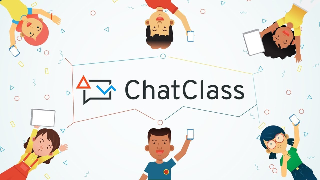
This explainer video uses pleasant soft colors, smooth transitions, and a calm voice-over which explains the viewer’s problem and presents the solution. In the first few lines, the video straightforwardly addresses its target audiences (teachers and parents) to nail their attention.
Since the video focuses on the whole marketing message to a specific target audience, we make sure that the script resonates with their problem: hard methods of English learning for children and students.
An intrigue-inducing script with a side of kick-ass cartoon characters helps the audience understand the problem and shows there’s a better way to make children learn English more effectively. In that moment of need, we can offer them ChatClass as the perfect solution.
Telling your story with a video may boost your conversion rate by up to 81%
Keystone Academic
App Demo Video, Customer Onboarding Video
Education
Cartoon
1:30
Website, Social Media, Trade Shows
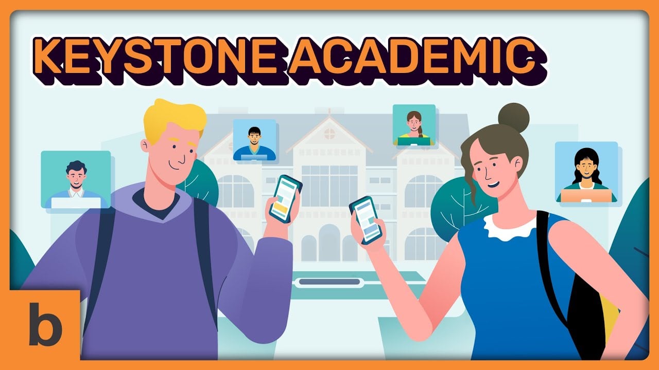
The inviting background music and relatable difficulties draw you in from the moment you press play. A unique voice-over style enhances the playful motion with cartoon characters. That’s how we make the viewers stay longer and watch the video all the way through.
The script dives straight into the problem and uses an impactful analogy to help viewers understand the bigger picture. At this point, they know why Keystone is a solution they should consider.
Instead of pushing them to purchase the service and brag about the features, we keep the script friendly by showing how the service really works and how it will benefit its users. Doing so tempts the viewers to purchase the service instead of shying away from it.
Telling your story with a video may boost your conversion rate by up to 81%
Bench Prep Animated Video
Video Ad, Microinteraction
Education
Motion Graphic, Screencast
1:03
YouTube, Website
This clean, simple, and minimalist motion graphic explainer video is one of the best go-to when it comes to breaking down a complex topic. With this kind of simplicity, the viewers can easily understand what the video conveys right after they click on the play button.
In the first 25 seconds, the viewers will learn the struggles of studying PHR or SPHR exams and how BrenchPrepHR can make it easier. We showed how the BrenchPrep works, complete with the real user interface to give the viewers a solid grasp on how the service looks.
Using typography helps viewers remember the benefits of using the service. In the end, we make sure that viewers remember the video by including the brand name.
Telling your story with a video may boost your conversion rate by up to 81%
Wizefi Animation Explainer Video
App Demo Video, Microinteraction
Fintech
Motion Graphic, Screencast
1:43
YouTube, Facebook
In this explainer video we crafted for Wizefi, we introduce the viewer to cartoon characters named The Fosters. We present the family from the beginning to make the viewers relate to the character’s lifestyle and problems.
Using a creative visual storytelling method, we walk the viewers through the Wizefi app and its key features in a compelling story and endearing characters. Instead of narrating the features verbally, we use motion graphics with characters that can give life to the brand storytelling.
We also use pastel colors to give the video a natural, free-flowing style. Those engaging color palettes are also suitable for all age groups, which help Wizefi appeal to a broader audience.
Telling your story with a video may boost your conversion rate by up to 81%
CardCruncher
Video Ad, Microinteraction
Fintech
Motion Graphic, Cartoon
1:36
Website, Youtube
At the very beginning, we throw the viewers a question about credit cards, which catches their attention.
We use a conversational and friendly script to demonstrate how CardCruncher's service fits into the scene without being overly promotional.
For the first minute, we focus on a relatable problem that every credit card holder has faced. And it takes only 30 seconds for CardCruncher to introduce its benefits to the audience.
This video shows that you don't have to spend 3 minutes just to explain the key features of your brand. The secret sauce here is to evoke the viewer's emotion by understanding the difficulties they're facing. That's how you gain their trust and make them convert.
Telling your story with a video may boost your conversion rate by up to 81%
Tipbros
App Demo Video, Customer Onboarding Video
Fintech
Motion Graphic
1:01
Website, Social Media
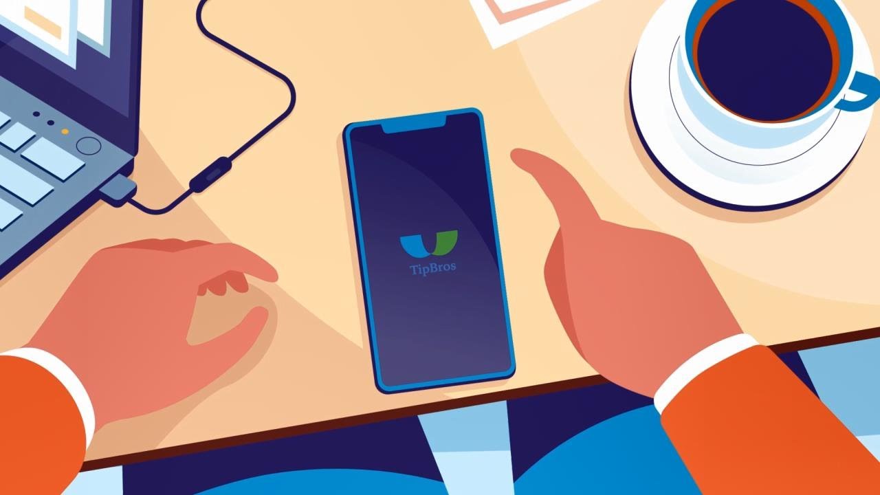
A good explainer video tells a good story. That is what we aimed while creating this explainer video for TipBros. We decided to take the viewers on a pleasant journey while learning about the service.
That's why we use an engaging, bright tone voice-over style to help viewers engage with the content. It complemented with a straightforward and easy-to-understand term that sticks to TipBros' audience-first communication style.
With the stunning motion graphics, seamless transitions, and lovely animated characters explainer videos like this can make viewers forget they're watching an ad.
Telling your story with a video may boost your conversion rate by up to 81%
SagePay Animated Video
App Demo Video, Sales Video
Fintech
Screencast, Motion Graphic
1:20
YouTube, Website
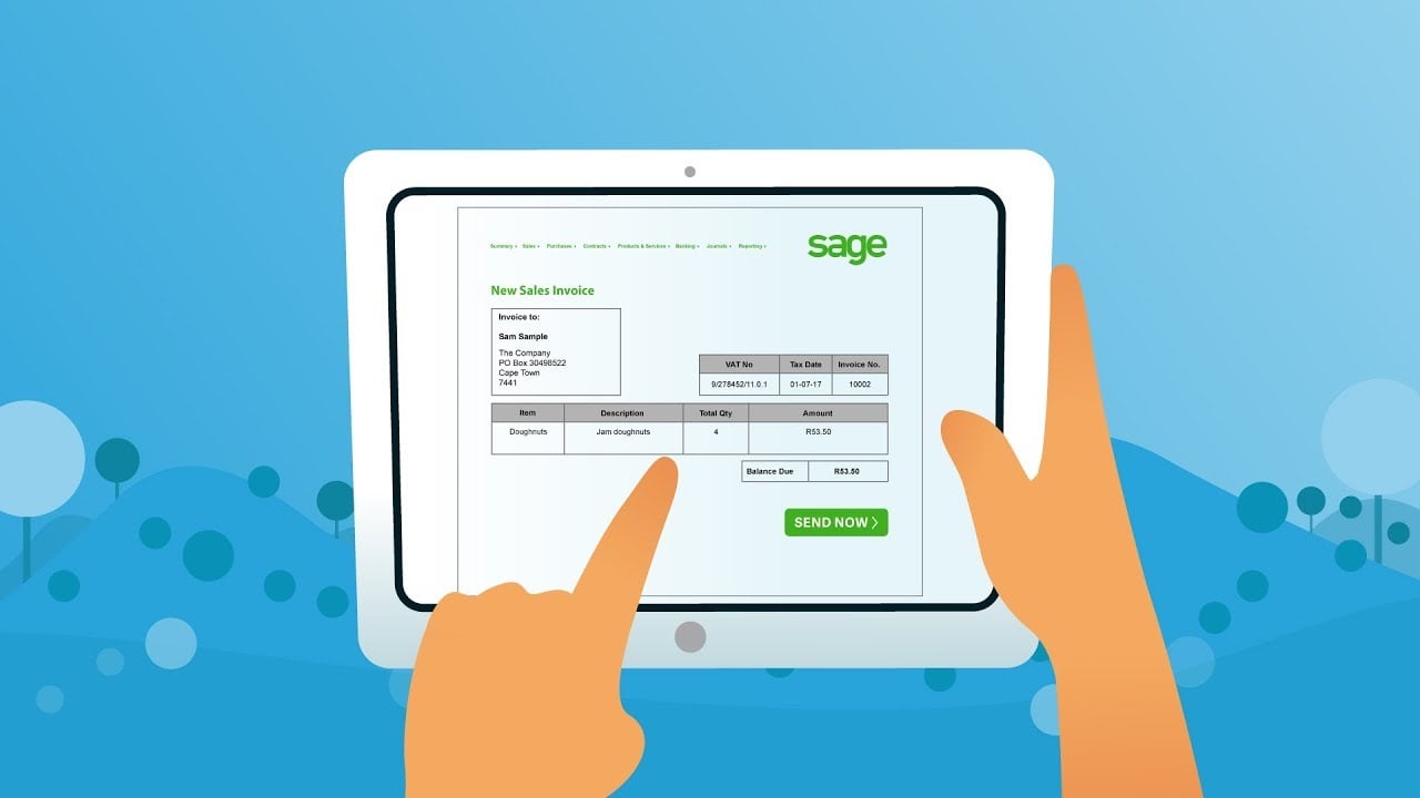
We understand that the viewers are busy and don’t want to waste their time on a salesy video. We introduce Sage Pay as early as possible in this video to provide more time for focusing on its benefits and other unique selling features.
To make the video even more captivating, we decided to use the combination of motion graphic animation with cartoon animation, which enhances the overall visuals and brings more variety to the animation.
We highlight how SagePay works using line illustrations. Visualize each step of how users can take advantage of this app with in-and-out interactions in a flat style.
Telling your story with a video may boost your conversion rate by up to 81%
8 Securities Animated Motion
Video Ad, Event Video
Fintech
Screencast, Motion Graphic
0:50
YouTube, Website
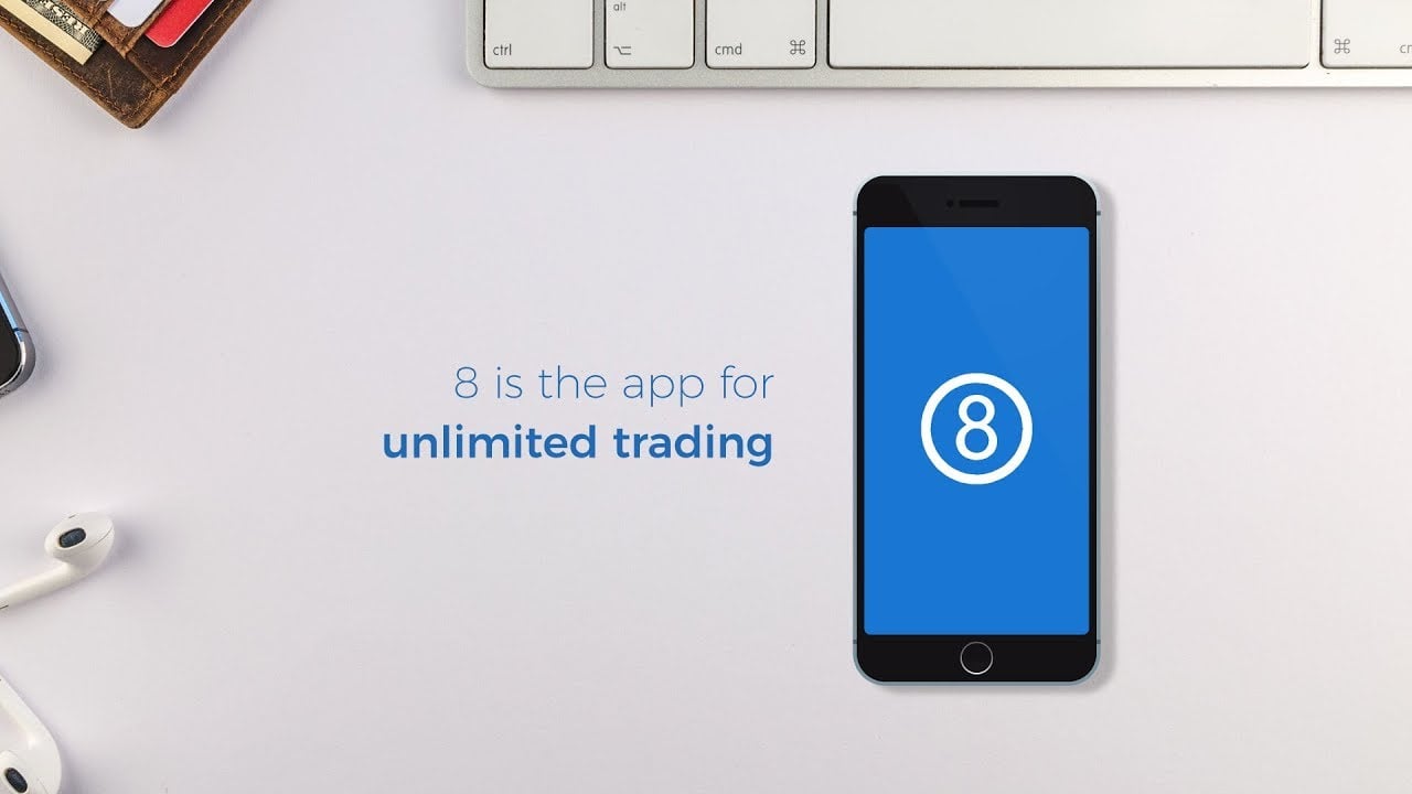
We understand 8 Securities mostly target Millenials and other younger generations as their focus audience. That is what makes us focus on a sleek, branded look, and some upbeat music. It helps viewers of all ages understand the service that 8 Securities offers.
Voice overs were not used in this explainer video. We let the visuals do the talking. All the crucial information is delivered with engaging animation graphics and typography to help the viewers understand the concept.
Since this explainer video is all about visuals, it’s an ideal video to share across social media channels like Twitter and Facebook, where the majority of videos on the platforms are played without a sound.
Telling your story with a video may boost your conversion rate by up to 81%
Clearly Derm
App Demo Video, Videographic
Healthcare
Cartoon
1:13
Facebook
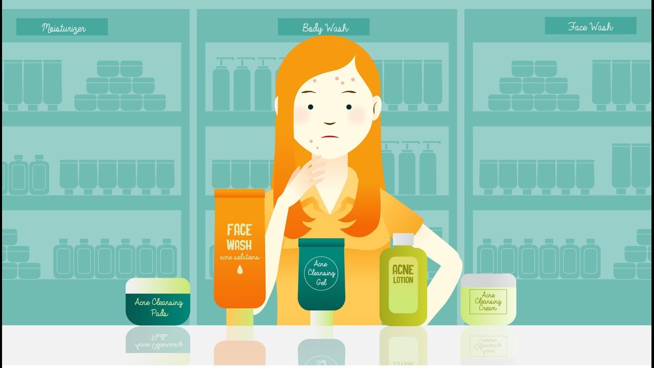
The healthcare industry is such a competitive market. In the battle of eyeballs, there are tons of videos from healthcare providers that talk about their products and services. In this situation, we decided to rely on awestruck cartoon animation to make Clearly Derm stand out.
We started the video with some statistics about acne issues which most people deal with. The narrator maintains a friendly tone of voice that makes the viewers feel like they’re chatting with a friend.
We introduce Clearly Derm and show viewers concisely how to use the service without sounding like another brand here to sell. The video is packed in intriguing storytelling that doesn't bore the viewers.
Telling your story with a video may boost your conversion rate by up to 81%
Finalytic
Product Demo Video, Customer Onboarding Video
Healthcare
Motion Graphic, Cartoon
1:18
Website
It’s easy for the audience to feel a bit daunting when they learn about a new brand, especially when it talks about insurance revenue cycle. For newbies, it takes time for them to understand the concept. But with this explainer video, they’ll have a good grasp of the ideas from the first few seconds of the video.
The fine-tuned script and conversational voice-over do a great job of sparking the viewers’ curiosity and keeping their attention with mind-boggling basic insurance revenue concepts. Even for the people who are familiar with this kind of sales pitch, they'll have an easy understanding of what Finalytics is about.
We also added charming and detailed sound effects to emphasize what’s on screen and engage viewers, helping them digest what Finalytics can do for them.
Telling your story with a video may boost your conversion rate by up to 81%
Charted Scientific
Customer Onboarding Video, Sales Video
Healthcare
Motion Graphic, 3D Animation
1:52
Website / LinkedIn
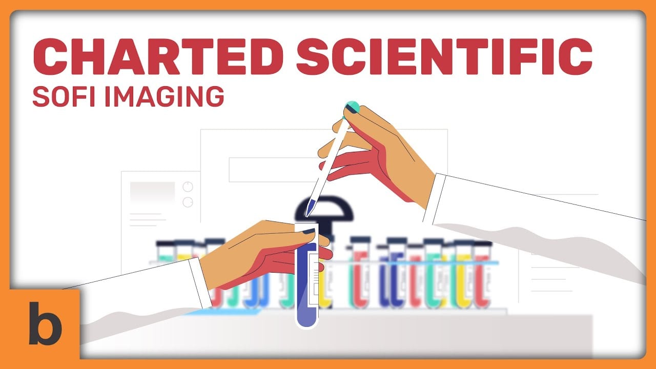
One of the greatest things about animated explainer video is that you can bring any concept to life that real-live cameras can’t afford. Therefore we use a captivating hybrid style. We add 3D post-processing and effects to 2D animation to give it a subtle sense of greater depth.
The 2D motion graphics show the script's statistical portions combined with a robust 3D animation bring forward the ultra-sensitive tools for biomarker detection and single-cell imaging.
The simple color and warm, calming tone of voice-over in this video make the explanation about science and technology less intimidating and easier to understand. The narration seamlessly syncs the stunning animations, creating a fluid explainer video that is highly engaging and conveys the complex topic in minimal time.
Telling your story with a video may boost your conversion rate by up to 81%
CDISC Whiteboard Explainer Video
Customer Onboarding Video, Customer Service Video
Healthcare
Whiteboard
1:52
Website
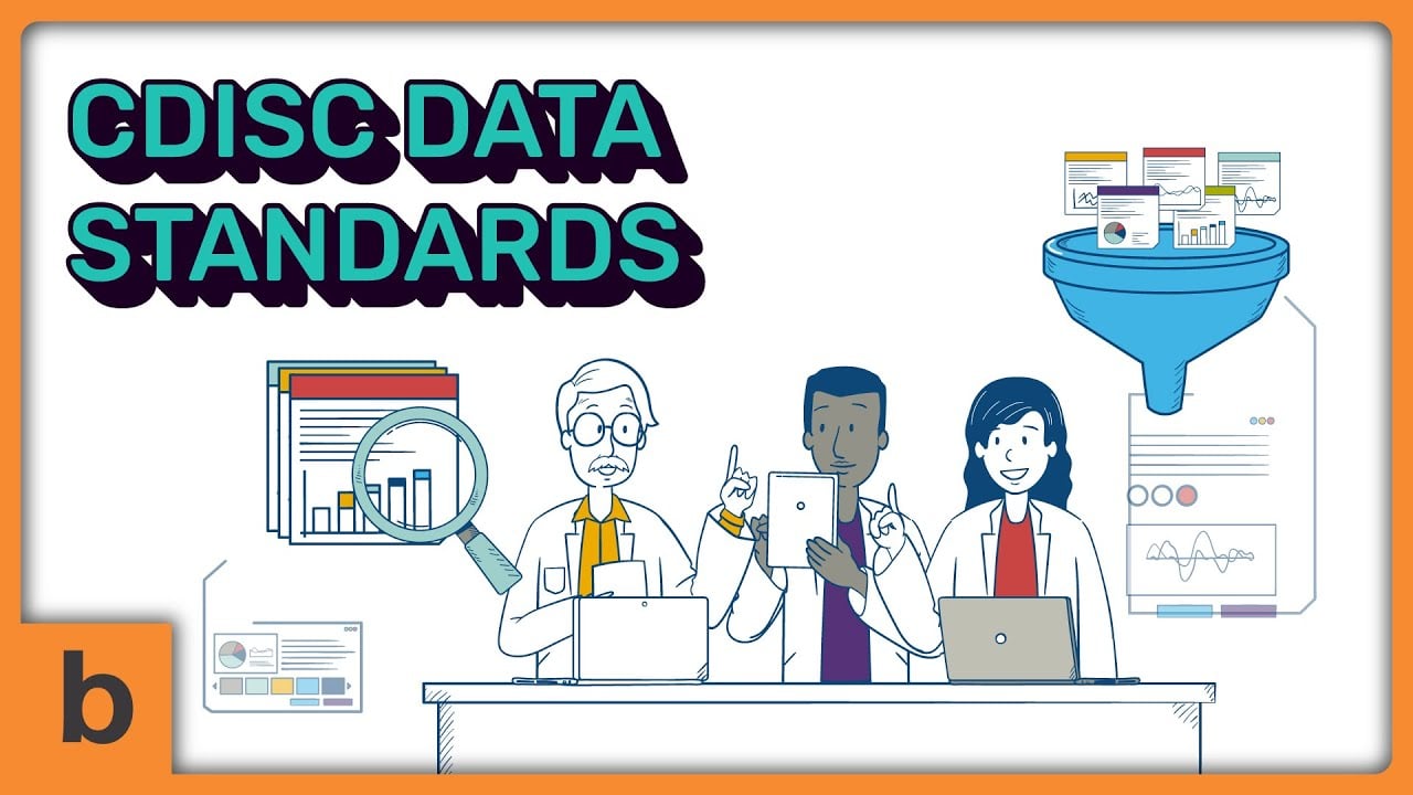
CDISC has much crucial information to tell, and it can be overwhelming for the viewers to learn. We created an engaging whiteboard explainer video to guide the viewer's eyes to specific points.
While the “hand-drawn” image is being revealed within the video, only portions of it appear at a time in the attempt to allow the viewer to focus on a certain point. This is an effective way to trigger the curiosity of the viewers who will continue to watch the video while other images are being revealed.
Unlike traditional, classic whiteboard styles that use only black and white color, we included some degree of color to make it more impactful and visually intriguing.
Telling your story with a video may boost your conversion rate by up to 81%
Astra Life
Sales Video, Product Demo Video
Insurance
Cartoon, Motion Graphic
1:19
Website, Instagram & YouTube
This explainer video shows you can still create a highly engaging video even with a classic, pure white background. The sleek background and soft, almost-pastel colors result in an elegant and modern explainer video style.
The video shows the narrator talking to the character, Rico, about unpredicted life-changing moments, making it appealing for viewers to keep on watching. The narration then advises Rico about the importance of having a life insurance agent.
This storytelling method is a captivating way to deliver Astra Lifes' message and offer its insurance services where viewers won't feel they're watching an ad. It’s more like they’re listening to advise from a big sister or a close friend.
Telling your story with a video may boost your conversion rate by up to 81%
AmTrust
Training Video, Event Video
Insurance
Motion Graphic, Cartoon
1:44
Website, Youtube, Events & Trade Shows
The explainer video starts with an AmTrust introduction to increase top of mind awareness of the viewers. After establishing their brand, the engaged viewers and repeat customers are most likely to watch the video all the way through.
The structure of the content is based on fine lines drawn through the video. From these continuous lines, new graphics emerge one after the other. Instead of overwhelming the viewers, it forms a supporting element for them, which leads them throughout the video.
This line illustration style is great for focusing on comprehensibility. Even AmTrust has several points to deliver at once, the smooth flow of this explainer video helps the viewers digest them effortlessly.
Telling your story with a video may boost your conversion rate by up to 81%
The Opioid Epidemic
Product Demo Video, Sales Video
Insurance
Motion Graphic, Cartoon
2:09
Website, Youtube, Events & Trade Shows
With soft and elegantly moving transitions, this video flows so effortlessly. For viewers who aren't familiar with the opioid epidemic, we show the difficulties in engaging storytelling that allows viewers of all ages to understand what the video conveys.
The convincing story is used to deliver fascinating facts about the epidemic, helping the viewers realize that the addiction is real and needs awareness. This kind of storytelling is an effective way to simplify and explain complex concepts and save time.
With this video, the viewers don’t have to spend hours reading bulky paragraphs to get the juicy bits about the epidemic. It only takes two minutes for the viewers to get the gist of it, including the symptoms, and how AmTrust can help them.
Telling your story with a video may boost your conversion rate by up to 81%
Mandarin Minds
Video Ad, Product Demo Video
Online Learning
Cartoon
1:00
YouTube, Website
Cartoon animation videos are known as one of the most popular styles. The great thing about them is that they bring emotion and personality to your brand. This is why we choose this engaging style for Mandarin Minds to make the brand stand out and evoke the viewers' emotions.
This explainer video targets parents, especially those who look for an easy way for their children to learn mandarin. We create lovely cartoon characters and a relatable script to generate strong empathy in them.
When the viewers see the characters are similar to them in characteristics, behavior, and attitude, they will feel represented by this cartoon explainer video instantaneously. This is what makes this video even more appealing, engaging, and memorable.
Telling your story with a video may boost your conversion rate by up to 81%
Fluentize Animated
App Demo Video, Microinteraction
Online Learning
Motion Graphic, Screencast
1:24
YouTube, Website
Explaining an e-learning service can be quite tricky. On one side, you need to make sure that you mention all of your service benefits to make it stand out; one the other hand, you need to keep it engaging and avoid boredom.
Using stop motion explainer video like Fluentize can deliver your message while entertaining your viewers at the same time. We are aware that too much information can overwhelm the viewers. That's why we packed crucial information in.
See how the video doesn't detail how to use the app; rather, it just points out the feature that benefits the viewers in learning English easier.
Telling your story with a video may boost your conversion rate by up to 81%
eChalk Explainer Videos
Training Video, Event Video
Online Learning
Screencast, Motion Graphic
2:53
Website
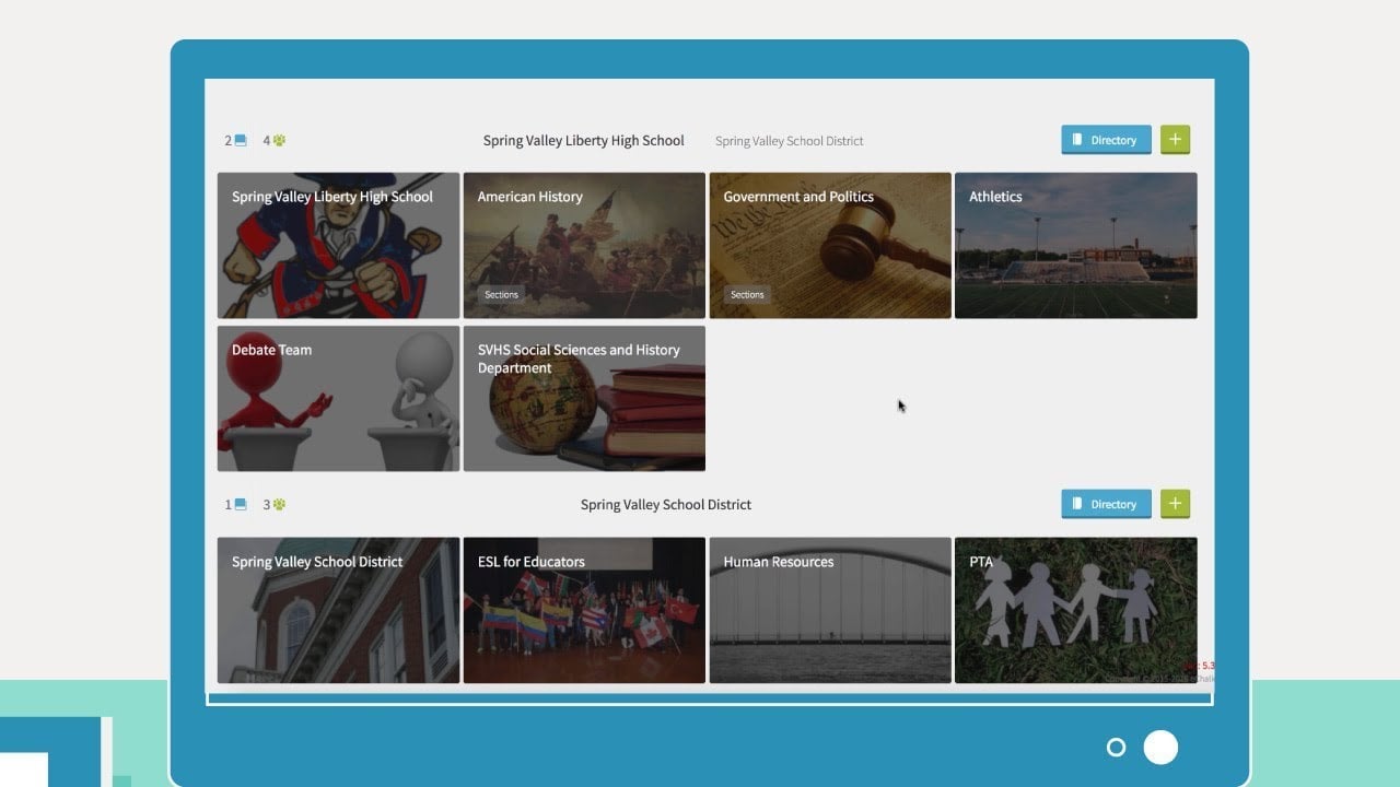
One of the main responsibilities of explainer videos is to deliver a nice and clean message to the viewers. It means that you don't have to create an Oscar-worthy script to make it work.
This minimalist and straightforward explainer video visualizes the words and outlines the benefits of the concept as visitors absorb the information. We portray eChalk's capabilities and benefits using screencast technique.
We display the actual interface to give the viewers a user experience. There is simply no better way to show you how a certain platform works than to use it yourself.
Telling your story with a video may boost your conversion rate by up to 81%
InHaus Explainer Videos
App Demo Video, Customer Onboarding Video
Real Estate
Motion Graphic, Screencast
1:00
Facebook Page, Instagram
To show the viewers what to expect and how the service works, we created an animated explainer video that shows a screencast of InHaus in action.
Screencast style is handy in giving a concise and convincing explanation. It's what makes this video master the art of a super-short explainer video. In just 60 seconds, we made a simple and effective video that shows how their service works.
Not only that, but we also make sure to include InHaus' unique selling points and bonuses that name the brand differently than what most customers would expect. With such a convincing script, the viewers get more tempted to purchase the service.
Telling your story with a video may boost your conversion rate by up to 81%
Blue Frog
Customer Onboarding Video, Sales Video
Real Estate
Motion Graphic
1:10
Website, Youtube
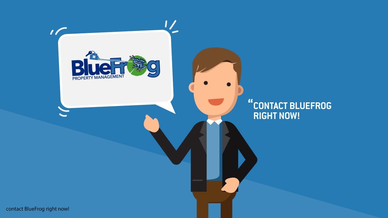
Just like the name "Blue Frog," we predominantly use the blue color for motion graphics. It represents Blue Frog's brand, which cements their logo and company brand into the viewers for better recalling.
Through delightfully-crafted motion graphics, the video features text overlays and basic shapes on top of classic blue and white backgrounds.
When a brand offers a service, explainer videos are about showing processes and benefits, which is a difficult task when using live-action footage. Here, stunning motion graphics removes those difficulties and opens up the possibility of putting anything on screen to engage the viewers.
Telling your story with a video may boost your conversion rate by up to 81%
DC Homebuzz Whiteboard Explainer Video
Employee Onboarding Video, Event Video
Real Estate
Whiteboard
1:28
Social Media
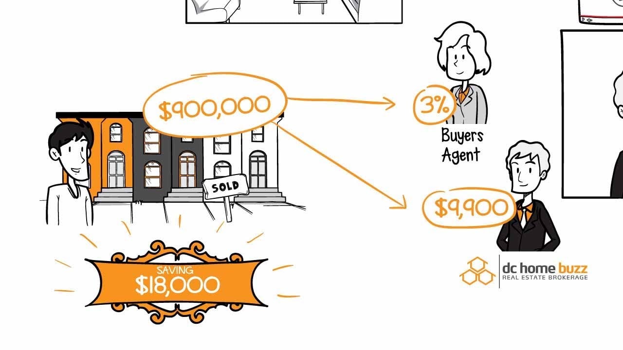
This explainer video uses an excellent combination of lines and a super-restricted color palette that generate together memorable and outstanding characters.
We also like to emphasize the beauty of smooth transitions between the scenes in this video. We drew illustrations of different scenes one after another. Thus, we complement the visual with an engaging story that follows a clear plotline and expands far beyond a single illustration.
Combined with detailed sound effects, this explainer video gains a particular charm that is able to convince viewers to purchase and use the service for their real-estate solution.
Telling your story with a video may boost your conversion rate by up to 81%
Nostra
Video Ad, Sales Video
Artificial Intelligence
Motion Graphic
1:16
Website, YouTube
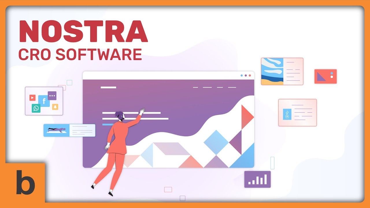
Artificial Intelligence is a complex topic that many people still find difficult to retain. This video we crafted for Nostra shows that motion graphics combined with minimalist background settings can break down all those techy explanations and encourage the viewer to pick up the information smoothly.
For this video, we use a minimalistic and clean style to help viewers focus, engage viewers and avoid distracting them with too-much visuals. After all, the aim here is to make sure that every target audience (no matter how skill-level in content marketing) can understand how Nostra benefits them in some ways and make their lives easier.
Since we rely on cleanliness and simplicity, we know we have to come up with an impactful yet easy-to-digest script. Also, we use a clear voice-over with a slightly slower pace to make sure that viewers can keep up with crucial information on the video.
Telling your story with a video may boost your conversion rate by up to 81%
Ava
Sales Video, Event Video
Artificial Intelligence
Cartoon
1:09
Website, YouTube, Events & Trade Shows
As a new service launched by Dentma, Ava aims to boost awareness using a catchy cartoon animated explainer video. To encourage their target audiences to watch the video all the way through, we use a thought-provoking fact as an opening line.
After the viewers understand the problem, we introduce them to Ava-- using endearing animated characters to make it stick to the viewer’s mind. Instead of explaining all the features that the AI-powered virtual assistant has in detail, we show the viewer how this service can be beneficial for them.
The script we use breaks down how Ava works using motion graphics along with kinetic typography animation. These types of animation are doing a good job of holding viewers’ attention and encouraging them to stay focused throughout the video.
Telling your story with a video may boost your conversion rate by up to 81%
Grok
Employee Onboarding Video, Customer Onboarding Video
Artificial Intelligence
Motion Graphic
2:01
Website, YouTube
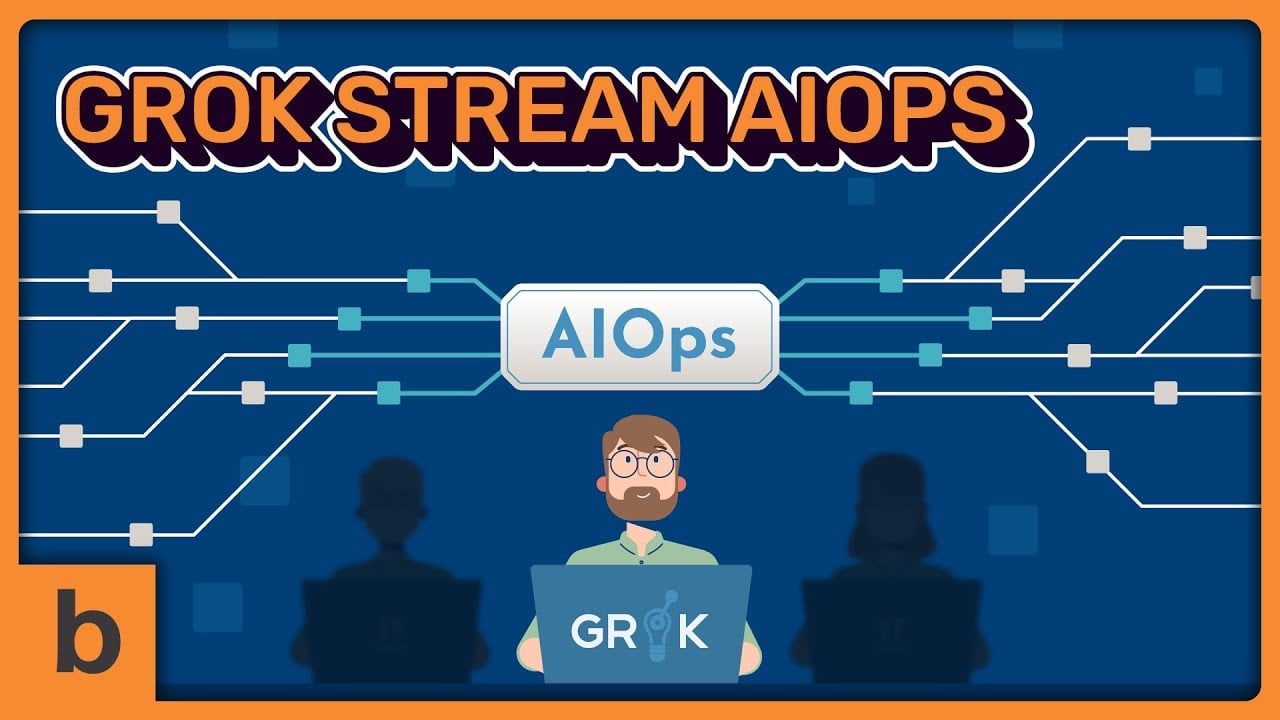
Grok has to deliver its brand messages about IT and AI. And we all know those two topics can be very intimidating to even think about it, let alone talk about it. This is why we created this video for them.
To help Grok make their messages more snackable and enjoyable, we use stunning motion graphics with character animation. Of course, the video also uses simple and easy language to make the whole content less intimidating for the viewers.
These two-minute videos pretty much summarized how the complex technology that Grok has worked in such an engaging way. They don’t have to write 500-word descriptions that can only bore their audiences.
Telling your story with a video may boost your conversion rate by up to 81%
Hawksearch
Sales Video, Event Video
Artificial Intelligence
Motion Graphic
1:07
Website, YouTube, Facebook
We fully understand that a great explainer video should focus only on providing values without being hard-selling. That’s why when we craft this video for Hawksearch, we make sure that we understand their audiences’ pain points and problems that Hawksearch can solve.
In the scriptwriting process, we put ourselves in their audiences' shoes so that we can identify their problems and try to solve them using Hawksearch. The script also highlights the selling points, so the viewer can understand why they should invest in their service-- and not others'.
The voice-over we use also represents a caring, and friendly tone. And as you can see, we also use mostly the color orange for the visual to strengthen their branding and create top-in-mind awareness.
Telling your story with a video may boost your conversion rate by up to 81%
Mender
Customer Onboarding Video, Employee Onboarding Video
Internet of Things (IoT)
Motion Graphic
1:45
Website, YouTube
As a company that offers intangible tech products, Mender understands that they have to create a snackable message so they don’t overwhelm their potential customers. Using these motion graphic animated explainer videos, the company relies on straightforward explanations and only includes information that their audiences need to understand.
Instead of spending the whole 100 seconds to break down their features, Mender shows how their software can improve customers’ lives. They also give a succinct explanation of their packages, helping viewers understand what plan suits their needs the best.
Through the video, viewers can understand what Mender offers, their unique selling points, even some packages or plans they offer without having to visit their website and explore all the information in the first place. Also, all those motion graphics animations play such a significant role in holding customers’ attention as it creates transitions that are interesting to watch.
Telling your story with a video may boost your conversion rate by up to 81%
Sigfox
Teaser Video, Video Ad
Internet of Things (IoT)
Cartoon, Motion Graphic
1:05
Website, YouTube, Events & Trade Shows
From the intro of this 100-second explainer video, Sigfox makes it clear who they want to deliver their messages for; “all the IoT device makers.” When you specify your audience right off the bat, you create a more targeted and efficient marketing campaign.
Also, understanding target customers’ pain points is a powerful way to show that your brand cares about them and wants to help them improve their lives. This way, customers will easily engage in your brand and establish a more solid brand-customer connection. And this is what Sigfox just did using their explainer video.
Intriguing motion graphic animation combined with colorful characters and visual elements makes this video pops up and is convincing to watch all the way through. This type of video is perfect for your homepage or even social media campaigns.
Telling your story with a video may boost your conversion rate by up to 81%
Dorbys
Teaser Video, Event Video
Non-profit Organizations
Cartoon, Motion Graphic
0:59
Website, YouTube, Events & Trade Shows
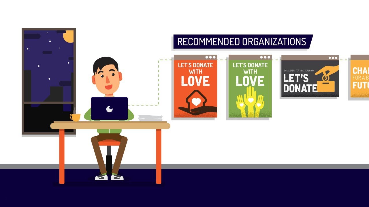
As a non-profit organization, Dorbys aims to generate trust from their audiences, and that’s why they rely on this colorful cartoon animated explainer video-- to let their audiences understand how to use their service and why they should do it.
Endearing animated characters, succinct voice-overs with elaborate backgrounds and compositions work marvelously to convey their message. We focused on leveraging the power of motion graphics using energetic transitions and characters to convey not only the information Dorbys needed to get across but also to create attention-grabbing that kept viewers engaged.
This type of video would be a great addition to the homepage or About Us page-- as well as social media platforms, helping Dorbys to reach out to more potential donors.
Telling your story with a video may boost your conversion rate by up to 81%
Charityvest
Video Ad, Teaser Video
Non-profit Organizations
Cartoon
2:03
Website, YouTube, Events & Trade Shows
Every non-profit organization should agree that building trust with potential donors seems like a back-breaking task. You have to make sure that they have all the information; why they should donate, what they donate for, how impactful their donation is, etc. Charityvest is aware of that, that’s why they use an explainer video to be more transparent with their potential donors.
As you watch it, start by paying attention to the crucial elements that make this explainer video worth watching; catchy character design, to-the-point narration, minimalist yet impactful scenery, and of course, how each scene ties to the next through stunning unique transitions.
Besides all the stunning cartoon animation and motion graphics, we also add kinetic typography so that we can capture attention, set a tone, and entertain the viewers-- which can also lead to higher retention rates.
Telling your story with a video may boost your conversion rate by up to 81%
Mireya
Event Video, Teaser Video
Non-profit Organizations
Cartoon, Motion Graphic
1:32
Website, YouTube, Events & Trade Shows
Highlighting a problem, speaking facts, and offering solutions is an ideal formula in an explainer video. We applied it in this explainer video for Mireya. This way, the viewer has a reason why they should care about the content of the non-profit video.
A friendly, casual voice-over with a catchy animation style and streamlined visuals make sure the viewer is never left behind. It encourages them to become closer to Mireya and its values, hopefully bringing about trust and loyalty.
This explainer video helps Mireya answer their potential audience’s common questions in one place effortlessly. We make sure that the script focuses more on viewers than on the brand itself, so the brand can understand what they need-- and that’s how we create a winning and successful presentation.
Telling your story with a video may boost your conversion rate by up to 81%
DCCA
Videographic, Teaser Video
Non-profit Organizations
Motion Graphic
1:44
Website, YouTube, Events & Trade Shows
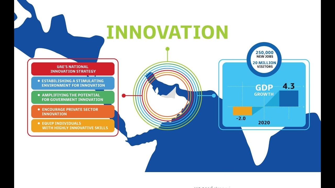
DCCA creates a non-profit explainer video to educate their audience about their project towards 2021’s Dubai Plan to create more sustainable growth for the country.
We helped them to visualize their ideas and information through a mix of motion graphics, light-hearted background music, infographics, and animated texts to make it much easier for audiences to understand what they do and take action.
We also include captions at the bottom of the screen so the video can be easily shared across social media and reach more audiences-- considering that most social media users watch the video with the sound off.
Telling your story with a video may boost your conversion rate by up to 81%
W+
Videographic, Event Video
Non-profit Organizations
Cartoon, Motion Graphic
2:37
Website, YouTube, Events & Trade Shows
The most important part of running a non-profit campaign is to ensure your audiences get enough information about your campaign so they can trust it. This is why an educational-style explainer video like this one can be a great solution.
The video is constantly presenting flat elements in an animated style and includes all the crucial information about the W+ campaign in under three minutes. And to keep viewers hooked and create a relaxed feeling for them, we rely on a simple color palette and blended animations.
The best part? It’s not promotional at all as the aim of the video itself is to raise awareness about the specific issue and W+ simply offering a solution for the viewer.
Telling your story with a video may boost your conversion rate by up to 81%
Questions to Ask Before Choosing an Explainer Video
There’s no such thing as one-size-fits-all explainer videos.
The best one is the one that is tailored to your brand and helps you achieve your goals and improve your bottom line.
With all those references and options above, it’s time to understand what kind of explainer videos you really need.
We’ve listed some key factors to consider when crafting your animated explainer videos so that you end up choosing the right style, achieving your goals, and earning a competitive edge in your industry.
What Are Your Target Audiences?
First thing first. Ask yourself, “Who do I want to watch this explainer video?”
Different industries have different target audiences with different demographics.
Knowing your audience will help you choose an explainer video style that appeals to them and effectively communicates your message.
For example, 2D animation with cartoon characters can be a good option if you aim to appeal to younger audiences.
Motion graphics and whiteboard animation will be a better choice if you want to make the video accessible to professionals.
What Is Your Video Purpose?
Clearly define the goal of the explainer video. Is it to educate, inform, entertain, or persuade?
The purpose serves as the guiding principle that shapes every aspect of the video's creation, from its content to its style and distribution strategy.
Each of these purposes requires a tailored approach in terms of content, style, tone, and call-to-action.
What Do You Expect from the Video?
Your explainer video goals should be specific, measurable, and aligned with your overall business objectives.
Some common goals for animated explainer videos include increasing brand awareness, driving sales, and explaining complex concepts.
Remember that no explainer videos are created the same. Each of them has a specific use case.
For example, sales videos are created to boost conversion, while teaser videos aim to create buzz for the new product launch.
Whether it’s for YouTube, social media, or your website, choosing the right video format can significantly impact audience engagement and interaction.
A clear understanding of your goals will help you choose the right type of video and make sure that your video effectively communicates your message.
So, what do you try to achieve from the video? Boost your revenue the sales? More coverage? Or simply just increase awareness?
What Is Your Brand Voice?
Your explainer videos should represent your brand voice and personality.
All the elements of your animated explainer videos– the visual, the script, the tone of voice-over, and the soundtrack and ambient noise, should all be aligned with what you’re known for to ensure uniformity and engagement with your audience.
Have you identified all key aspects of your brand voice that you want to highlight in your explainer video?
What Is the Buyer’s Journey?
The buyer's journey is the process potential customers go through when making a purchase decision.
It consists of three stages:
Awareness, where they recognize a problem or need
Consideration, where they explore possible solutions
Decision, where they choose a specific product or service
Understanding where your target audience is in the buyer's journey will help you determine the type of video most appropriate for them.
For example, video ads and product videos that provide a high-level overview of your product or service may be most effective if someone is at the awareness stage.
If someone is at the decision stage, testimonials or customer service videos may be more appropriate.
Awareness Stage: Are They Just Realizing They Have a Problem?
At this stage, potential customers just realize they have a problem or need.
The animated video you create should focus on highlighting the problem and presenting your brand as a solution.
Whether it’s an animated explainer video or a live-action one, all videos at this stage should be informative and educational to help viewers understand why they need your product or service.
Interest and Desire Stage: Are They Actively Seeking Solutions?
Once your audience is aware of their problem, they enter the interest and desire stages.
Here, they are actively seeking solutions and comparing different options.
Your video should showcase the benefits of your product or service and demonstrate how it can meet their needs better than any other option.
Action Stage: Are They Ready to Make a Purchase Decision?
In the action stage, potential customers are ready to make a purchase decision.
Include a clear call to action to guide viewers on the next steps they should take, whether it's signing up for a free trial, contacting your sales team, or making a purchase directly.
What Is the Message You Want to Deliver?
The message you deliver in your animated explainer video should be clear, concise, and relevant to your target audience.
Do you need to present complex data or statistics in a visually engaging way? Use a short-form video. This can be videographics or motion graphics.
Or do you want to deliver story-driven content? Cartoon characters and whiteboard animation are worth considering.
Meanwhile, the screencast style is the perfect fit when you need to give viewers step-by-step tutorials for your new feature.
Learn How Explainer Videos Use an Ancient & Time Tested Story Telling Technique
See all of our explainer video resources, including countless articles, tips, and insights.


