Table of Contents ×
- 1 The Story of Our Animation Styles
- 2 What are The Popular Types of Animation Styles?
- 2.1 1. Whiteboard Animation
- 2.2 2. Motion Graphic Animation
- 2.3 3. Kinetic Typography Animation
- 2.4 4. Paper Cutout Animation
- 2.5 5. Digital Cutout Animation
- 2.6 6. 2D Cartoon Animation
- 2.7 7. Silhouette Animation
- 2.8 8. Animated Music Video
- 2.9 9. Live-Animated Video
- 2.10 10. Stop Motion Animation
- 2.11 11. Animated Stick Figures
- 2.12 12. Animated Infographic
- 2.13 13. Screencast Animation
- 2.14 14. 3D Mechanical Animation
- 2.15 15. Flipbook Animation
- 2.16 16. Claymotion
- 2.17 17. Line Art Animation
- 2.18 18. Collage Animation
- 2.19 19. Photo Animation
- 2.20 20. Anime-Style Animation
- 3 The Combination of Several Animation Styles Above
- 4 Find Your Perfect Animation Style with Us
- 5 Mini FAQs on Explainer Video Styles
I’ve witnessed the explainer video industry moving up in the world.
Back in 2017, these short visual pieces were popping up everywhere– the news, TV, Facebook, Instagram, and Twitter.
Fast forward to today, explainer videos have continued to evolve and expand, now reaching even more platforms and integrating advanced technologies like interactive elements and augmented reality.
They provide amazing results when it comes to showing viewers’ problems and immediately offering a solution to them.
They’re also good educational media due to the eye-catching visuals, snappy animations, and narrative audio, making them an obvious center of attention that is hard to skip or miss.
Add all of those up, and you’ll get the perfect marketing tool to execute any business marketing strategy.
From global companies telling their stories to industries like health, travel, tech, fashion, and food, explainer videos can cover it all.
With at least 20 different animation styles, there’s something for every audience and purpose.
I’ll share with you 20 popular styles of video animation, and a bit of our journey in this industry.
The Story of Our Animation Styles
As the industry grows, I’ve noticed video production companies starting to pop up everywhere, which has caused fierce marketing and creativity competition.
The rise of animated marketing videos in various industries is also causing demand for explainer animation as a tool to increase brand awareness.
At Breadnbeyond, we believe that every project is unique, and that’s where our diverse range of animation styles comes into play.
Whether you’re looking for something sleek and modern or fun and quirky, we’ve got a style that fits.
It all started with a desire to capture the essence of each brand we work with.
From 2D and 3D animations to whiteboard explainer videos, motion graphics, and everything in between, we tailor our approach to make sure your story shines through.
Each style is carefully crafted to resonate with your audience to make sure your message is not only heard but remembered.
Our journey through different animation styles is all about flexibility and creativity.
No matter the industry or message, we’re here to bring your vision to life with the perfect animation that feels uniquely yours.
With years of experience in creating explainer videos, our team has tried out (and also seen) lots of styles from top-level studios.
Some of them we love, and some are a little out of our taste. Some require god-tier techniques, and some can be done by new learners.
So, with this article, I hope to shine a light on the animation styles we love and the ones that might be perfect for you.
What are The Popular Types of Animation Styles?
I’ve curated a list of popular video animation styles, along with examples (most of which are our own projects), to help you make the right choice, whether you’re after something super complex or clean and simple.
1. Whiteboard Animation
A classic and traditional definition of explanatory video content. It is the simplest form of 2D animation.
As you can see, this whiteboard animation style relies heavily on illustration, mostly in black and white. It’s, by far, the go-to bang-for-the-buck video style for corporate purposes.
Right from the start, we need to highlight the pain points and key messages to convey the solution.
You can see the hand of the illustrator drawing image after image on a clean white surface to explain a concept to you.
Whiteboard animations are known as the most effective type of explainer video animation thanks to their minimalistic design that allows viewers to concentrate on the content.
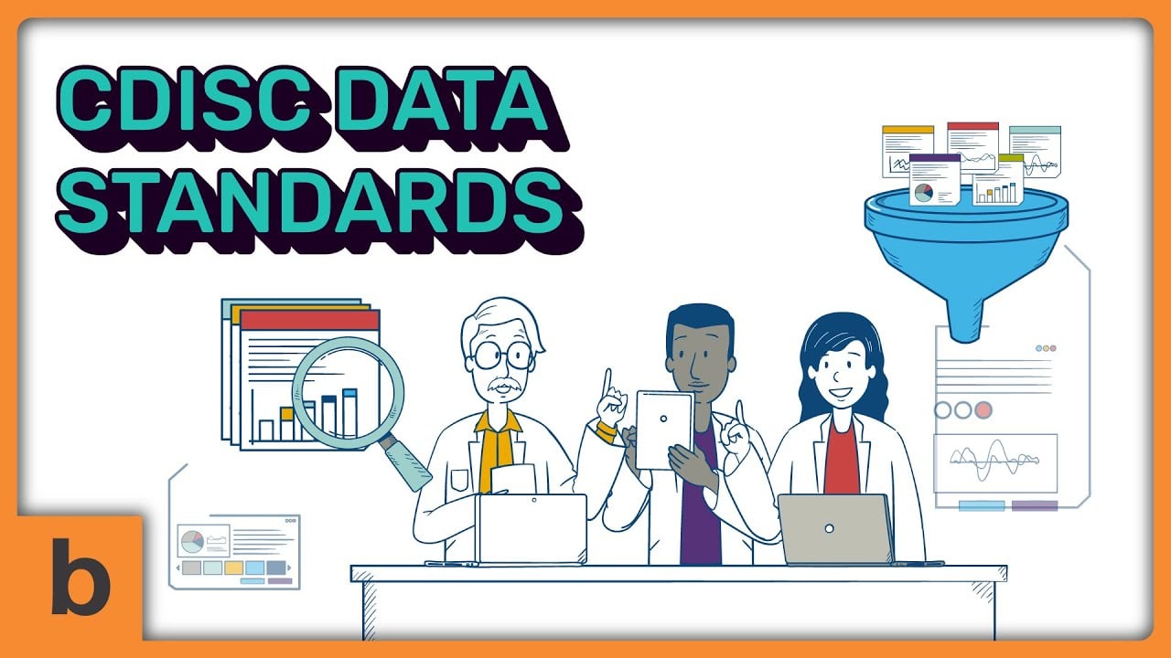
Here’s an example of one of our animated videos for business that uses the whiteboard style of animation for SDiSC:
2. Motion Graphic Animation
Just as the name suggests, this video animation style conveys an explanation through simple animated graphics.
Since there’s always constant movement, this style is designed to be engaging and easy to follow, perfect for marketing on social media like YouTube.
A motion graphics animated video explainer is incredibly fluid in various ways. You almost can’t go wrong with it, whatever the case.
Plus, this is a budget-friendly option for small businesses. That is why motion graphics explainers are always in high demand (at least for us).
In our company’s culture, we believe that motion graphics are designed to be entertaining and educational, so they can ultimately boost sales without spending too much on ads.
It might look like a simple design. However, it requires a sharp set of skills and a lot of special training to illustrate one of these animated videos.
Every movement in motion graphic videos needs tremendous attention to detail and method to execute, especially the transition between frames and the movement of small objects.
That’s why, most of the time, motion graphics take a bigger chunk of animators’ time (and therefore your budget) compared to other styles.
This explainer video from Saleswhale that our animator team created would be a well-fitting example:
3. Kinetic Typography Animation
If you’re a music enthusiast, you might see lyric videos so often. But do you know what those texts that sync with the beat are called?
That’s an example of typography animation.
The idea of kinetic typography animation is to deliver a message through words. This type of video is quite common on the Internet and social media.
Kinetic typography animated videos rely heavily on font selection and animated text and numbers, so the background music or voice-over could be optional here.
It can boost understanding, inspire someone’s mind, express an idea and way of thinking, and evoke people’s emotions.
Look at this stunning kinetic typography animated explainer video we created for Adhesive:
4. Paper Cutout Animation
Are you looking for something that combines simplicity with a strong focus on the message? This animation style can be a good option.
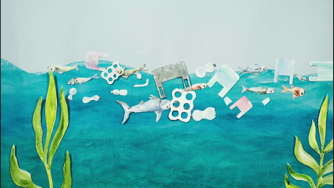
Traditional cutout stop-motion animation is usually created from scratch on a physical medium (paper or fabric). After that, this animated video is cut into its component parts, which can be controlled.
Let’s say if you want to show a character walking, you simply move its legs cut-out. Both designs and video editing play crucial roles in creating this type of animation.
It’s really simple regarding look and movement, which can be its main strength or weakness. Essentially, cutout animation features characters and objects that are cut out of paper, hence the name.
However, since it’s not demanding on the eyes, even with no fancy animation and whatnot, the audience can still really concentrate on listening to and grasping the message.
On the other hand, however, the video might also come across as somewhat too plain or downright boring for those attracted to color and movement.
Here’s an example with a clear sign of a basic paper cutout-style video created by artist Oleksa:
5. Digital Cutout Animation
Remember those old-school paper cutouts that moved around in stop-motion?
With the rapid growth and use of technology, traditional cutout video animations have now been replaced by digital animations, a more elaborate version of the cutout style.
This digital style is richer in the features that a more straightforward cutout style lacks. The cut-out pieces are created digitally and controlled in film frames as needed using the software.
Check out the example from The Drink Card below. We crafted this animation ages ago, so you can see how our animation techniques have evolved over time.
6. 2D Cartoon Animation
Who says cartoons are only for kids? Have you ever considered how a touch of whimsy could make your message more memorable?
Cartoon style is most commonly used in animated explainer video production.
We’ve received numerous requests from businesses to create character animations featuring their own mascots, as they add a friendly and relatable element to the videos.
A strong sense of humor and storytelling is the main appeal of 2D cartoon animation, and it has a wide range of applications.
The animated cartoon explainer video from Astra Life Insurance below will help you get more insights:
With this style, you can go for a more fun, adventurous concept.
There are many colors and humorous bits, complete with sound effects, expressive characters, and detailed environmental elements.
Some videos even add extraordinary background music to empower the storytelling method being used and make it more engaging, while others avoid background music to put more emphasis on the narration.
7. Silhouette Animation
Next up is silhouette animation. Do you know that a marketing video can be both mysterious and engaging at the same time?
This style works in a way that shows a character in the animated explainer video, but only in the form of a silhouette.
You might worry that a silhouette character could seem a bit cold or even creepy.
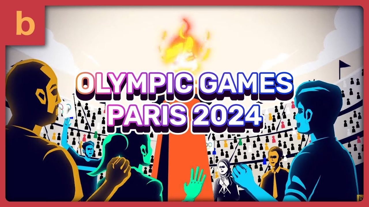
But you can still bring it to life with expressive features or by swapping in your brand colors instead of the usual plain ones, just like we did in this unofficial Paris 2024 animated teaser video:
This style of animation works best to introduce a new product since it highlights the product itself and leaves the rest of the elements as just shadows.

8. Animated Music Video
Similar to the usual animated music videos from our favorite musicians on YouTube, this style utilizes character animation instead of a real live singer.
Music is liberal, and the animation that represents it should be, too. Many MV creators have tried using a 3D animation style, but some still stick to 2D.
Now that the technology is evolving, some even combine 2D and 3D animation elements to create a unique and visually stunning hybrid style.
This versatility allows a wide range of artistic expression to cater to different audiences and musical genres.
Whether it’s the nostalgic charm of 2D or the modern edge of 3D animation, each style brings a unique flavor to the music video that can enhance the overall experience for viewers.
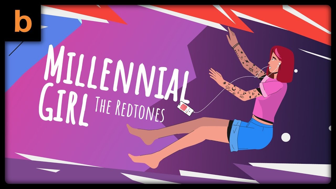
Music videos are at their finest when it’s mixed up with some kinetic typography for the lyrics for viewers to sing along, like this music video here we created for The Redtones:
9. Live-Animated Video
Live-action vs. animation is an eternal debate when choosing videos for your business. Which one do you think is better?
Wait, why not use them both? I suggest.
When a single video style gets boring, mixing live-action and animation gives you the best of both worlds.
You can be personal and build trust with the live-action part while entertaining and illustrative with the animation part.
Just make sure to get a high-quality camera beforehand.
Check out this live-action explainer video combined with motion graphics that we produced for Satoria Agro:
10. Stop Motion Animation
Do you know or remember Wallace and Gromit? That’s the perfect example of a stop-motion animation.
Here’s how it works: you start by drawing a character, either by hand or digitally.
Then, you take a photo, make a small change (like moving the hand), and snap another one.
Keep repeating that, and when you string all the pictures together, voilà! You’ve got a stop-motion video!
Stop-motion animation is the least complex of these styles, but it involves a tedious process of taking pictures, and it goes frame by frame.
Not to mention that a hundred pictures can result in a video production that is only a few seconds long.
The medium can be anything, including puppets, graphics, papers, and anything else you can imagine.
Since this style of animation is extremely fun to watch, it’s ideal for companies that want to leave a long-lasting impression with their brand’s introduction.
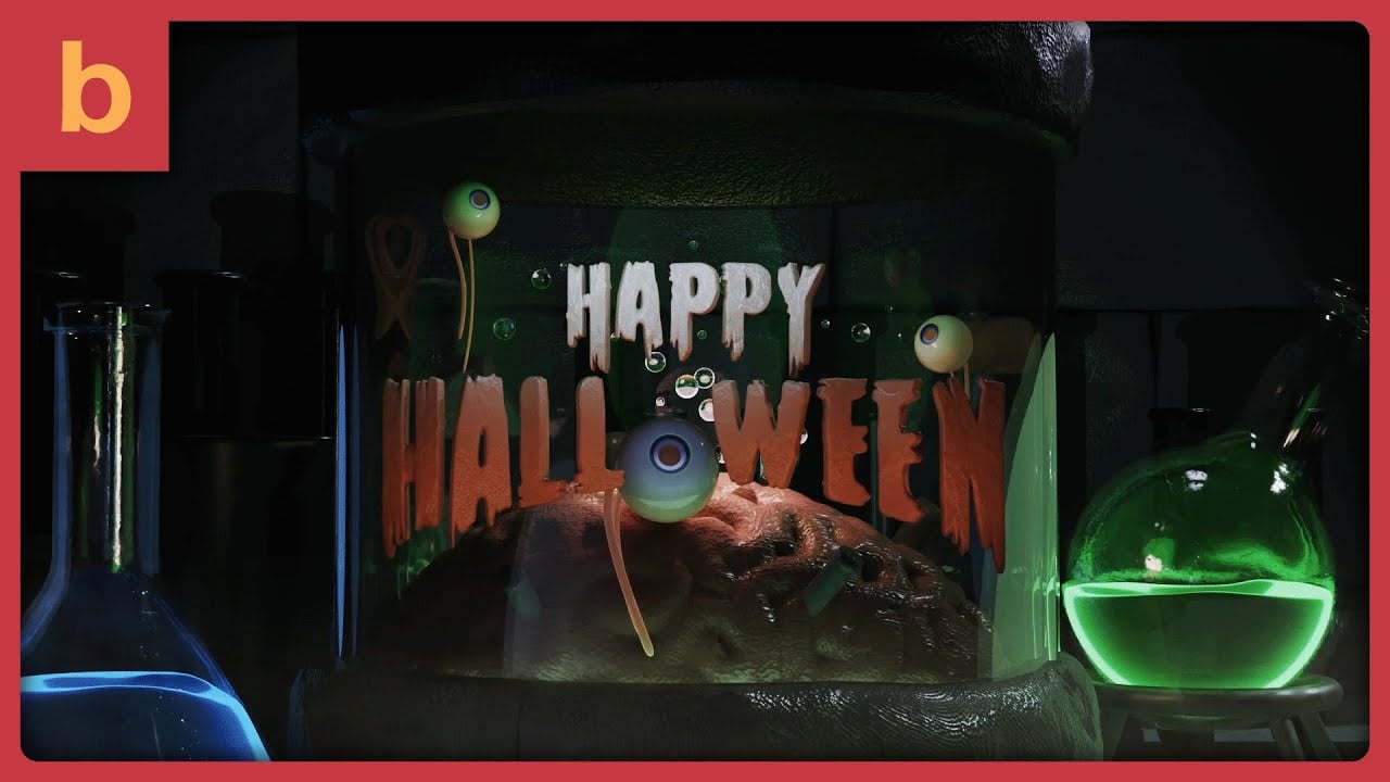
We’ve created an animated short video clip to celebrate Halloween.
Though it’s a complete digital 3D, it’s inspired by claymation and stop motion techniques.
We’ve meticulously crafted each film frame to capture the charm and nostalgia of classic stop-motion.
11. Animated Stick Figures
As the name implies, everything will be drawn in stick figures.
It’s very simple, playful, but not overwhelming.
This animation style breathes life into the drawing of your 5-year-old daughter, and that is simplicity at its finest.
It’s perfect for explaining a complex topic where the audience’s attention is more on the story than on the characters.
In our early days, we got a lot of animated stick figure-style requests.
But now, we’ve leveled up to crafting as diverse and sophisticated animations as they come and continually push the limits of creativity and ever-evolving tech.
Here’s a blast from the past– a stick figure project we created for Connexin over a decade ago:
12. Animated Infographic
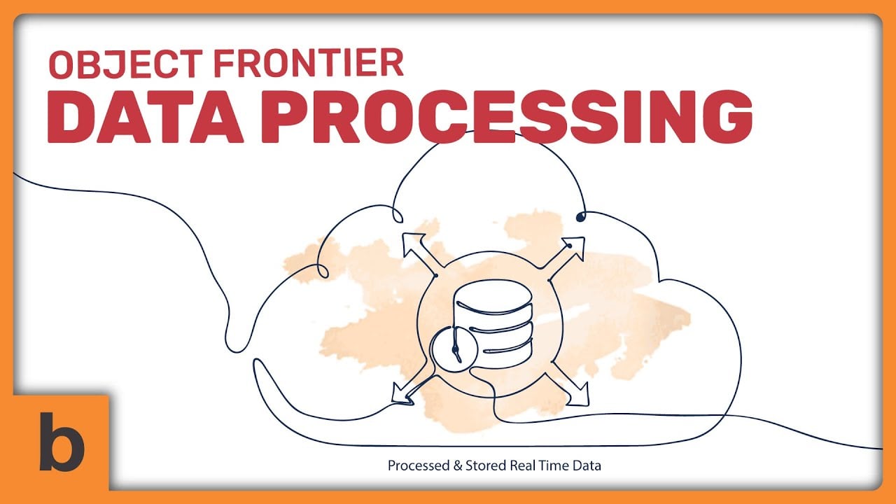
This is a motion graphic video that aims to explain, educate, or inform based on a script.
Infographic videos rely heavily on, well, information.
It can cover any information and transform boring figures into engaging, visually pleasing statistics so viewers can retain it much better.
Animation like this is packed with many facts, data, numbers, charts, and other statistics.
More often than not, subtitles are included to enhance comprehension and ensure the information is accessible to a broader audience.
Having all this data animated is very helpful in avoiding putting the viewer to sleep while reading through the data.
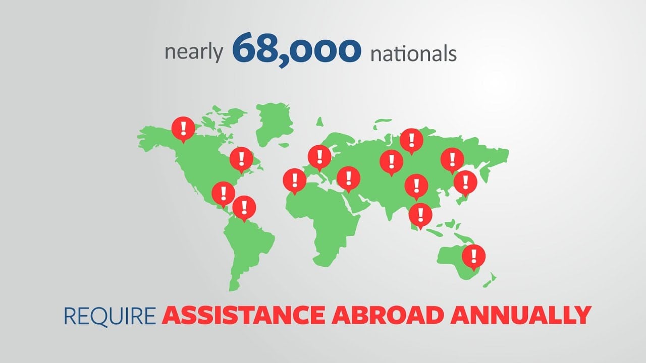
We’ve created this one project for Red24 to help them present the complex data and numbers in the most compelling way:
13. Screencast Animation
I recommend using screencast animation as one of the best styles for explaining products, websites, or apps, provided you don’t plan to update the UI later.
Mostly, it’s an animated version of your website (or mobile app), showing the viewer how to use the desktop site or mobile app- step-by-step.
This type of video is very helpful in improving customers’ experience in using your product service and, therefore, increasing or at least maintaining revenue at a steady level.
Most videos that intend to become tutorials, pre-recorded webinars, or how-to videos should use animated screen capture to make them easy to understand.
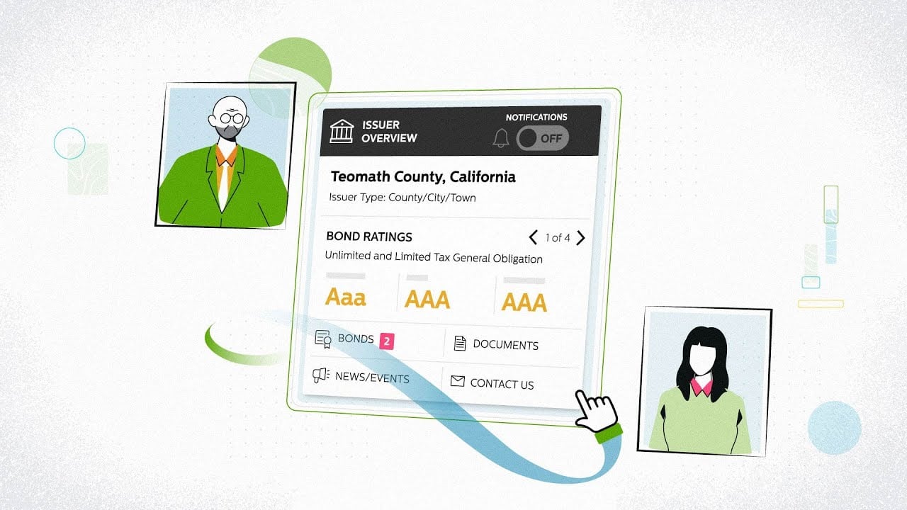
Like this one video we made for Bondlink:
14. 3D Mechanical Animation
Many of our clients use 3D animations to introduce a physical product.
The reason?
It offers a detailed, realistic representation that helps potential customers understand complex mechanics and visualize the product in action.
We use top-notch software (a mix of different ones) to create 3D animations that showcase the assembly process or product details.
This way, even in 4K high resolution, every intricate detail and function comes through crystal clear.
The goal in mind is to visually represent the configuration of a mechanical product and its components.
That’s why its animation techniques need to be of the highest quality to make sure that the result is realistic.
No wonder the cost of video production is quite high compared to other styles of animation.
Look at the example from OLEDWorks. When we created this animated demo, we meticulously detailed every component to ensure accuracy and realism.

15. Flipbook Animation
If you need an informal type of homespun animation, a flipbook can be one of the best options.
The old-school style of this type of animation requires a series of hand drawings that gradually change from one page to the next.
When it turns rapidly, the pictures appear to animate by simulating motion.
Now that everything has turned digital, the digital flipbook has stolen the scene. With the help of animation software, it’s much easier to create realistic pages and turn them into animations.
This video from Modo Modo shows you how it’s done:
16. Claymotion
Along with flipbooks, claymation is another informal type of animation.
As you can tell from the name, clay or plasticine is used as a primary medium for production.
This animation style uses the stop motion technique, where each movement is a new “shot,” and the “shots” are combined at the end to create a whole video.
There’s no illustration involved. Instead, the characters and scenes are physically sculpted and then manipulated frame by frame to produce the animation.
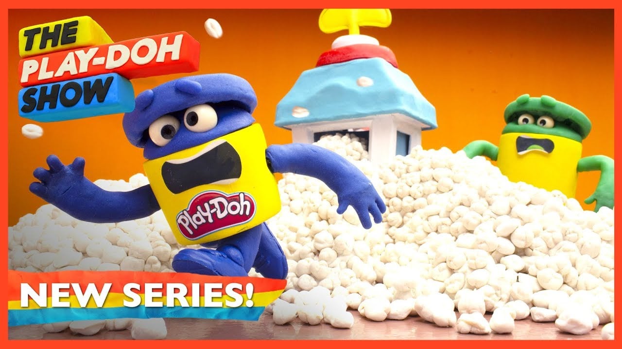
Play-Doh, a famous modeling compound brand, often uses claymation in its video advertising campaigns to give the brand a strong trademark identity.
Look at one of its video campaigns using claymation:
17. Line Art Animation
Line art animation keeps things simple and stylish. It uses smooth, clean lines to bring characters, objects, and scenes to life, often sticking to just one or two colors.
The beauty of this style is in its simplicity. Everything comes to life through the flow and movement of the lines themselves.
It’s highly versatile, easily conveying emotions and motion through subtle changes in line thickness, curvature, and dynamic movement.
It’s perfect for storytelling or any project where you want things to look crisp, clear, and effortlessly cool.
We create this line art for Relevants. We use black lines and pastel colors in the background to add a soft, modern touch that complements the clean lines while making the visuals pop.
18. Collage Animation
Although it can be categorized as motion graphics, collage animation stands out with its playful and eclectic mix of textures, images, and styles.
It’s like a scrapbook or collage art brought to life.
This technique blends various visual elements (like photographs, cutouts, illustrations, and even found objects) into a dynamic and layered composition.
The charm of collage animation lies in its ability to combine the old with the new to create a quirky, often surreal experience that feels both nostalgic and fresh.
It’s perfect for projects that want to capture attention with bold visuals, tell a story with depth, or add a touch of whimsy and creativity to the message.
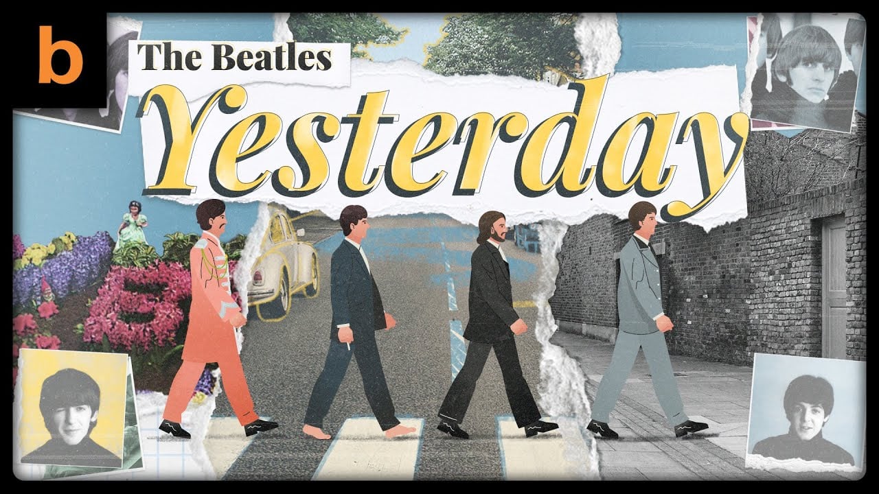
We’ve used this style in one of our lyric video projects.
Choosing the song “Yesterday” by The Beatles, we used rustic textures, vintage photographs, and soft paper cutouts to evoke a sense of timelessness, perfectly matching the song’s nostalgic vibe.
19. Photo Animation
Photo animation is a video style where static photos serve as the backdrop, while animated motion graphics or characters are overlaid and move dynamically within the scene.
It’s a seamless blend of real-world imagery and imaginative animation.
This approach combines the rich detail of photographic imagery with the engaging, fluid movement of animation.
It creates a visually interesting contrast between the still and moving elements, making it ideal for more artistic projects.
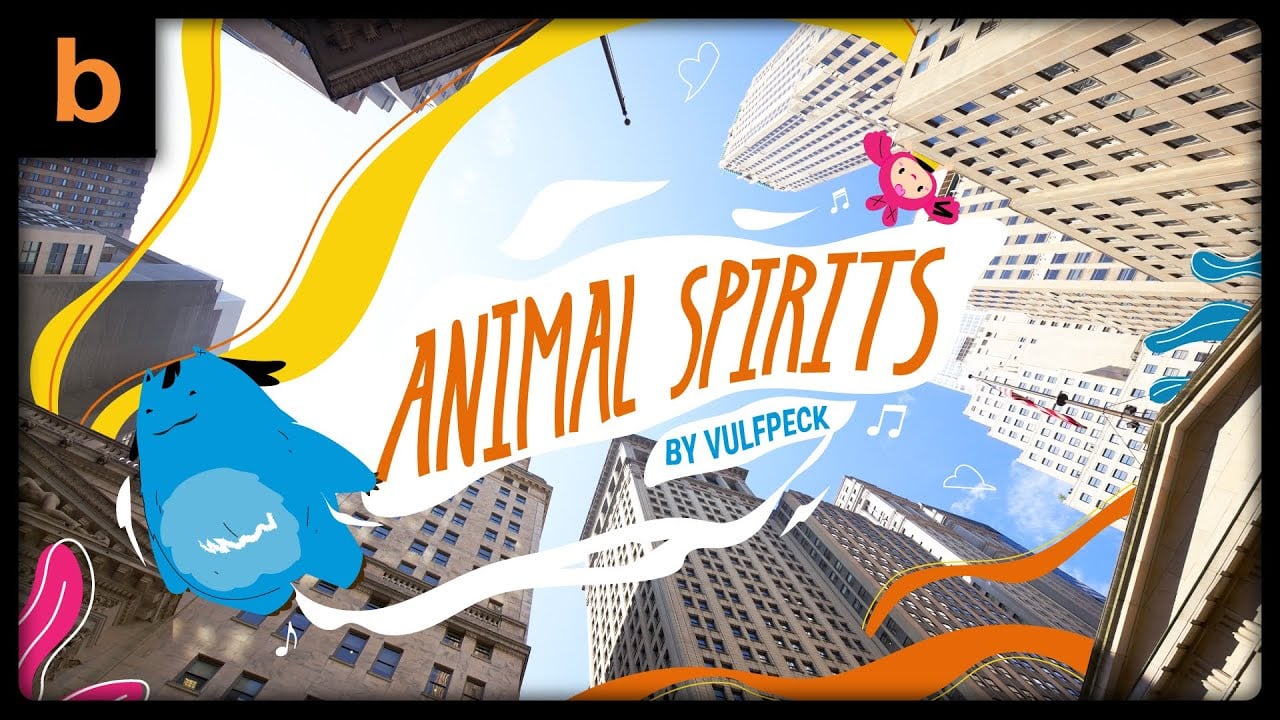
Take a look at this project we made for one of Vulfpeck’s songs, Animal Spirits.
We used city and building photos and added colorful graphics and animated characters that interact with the static backgrounds.
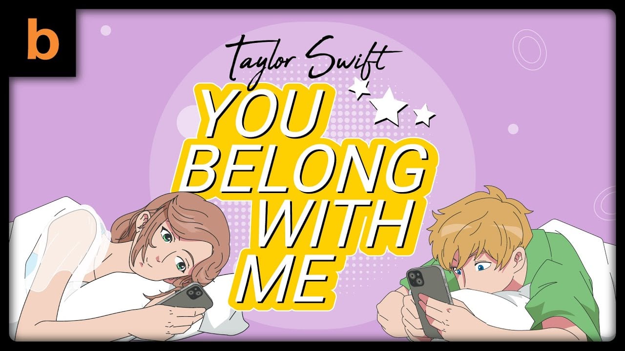
20. Anime-Style Animation
This style of animation is inspired by Japanese anime.
Think vibrant, expressive characters with big, emotive eyes and cool hairstyles, plus dynamic, fluid movements. It’s got a knack for exaggerating expressions and creating intense, immersive scenes.
Anime-style animation can range from action-packed scenes to serene, emotional moments, all while maintaining a unique blend of color, shading, and artistic flair.
When used in an explainer video, it brings an engaging visual style that makes complex ideas more relatable and entertaining.
The dynamic and expressive nature of anime helps to simplify information, keep viewers hooked, and make the content memorable.
Here’s an example of the anime style we created for Taylor Swift’s song, You Belong with Me.
The Combination of Several Animation Styles Above
I’ve always believed that animation is at its best when creativity meets strategy.
One of my favorite approaches is combining multiple animation styles, such as mixing cartoon with music-driven visuals, or blending stick figure simplicity with dramatic silhouettes.
When these styles are paired with a solid production strategy, the result can be a true game-changer.
So, what can be great combinations among those styles?
1. Cartoon Animation + Motion Graphics
I’ve found that pairing cartoon animation with motion graphics creates the perfect balance of personality and clarity.
The cartoon elements bring in warmth, humor, and relatability, while the motion graphics deliver information in a clean, structured way.
We’ve used this combination for explainer videos where the goal was to make complex topics feel approachable without losing professionalism.
2. Silhouette Animation + Music-Driven Visuals
When I want to evoke strong emotion or create a sense of mystery, I often combine silhouette animation with a soundtrack that drives the pacing.
The lack of facial detail in silhouettes makes viewers focus on movement, mood, and sound, which is perfect for brand stories or advocacy videos.
This pairing has worked wonders in campaigns where the message needed to feel cinematic and impactful.
3. Stick Figure Animation + Whiteboard Explainer
Oftentimes, the simplest visuals deliver the clearest message.
I’ve used stick figure animation blended with whiteboard drawing effects for educational and training videos.
The minimal style keeps costs low and production fast, but it still holds attention because the “live drawing” effect gives viewers a sense of progress and discovery.
It’s a favorite when clients want to keep things light, budget-friendly, and easy to follow.
4. 3D Realism + Line Art Overlays
In projects where I want to blend high-end polish with artistic flair, I’ve combined realistic 3D renders with subtle line art overlays.
The 3D provides depth and photorealism, great for product demos or architectural walkthroughs, while the line art adds a layer of creativity that softens the technical feel.
This mix appeals to both analytical and creative audiences, making it a versatile choice for cross-industry projects.
5. Claymation Style + Motion Typography
Claymation’s handcrafted textures have a charm that digital tools can’t fully replicate.
When paired with bold motion typography, the result is a playful yet dynamic aesthetic.
I’ve used this combo in music videos and social media campaigns where brands wanted to stand out with a tactile, almost nostalgic vibe while still delivering key messages clearly through text animation.
6. 2D Flat Design + Kinetic Typography
For brands seeking modern, vibrant, and on-trend visuals, I frequently turn to 2D flat design enhanced with kinetic typography.
The flat shapes and bold colors keep things visually clean, while the moving text ensures key points can’t be missed.
This is especially effective for marketing videos aimed at younger audiences who are used to fast, dynamic content on platforms like Instagram or TikTok.
Of course, these are just a handful of the combinations we’ve explored and loved over the years.
There are plenty more out there—some a little unconventional—that can deliver just as much visual punch and emotional pull.
For me and my team, it always comes down to finding the right match between style, story, and audience.
When those pieces click, even the most unlikely mix can turn into something memorable to the audience.
Find Your Perfect Animation Style with Us
Looking for the right animation style for your explainer video is not easy, but we hope this article will help in your search for the best types of explainer clips for your company.
Need something flashy and intricate for a business profile or video advertising? Or straightforward and to the point for a social media campaign?
We’re here with the experience to guide you to find an animation that clicks with your brand and goals.
We can also help you identify your needs and find the best solution for your video marketing strategy.
Breadnbeyond is one of the best explainer video companies you can trust for your next project.
If you want to see more videos that we have created, click here to see our portfolios.
If you’re interested in creating your first explainer video with us, we’ve created an infographic to guide you through our production process.
Disclaimer for the featured videos: all rights reserved by Breadnbeyond and its client(s); usage of these videos is permitted with attribution.
Mini FAQs on Explainer Video Styles
1. Can I mix more than two animation styles in one video?
Absolutely. I’ve worked on projects that combined three or even four different styles.
The key is making sure each style serves a clear purpose in the story, rather than mixing for the sake of novelty.
A solid production plan will keep the transitions smooth so the video feels cohesive, not chaotic.
2. How do I know which animation style is right for my brand?
It always starts with your story and audience.
In our projects, we usually begin by understanding your brand’s tone, message, and goals, then match those to styles that will resonate.
Sometimes the right choice is bold and colorful, other times it’s minimal and clean.
The style should always support your core message and brand image.
3. Does combining styles cost more than sticking to one?
Not always. Some combinations can be cost-effective if they share production elements or simplify certain scenes.
Others, especially those involving complex 3D or stop-motion, often require more time and resources.
That’s why I recommend starting with a clear creative direction and, if you’re unsure, using tools like our video cost calculator to set realistic expectations.
At Breadnbeyond, we offer a wide range of animated explainer video packages that are tailored to boost your company’s sales in the next campaign.
Or you can check out our video cost calculator below to get a quick idea of what your animation might take to produce.

