Table of Contents ×
- 1 What Is Cryptocurrency and Why Does It Need to be Explained?
- 2 How Can Cryptocurrency Videos Help?
- 3 What Makes a Cryptocurrency Video Perfect?
- 4 Well-tailored Cryptocurrency Videos to Inspire Your Next Campaign
- 4.1 1) 0x: What is 0x?
- 4.2 2) Terra: Columbus-5 Mainnet Launch
- 4.3 3) Terra: Anchor Protocol
- 4.4 4) Symphony Protocol: We Value Data
- 4.5 5) Zense Blockchain and Machine Learning
- 4.6 6) MetaMask: What Is MetaMask?
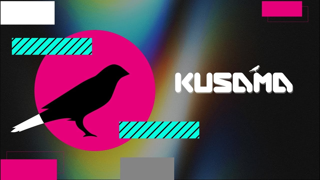
- 4.7 7) Kusama Network: The Great Experiment
- 4.8 8) Nouns 3D Intro Video
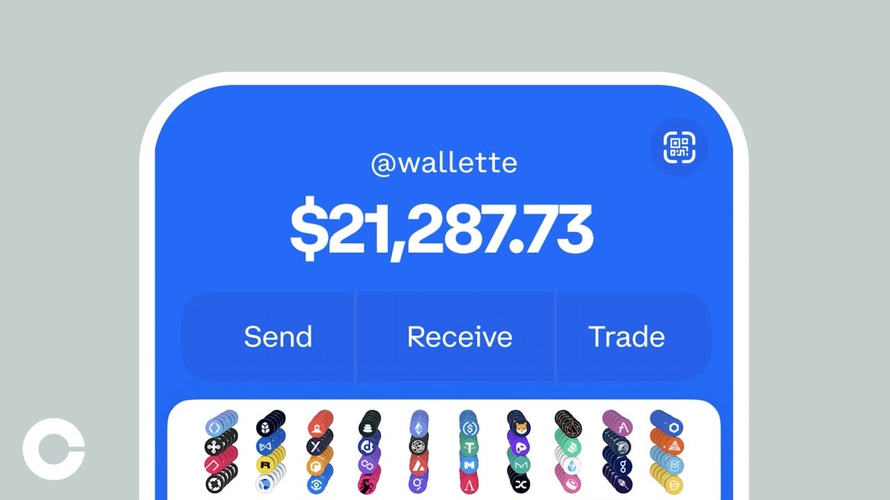
- 4.9 9) Coinbase Wallet – Your key to what’s next
- 4.10 10) Bethereum: Blockchain-powered social betting
- 4.11 11) UVC Exchange
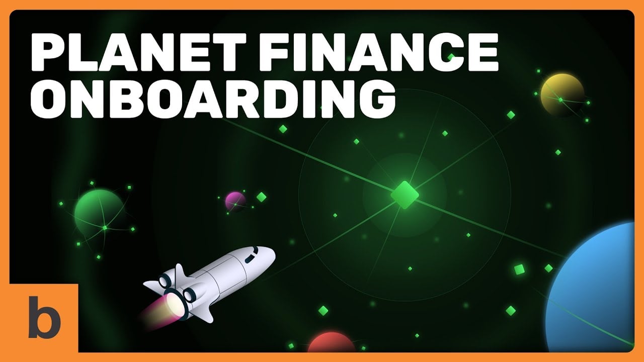
- 4.12 12) Planet Finance: How does GAMMA work?
- 4.13 13) Ethereum: the World Computer
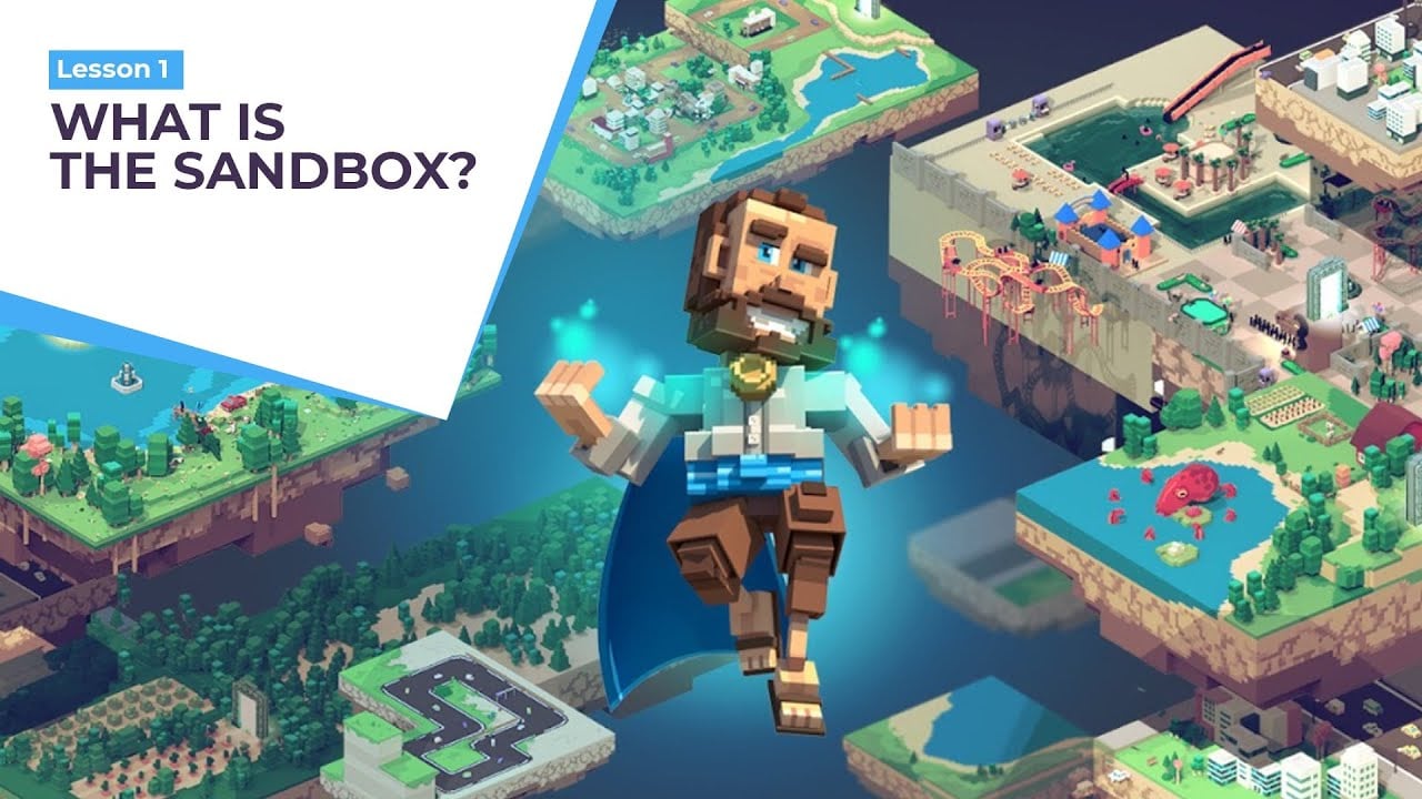
- 4.14 14) The Sandbox: What is the Sandbox?
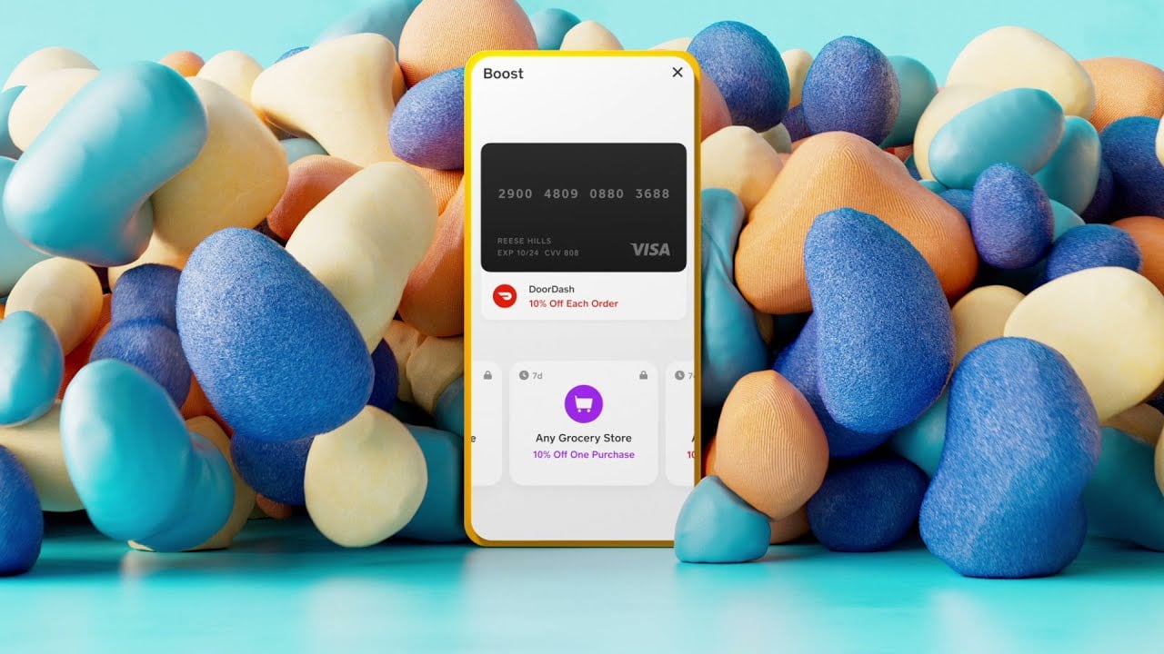
- 4.15 15) Cash App: Let’s talk Cash App
- 4.16 16) Kraken
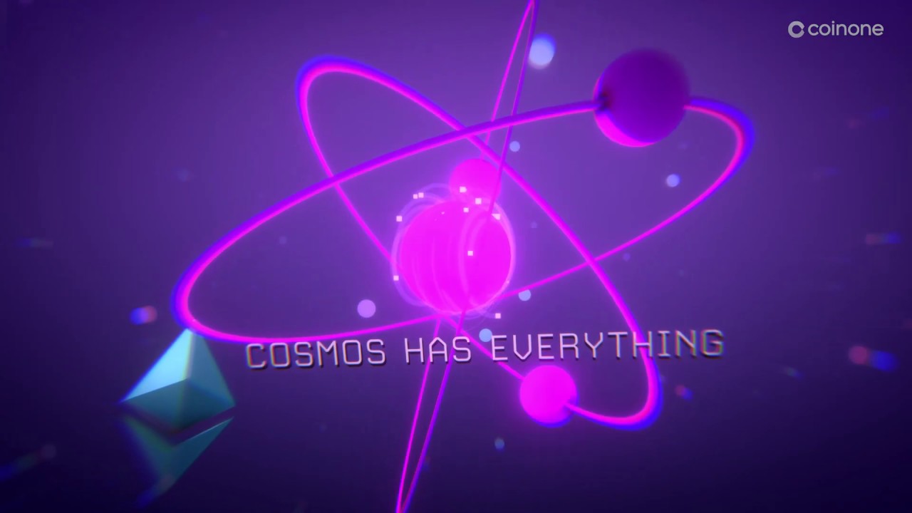
- 4.17 17) Coinone: COSMOS (Trailer)
- 4.18 18) The Future is Now – TRON
- 4.19 19) InCrypto Explainer Video
- 4.20 20) Alchemy Manifesto Video
- 4.21 21) Vestarin Explainer Videos
- 4.22 22) Kepler Technologies
- 4.23 23) Tokocrypto: No. 1 Crypto Exchange in Indonesia
- 4.24 24) AcknoLedger Genesis NFTs
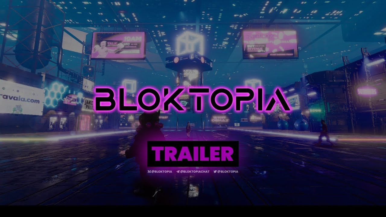
- 4.25 25) Bloktopia Trailer – This Changes Everything
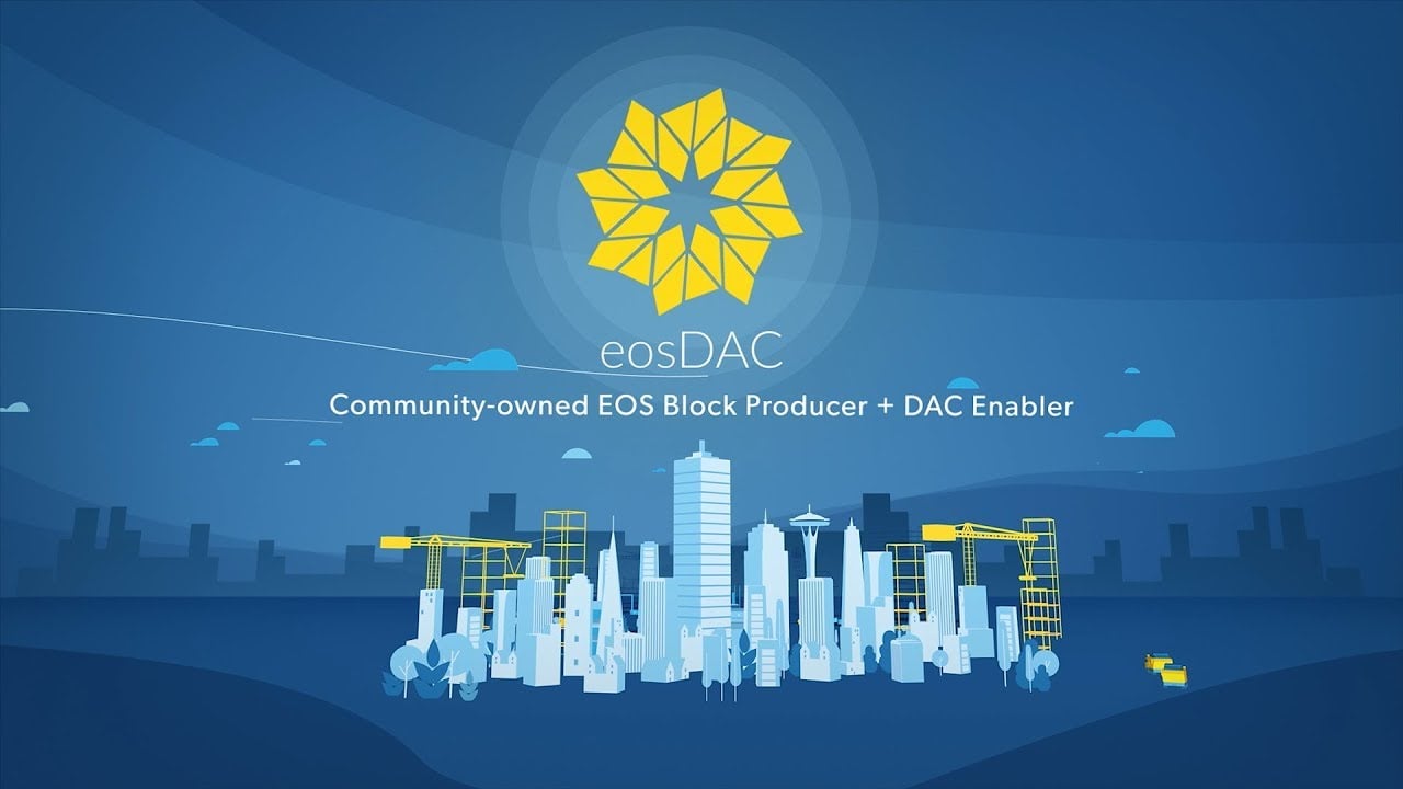
- 4.26 26) eosDAC Explainer Video
- 4.27 27) Eloom Explainer Video
- 4.28 28) Smart Trip Platform
- 4.29 29) Metagotchi
- 4.30 30) Monetha.io Intro Video
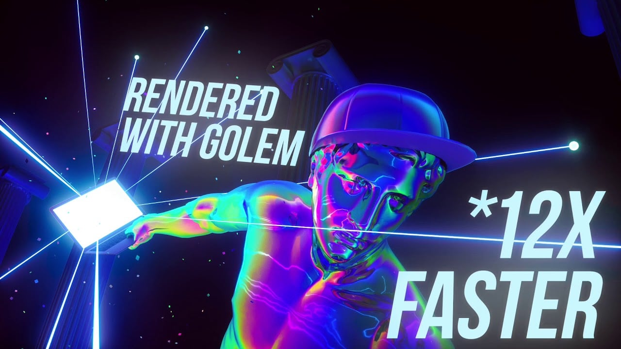
- 4.31 31) Golem Project: Promo Video
- 4.32 32) Open Sea: Meet OpenSea
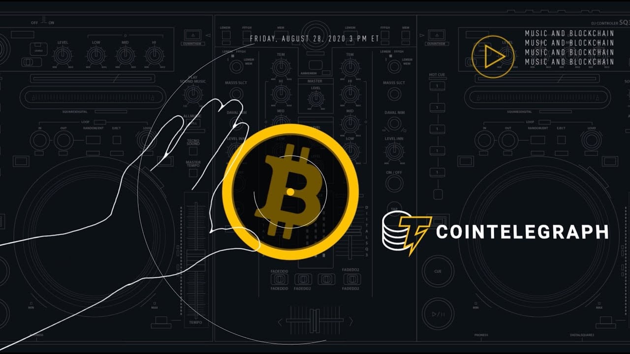
- 4.33 33) CoinTelegraph: CT Talks (Trailer)
- 4.34 34) Floyx Explainer Animation
- 4.35 35) Cobo Wallet
- 4.36 36) Crypto.com Visa Card
- 4.37 37) Celsius: Security at Celsius
- 4.38 38) Crypterium: Join Shareholders
- 4.39 39) SimplyBrand Explainer Video
- 4.40 40) Bibox Video Ads
- 4.41 41) NEXO
- 4.42 42) Timeswap Labs: Introducing Timeswap
- 4.43 43) Unstoppable Domains: Introduction
- 4.44 44) Audius Explainer Video
- 4.45 45) Tezos: Designed to Evolve
- 4.46 46) Experience Webull 7.0 Today
- 4.47 47) Enjin: What is Enjin Coin (ENJ?)
- 4.48 48) Okcoin: Product Demonstration
- 4.49 49) Nansen Cryptocurrency NFT Explainer
- 4.50 50) Moonbeam
- 4.51 51) How SALT Lending Work
- 4.52 52) CryptoWallet: Explainer Video
- 4.53 53) Welcome to Arbex
- 4.54 54) PayFbit
- 4.55 55) Crypto Idle Miner – Official Trailer
- 4.56 56) bitHolla: HollaEx Kit
- 4.57 57) NOVUM
- 4.58 58) OVR: What’s OVR?
- 4.59 59) Kasta: Crypto Payment Made Easy
- 4.60 60) CargoCoin ICO Explainer Video
- 4.61 61) OpenVino – Costaflores Organiz Vineyard
- 4.62 62) UVO Coin
- 4.63 63) Cryptonite
- 4.64 64) Hotelier Coin
- 4.65 65) Yanu ICO
- 4.66 66) Stepcoin Explainer Video
- 4.67 67) Cashback Coin
- 4.68 68) Avalanche: What is Avalanche?
- 5 Help Your Audiences Understand Your Crypto Business!
Blockchain, cryptocurrencies, NFTs – these are the future financial technology, aren’t they?
We’ve been seeing more companies and communities adopt blockchain technologies and embrace cryptocurrency like never before.
Just take a look at the price of bitcoin flirting with the $69,000 price level and take much of the rest of the industry with it.
Also, you are not even serious about the future until you add #CryptoTrader to your Twitter bio, preferably with an NFT you just purchased as your profile picture.
As the crypto market is booming, more newcomers from the non-tech-savvy side are becoming interested in this technology. Flexing much?
Meanwhile, many cryptocurrency companies in the industry still struggle with simplifying complex ideas for laymen.
One burning question would be, “how do you educate, convince, and convert the audience (with different tech knowledge levels) in a short span of time?”
This is where cryptocurrency video fits into the picture.
What Is Cryptocurrency and Why Does It Need to be Explained?
Let’s brush up on the basics first.
In a nutshell, cryptocurrency means a currency in the form of data. You trade your traditional currency for it online and store it on a digital wallet you download to your phone or computer.
Cryptocurrency uses cryptography for security so that users may securely pay online without the need for a third party.
It’s decentralized. It means it’s not backed by a single government. There’s a limited amount of it, and the supply is controlled by those who own the cryptocurrency.
With all the complicated details about this topic, there’s one thing cryptocurrency companies share in common: the headache to get their messages across smoothly.
For them, getting people to understand the idea is a key moment that can define the success or failure of their business. That’s why they have to find a powerful way to deliver that complex information.
How Can Cryptocurrency Videos Help?
The cryptocurrency concept is hard to understand because the idea seems far-fetched and too futuristic, just like something we see in sci-fi movies. It’s hard to explain even for people who work in the industry, let alone for complete newbies.
And those 10,000-word ultimate guides, colorful infographics, or downloadable ebooks might only make you more overwhelmed.
However, using the right explainer videos, the complexity of cryptocurrency is a thing of the past.
Here are a few reasons why videos help more people understand cryptocurrency without a headache:
- Snackable videos such as explainer videos, tutorials, and product demo videos focus on concise explanations of complex innovations and subjects.
- The colorful animation helps the amateur understand the concepts behind products and technologies.
- Story-driven narratives and endearing, fictional animated characters simplify the not-so-familiar industry-related jargon and make them easier to understand.
- The well-crafted video is shareable and powerful for reaching a wider market of interested users and building a solid customer base.
What Makes a Cryptocurrency Video Perfect?
Since cryptocurrency is often such a mind-bending concept to get one’s head around, creating effective cryptocurrency videos might seem like the next challenge.
After all, of course, not all cryptocurrency videos are created equal and work better than any other medium.
Only well-thought cryptocurrency videos can yield high results, while poorly made ones can scare away your audience, doing more harm to your online reputation than good.
Here are some main components that every great cryptocurrency video has in common that make it work:
Storytelling
Good stories are known to strike a chord with viewers, especially if they’re based on events that happened in the real world.
With intriguing stories, the explanation of cryptocurrency can be followed easily.
In addition, read More: Tell Brand Stories With Videos.
Demonstration
Demonstrations are an effective way of convincing your audience that what you show is good and worth trying.
If you show them what cryptocurrency is and how it can be of practical use, they’ll know that you’re an authority on the subject and won’t have a problem with your ideas.
Animation
In the labyrinth of cryptocurrency technology, not only does animation make the video catchy and entertaining, but it also helps to understand the subject better.
Most cryptocurrency videos use catchy yet straightforward types of animation, like motion graphics or classic cartoon animation.
In addition, read More: 20 Amazing Styles of Video Animation.
Easy-to-Understand Language
One of the best ways to make sure your viewers understand what you’re saying is to avoid the use of complex words and phrases.
A perfect cryptocurrency video would always avoid using cryptocurrency jargon that only experts would understand.
Well-tailored Cryptocurrency Videos to Inspire Your Next Campaign
We showcase some of the best examples of animated video usage in the cryptocurrency industry on this page.
Don’t worry. We are not picking random videos on the internet and making a list from that. We know you deserve much more than that.
We involved our professional animators and asked for their comments about each video below.
And all of the videos on this list are Breadnbeyond’s animators approved. Yay!
So here comes the list…
1) 0x: What is 0x?
Animation is the best way to illustrate abstract topics.
But, live-action is uber-effective to put a human face to your business, thus creating more engagement. So, why not use both?
0x combines both seamless 3D-animated characters and a real actor as a narrator in this video. The story-driven script helps the company to break down its techy features light-heartedly.
With a video like this, you don’t have to be tech-savvy to understand what 0x is all about.
A few little birdies told us that they spent more than $100,000 on this campaign.
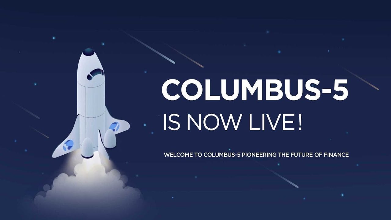
2) Terra: Columbus-5 Mainnet Launch
Terra is associated with space-themed terms, from Cosmos ecosystem to LUNA to Ozone protocol.
We agree that the best way to deliver the information about this new boldest and most significant mainnet upgrade is by using space-themed motion graphics animation.
Motion graphics are perfect for explaining processes or dense subjects. Terra understands they have a lot to explain, but they are determined to make viewers stay focused on the explanation.
Motion graphics is definitely a perfect option for this case.
3) Terra: Anchor Protocol
A fool-proof way to engage non-tech-savvy viewers to understand blockchain products is to tell them stories. That’s what Terra did.
Highlighting their target audience’s pain point right off the bat using an easy-to-follow analogy. And proceed to introduce their features and how they can make their target audiences’ lives easier.
The Storytelling + Problem + Solution formula always works well if you want to create a successful marketing message.
4) Symphony Protocol: We Value Data
Showing that your business cares is a powerful strategy to engage your audience. As a next-generation blockchain-based protocol, Symphony uses the video only to focus on how they can help their target audiences.
From the video, it’s clear that they understand who their audience is and what makes them frustrated.
Instead of bombarding their audiences with a list of their technical innovations, they make sure they include solid reasons for how their solution can make a difference.
5) Zense Blockchain and Machine Learning
When we think of a cryptocurrency business or blockchain-powered products, we expect to see a video that looks futuristic and somewhat serious.
Zense chooses to use classic 2D cartoons to make the style more familiar for audiences of all ages. Besides the engaging animated characters and narrative, the friendly tone of voice-over will not burden us.
6) MetaMask: What Is MetaMask?
The concept in the video reminds us of the classic, old-school game Super Mario Bros. The company knows how to keep its audiences focused on the explanation while showing the girl stepping from one stone into another.
The voice-over sounds like a person who reads us a bedtime story. With both visuals and audio combined, we feel familiar with the style, so it should be much easier for us to retain the message.
7) Kusama Network: The Great Experiment
Kusama sticks to the phrase “less is more.” They use the minimalistic approach while keeping the visual aesthetic at the same time.
The stunning motion graphics animation with a bit of collage art makes this video eye-catching.
They’re aware that their new audiences can get frustrated with receiving messages about blockchain-based solutions. That’s why they use simple visuals and rely on a descriptive but easy-to-follow script to balance everything out.
8) Nouns 3D Intro Video
The Nouns 3D Intro Video takes the quirky, pixel-art aesthetic of the Nouns NFT project and brings it to life in colorful 3D animation. The video introduces a cast of fun, blocky characters (each with their own unique personality) while maintaining the iconic Nouns glasses that tie them together.
Its playful design immediately captures attention and reflects the decentralized, community-driven spirit behind the Nouns DAO.
The animation is simple yet effective, showing how explainer videos in the blockchain and crypto space don’t need to be overly technical to communicate their message.
Instead, it leans on style, character, and brand identity to build recognition. This makes it a great example of how animated videos can be used to onboard audiences to complex Web3 projects in a fun and accessible way.
9) Coinbase Wallet – Your key to what’s next
This type of video is ideal for social media platforms; it’s short, eye-catching, and no voice-over is needed. The company uses text overlay to highlight the benefits along with seamless motion graphic elements.
Even without turning on the sound, the viewers understand what the company brings to the table. Also, a clear CTA at the end helps viewers to take action.
10) Bethereum: Blockchain-powered social betting
The video starts with a brief, lighthearted explanation of betting through familiar cartoon-style animation. As the video goes on, it talks about the solutions that Bethereum offers. And we don’t even realize that it’s a promotional video.
The script is superb and easy to follow. The company knows how to create engaging stories to engage viewers and help them retain quite complex explanations seamlessly.
11) UVC Exchange
UVC Exchange creates a good impression for its target audiences using elegant, overflowing motion graphics with techy feels. The smooth transitions are a smart way to helpt viewers to retain the concept longer.
Let’s also talk about the futuristic sound bites that are perfectly in sync with the movement of the pixel elements. And you can’t just ignore the well-crafted 3D animation that catches the viewer’s eyes, too.
12) Planet Finance: How does GAMMA work?
GAMMA is the utility token that powers Planet Finance’s ecosystem. The intro of the video makes sure that viewers have a grasp of the concept in the first place. It starts with breaking down the definition and all the impacts.
Visual-wise, the dark background really helps to make all the animated elements stand out. Not to mention the comforting, David-Attenborough-like voice-over with a slower pace makes the whole explanation like something that we can digest easily.
13) Ethereum: the World Computer
Ethereum introduces how the product impacts viewers’ life as a digital currency. The elegant color scheme brings together dark muted tones to create a clean and sophisticated look.
Its shades of gray and a little bit of red keep the video simple yet seem so high-end. The 3D elements combined with motion graphic animation is a smart way to keep viewers’ attention focused on the visual.

14) The Sandbox: What is the Sandbox?
The Sandbox Game is a … well, for lack of a better word to describe it … A SANDBOX. A place where players can play, build, own, and monetize their virtual experiences.
Since they’re talking about games, what’s a better way to catch viewers’ attention than using nostalgic and timeless pixel art animation?
The script illustrates how players can create a game for others and how they will like it. The nostalgic visuals combined with nostalgic, oldies game background music temp the viewers to experience the gameplay themselves.
15) Cash App: Let’s talk Cash App
Cash App only needs a half minute to introduce its product as a mobile payment service.
With this short video, they appeal to viewers with a short attention span using captivating bubblegum pop pastel colors combined with 3D-animated shapes that are moving so satisfyingly.
No fluffs are involved. The narration sounds like a good old friend who offers you a fool-proof solution for a specific problem. So, how can you not trust it?
16) Kraken
Talking to your viewers just like you know them and understanding what makes them struggle is the best to capture their attention.
That’s what Kraken did through their explainer video. They made a list of their audiences’ pain points and proceeded to introduce their solutions.
“We wouldn’t expect a video to change your mind, go to our website, download the app, and find out by yourself.” This cliffhanger at the end of the video sparks viewers’ curiosity about the app itself.
17) Coinone: COSMOS (Trailer)
A good trailer video not only captures viewers’ attention but also makes them excited for your upcoming product. That’s what the video from Coinone did.
It started with a brief sentence that is bold enough to spark viewers’ curiosity– followed by heart-pumping background music to build the tension.
Stunning movie-like motion graphics show some crypto logos, making it almost possible for the eyes to look away even for a second.
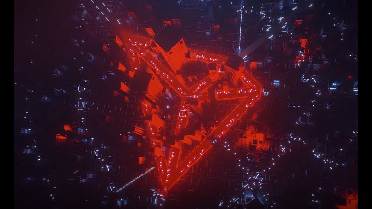
18) The Future is Now – TRON
Just like the concept and title suggests, this video couldn’t get any more futuristic.
From the voice-over, sound effects, background music, and visuals– everything is taking us to a futuristic world everyone has been dreaming about.
No heavy explanation is needed. Only brief sentences are used to give the viewer insight into what cryptocurrency is all about and what it has to offer.
19) InCrypto Explainer Video
We often see the type of animation that is used in the video in many sci-fi movies. It’s a good option to give InCrypto a forward-looking, professional feel.
After all, being a crypto company means that you have to constantly make innovations and impacts.
The dark background looks stunning with glowing lines that explain the concept of InCrypto. The use of gradients is also particularly unique and beautiful.
20) Alchemy Manifesto Video
We’ve seen a lot of seamless, stunning motion graphics. But, this one is on a new level.
The graphics elements, the combination of rainbow-like colors, and the intriguing script work together to create an impressive video.
Alchemy knows that they have to stand out among its competitors. It means that a classic, mainstream motion graphic animation just won’t cut it.
That’s why they use an interesting neon gradient color palette, captivating transitions, and memorable graphic elements.
21) Vestarin Explainer Videos
This well-crafted one-minute crypto explainer video shows that Vestarin really takes its promotional campaign seriously.
With this high-end video, they share it across all digital channels, from websites to social media profiles.
Combining multiple styles of animation in a video is a smart way to make the video more eye-catching and attract more eyeballs.
In this video, motion graphics are used to impress viewers with seamless motion, while screencast video is used to give them an insight into the interface, and the 3D animated logo is used to improve brand recall.
22) Kepler Technologies
Straight lines, squares, triangles, hexagons, and circles might be very basic, simple shapes. But, with a colorful color palette to contrast with the dark background, this video brings all those basic shapes to life.
Those multiple shapes are combined to create objects as the voice-over is saying. It happens all in sync, so it’s somewhat satisfying.
All the elements move captivatingly, spicing up the energy and vibrant feel of the explainer videos.
23) Tokocrypto: No. 1 Crypto Exchange in Indonesia
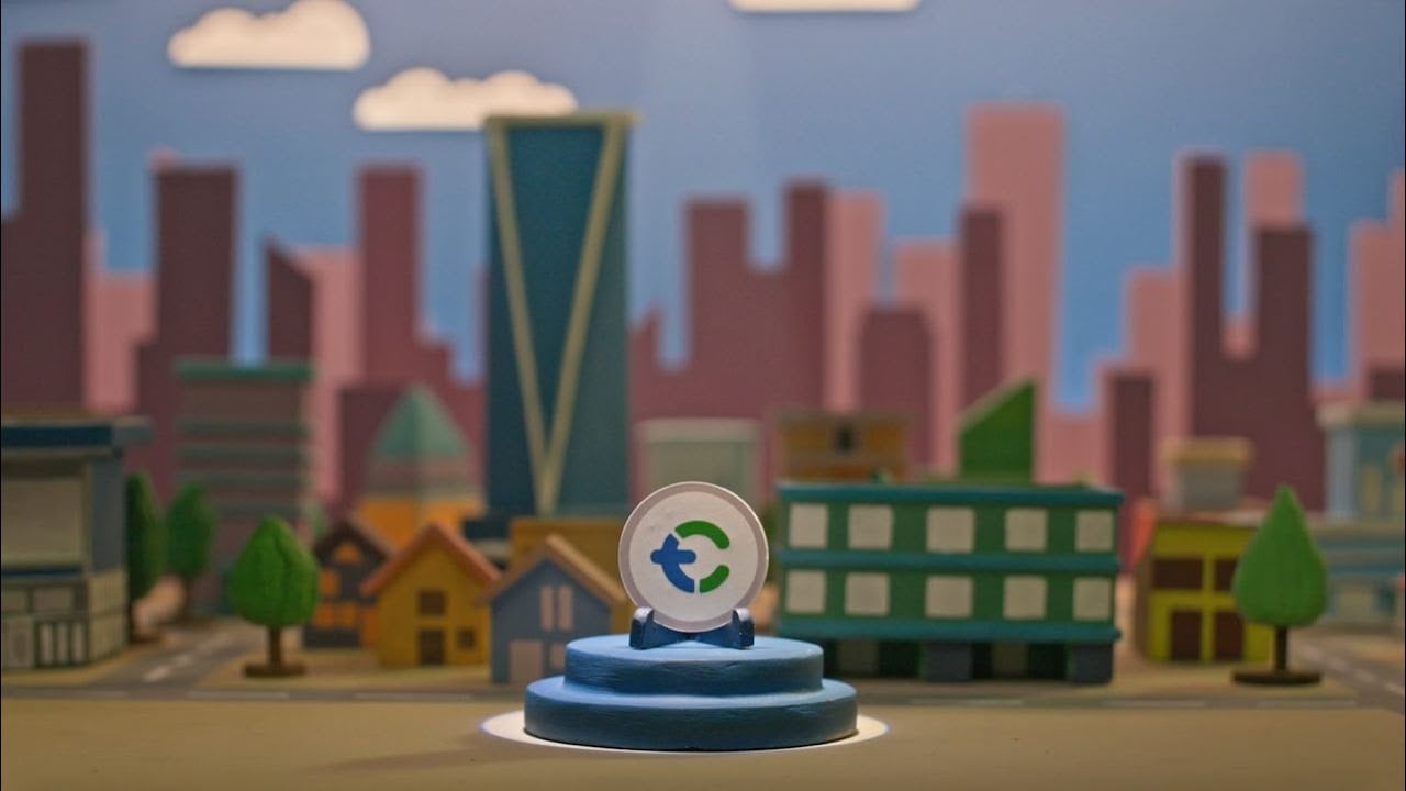
We can never get bored with clay animation, can’t we? Just imagine how much effort the company put into preparing the “hand-made” mini-city for the video.
Clay-based and hand-made houses, trees, and buildings are a fool-proof way to catch our attention from the get-go.
The company also combines clay animation with live-action, screencast, and even motion graphics.
All of these animations clearly show that, as the biggest crypto exchange in Indonesia, they make sure that their introduction video is professionally-made and well-polished.
24) AcknoLedger Genesis NFTs
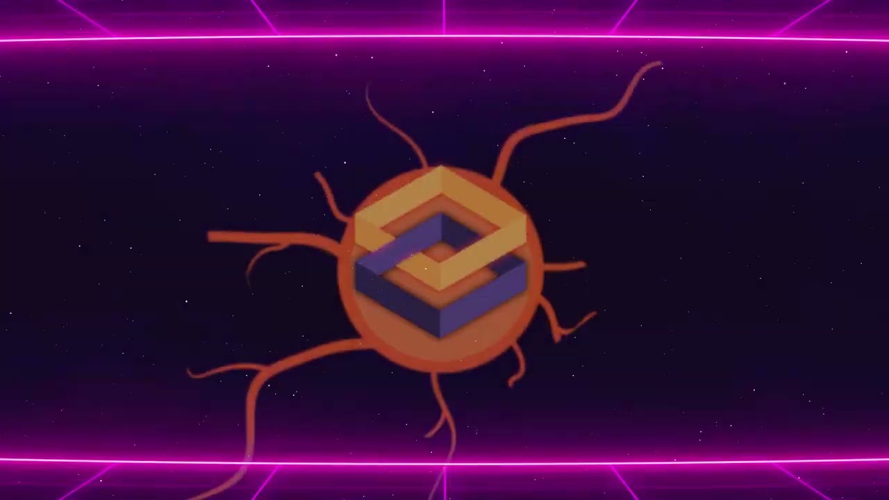
The AcknoLedger Genesis NFTs video uses sleek, neon-style animation to introduce the project’s vision of becoming the “Nervous System of Web 3.0 Digital Assets.”
With futuristic visuals of VR, neon outlines, and cosmic backgrounds, the video sets the stage for AcknoLedger’s entry into the NFT space.
It highlights how Genesis NFTs will be the first interoperable assets designed to work across multiple metaverses, giving them priority in unlocking cross-platform utility.
The animation communicates this ambitious concept in a way that feels both cutting-edge and approachable, blending sci-fi aesthetics with clear messaging.
Rather than focusing solely on technical jargon, the video leans into visuals that symbolize innovation, connection, and digital freedom.
This makes it an effective explainer for audiences who may not yet fully grasp NFT interoperability but can understand the big-picture potential. As a result, it serves as both a brand-building asset and an onboarding tool for the Web3 community.
25) Bloktopia Trailer – This Changes Everything
The main goal of a trailer video is to build the hype and make viewers simply can’t wait for your upcoming project. A blockchain-powered game of Bloktopia just nailed it.
The company introduces their Metaverse by taking us on a walkthrough and pauses at some popular logos their viewers would be excited about– Polygon, Dex Tools, and even… Jake Paul.
This video is literally a teaser, drawing on curiosity with the upbeat background music that has a sense of urgency. It prompts you to research them if you want to know more.
26) eosDAC Explainer Video
A great marketing video always provides viewers with insightful information about a specific topic rather than talking about a product all the way until the end. eosDAC understands that.
As a community-owned EOS block producer and DAC enabler, they start the visually-appealing video with a brief explanation about blockchain that many laymen didn’t know.
When a viewer has a solid grasp of the basics, it will be much easier for them to understand the impact of their product.

27) Eloom Explainer Video
A green, sustainable environment isn’t a new topic for us. But, addressing the impact of blockchain technology on our planet is something that catches our attention from the get-go.
Eloom uses the blockchain explainer video to spread awareness of the urgency of using a more sustainable way of stepping into a blockchain world.
A white background combined with soft-colored motion graphic elements gives the video a simple, elegant, and peaceful vibe.
The visuals are pleasing to the eye because they feel clean and uncluttered. This is an effective way to help new potential customers learn more about Eloom.
28) Smart Trip Platform
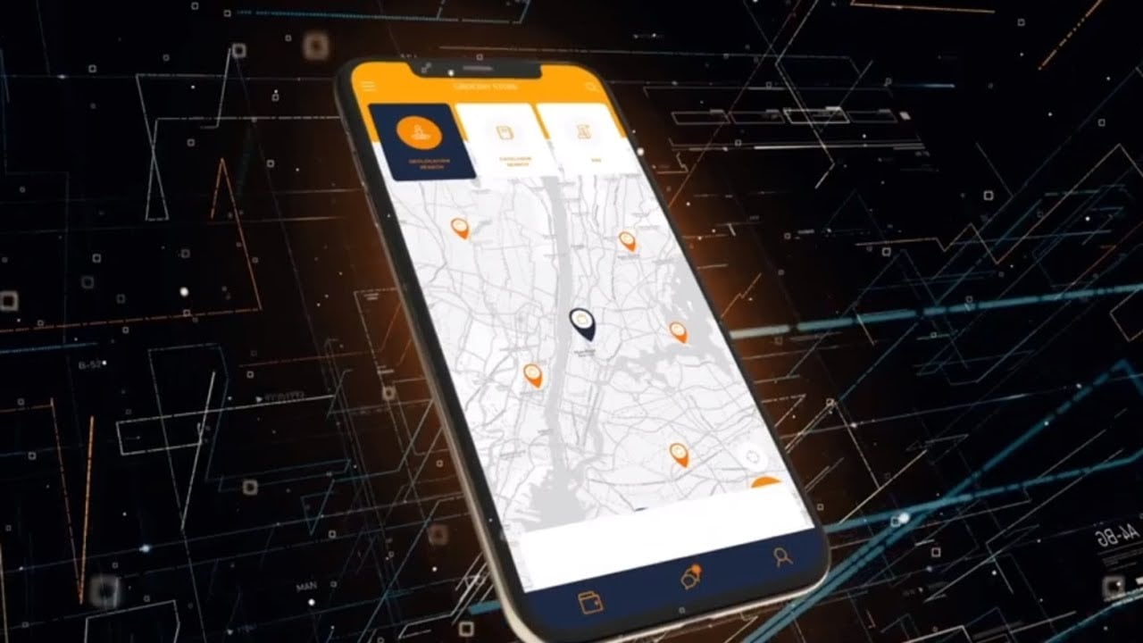
Just a few seconds in and we can already tell and are ready to admit that this video has superb animation. It’s like something we see in anime.
Smart Trip Platform also includes a screencast animation to give viewers an insight into the interface.
Along with the unique visuals, they use a comforting voice-over that gives a brief step-by-step guide to how to use the platform.
29) Metagotchi
The Metagotchi video introduces a new NFT project through a playful, story-driven animation style.
It follows three friends who must flee their hometown after an alien invasion, setting the stage for adventures in an entirely new world.
The characters are designed to be cute, expressive, and memorable. It’s perfect for building emotional connections with audiences and collectors.
Unlike many blockchain explainers that lean on abstract visuals, this video takes a narrative-first approach, pulling viewers into the lore behind the NFTs.
The animation was created using a traditional, frame-by-frame style combined with touches of motion graphics for extra flair, giving it a lively and dynamic feel. This mix of storytelling and handcrafted animation makes the project stand out in the crowded NFT space.
Ultimately, it shows how explainer videos can entertain and immerse audiences in a brand’s universe.
30) Monetha.io Intro Video
The Monetha.io explainer video takes a polished 2D animation approach to address one of the biggest challenges in online transactions: trust.
Targeted at professionals in e-commerce and fintech, the video highlights how blockchain can provide transparency, security, and reliability in digital exchanges.
Through elegant visuals and smooth transitions, it illustrates scenarios of everyday transactions and contrasts them with the potential risks of fraud or lack of accountability.
The storytelling is straightforward and professional, ensuring the message resonates with a business-focused audience.
The animation makes the technology approachable without losing its authority. The warm color palette and character-driven scenes also humanize what could otherwise feel like a purely technical topic.
31) Golem Project: Promo Video
There are a lot of animation styles involved there. First, they show us a real-life, 3D animation, then they also use live-action, and oh, they have classic 2D motion graphics too.
All of them work together to create one shiny, aesthetic promo video.
Let’s not forget about the background music. At first, we listen to upbeat music, then it trails off subtly to a relaxing one. And classical music suddenly takes over.
All of it is perfectly in sync with the pace of the video.
32) Open Sea: Meet OpenSea
NFTs are getting a lot of traction nowadays. It seems like everyone is talking about digital tokens.
In this case, OpeanSea uses 3D elements with some 2D animation to create a playful and informative explainer video.
The animators even use a real interface to demonstrate the product throughout the video. And the voice-over used in the video is basically like one of our savvy friends who is excited to introduce OpenSea, making all of the information easier to understand.
33) CoinTelegraph: CT Talks (Trailer)
Trailer videos need to be shared across social media or other digital platforms so they can reach more potential audiences and make the event successful.
This trailer video that CoinTelegraph made promotes their live-streaming event about blockchain and the music business.
The video is quite simple actually. It’s basically a combination of a webcam video, kinetic typography, and collage animation. But, the creative editing and motion graphics make it more eye-pleasing and suitable for most digital platforms.
34) Floyx Explainer Animation
The Floyx explainer video presents a bold vision of social media built on Web3 and blockchain principles.
Using dynamic 2D animation and clear visual metaphors, the platform effectively communicates its mission to provide security, fairness, and identity in both the real world and the digital space.
The video emphasizes Floyx’s core promise: a decentralized social media experience free from censorship, restrictions, or blockades.
By showcasing keywords like “Decentralized,” “Web3,” “Metaverse,” and “Security,” the animation positions Floyx as a reimagining of digital connection.
The visual style highlights the challenges users face on traditional platforms and contrasts them with the freedom and trust offered by Floyx.
It also points toward future expansion into metaverse interactions, such as online meetings, underscoring long-term potential. Overall, the video succeeds in blending technical ambition with relatable storytelling, making Floyx’s disruptive vision easy to grasp.
35) Cobo Wallet
Cobo Wallet relies on sleek, clean, but still engaging motion graphics video to highlight its features and unique selling points.
This animated video basically sums up the concept of Cobo Wallet as a crypto wallet, all under two minutes.
The video ends the video with their tagline and a call-to-action. They can help viewers remember their brand and have an idea of where to go if they need any further information.
36) Crypto.com Visa Card
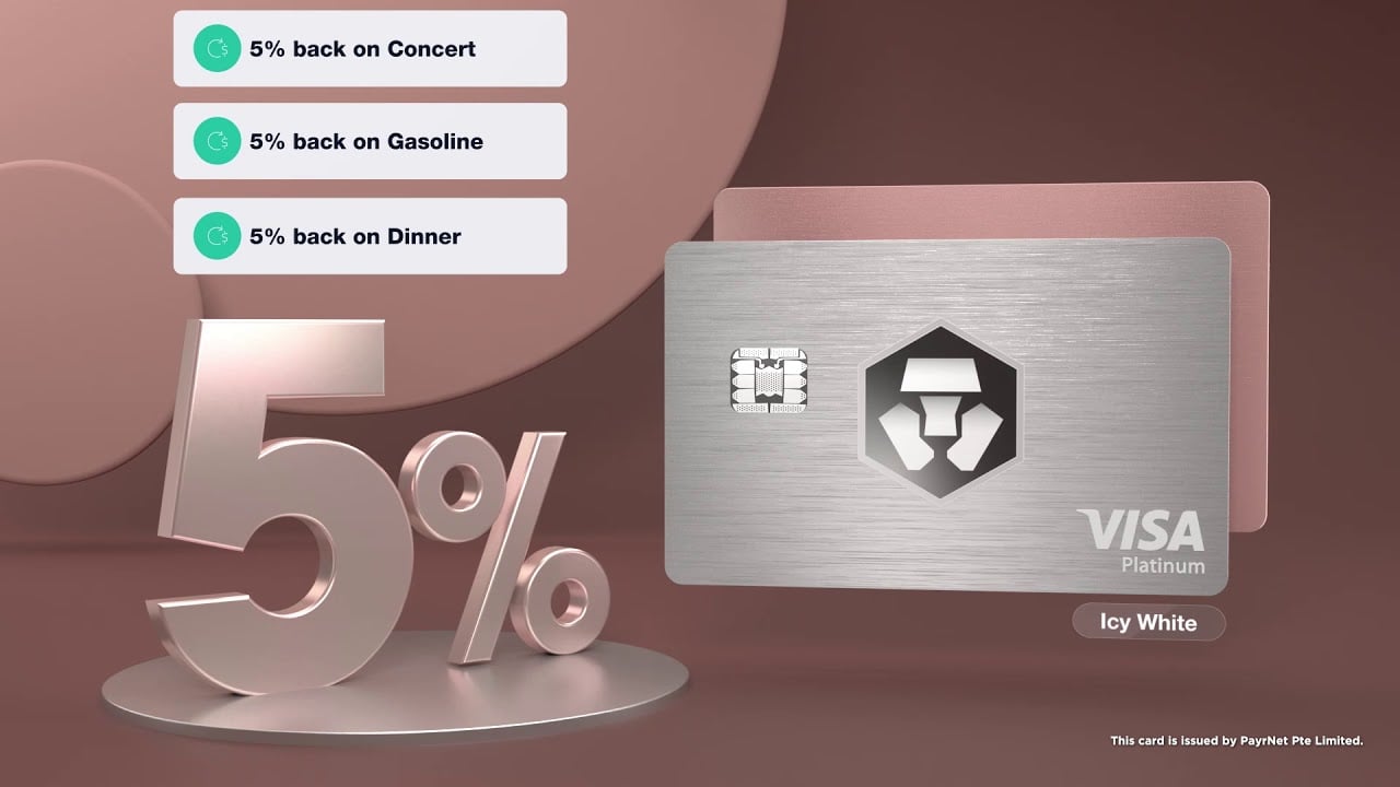
To promote their physical card, Crypto.com uses a real-life-like 3D animation that shows the card itself from different angles.
It’s just a card– but the way they use all the angles and well-polished animation makes the item look somewhat elegant and expensive.
Not only showcasing the card, but the video also explains how users can get the most out of it, from the benefits to other perks and bonuses that can convince potential users.
37) Celsius: Security at Celsius
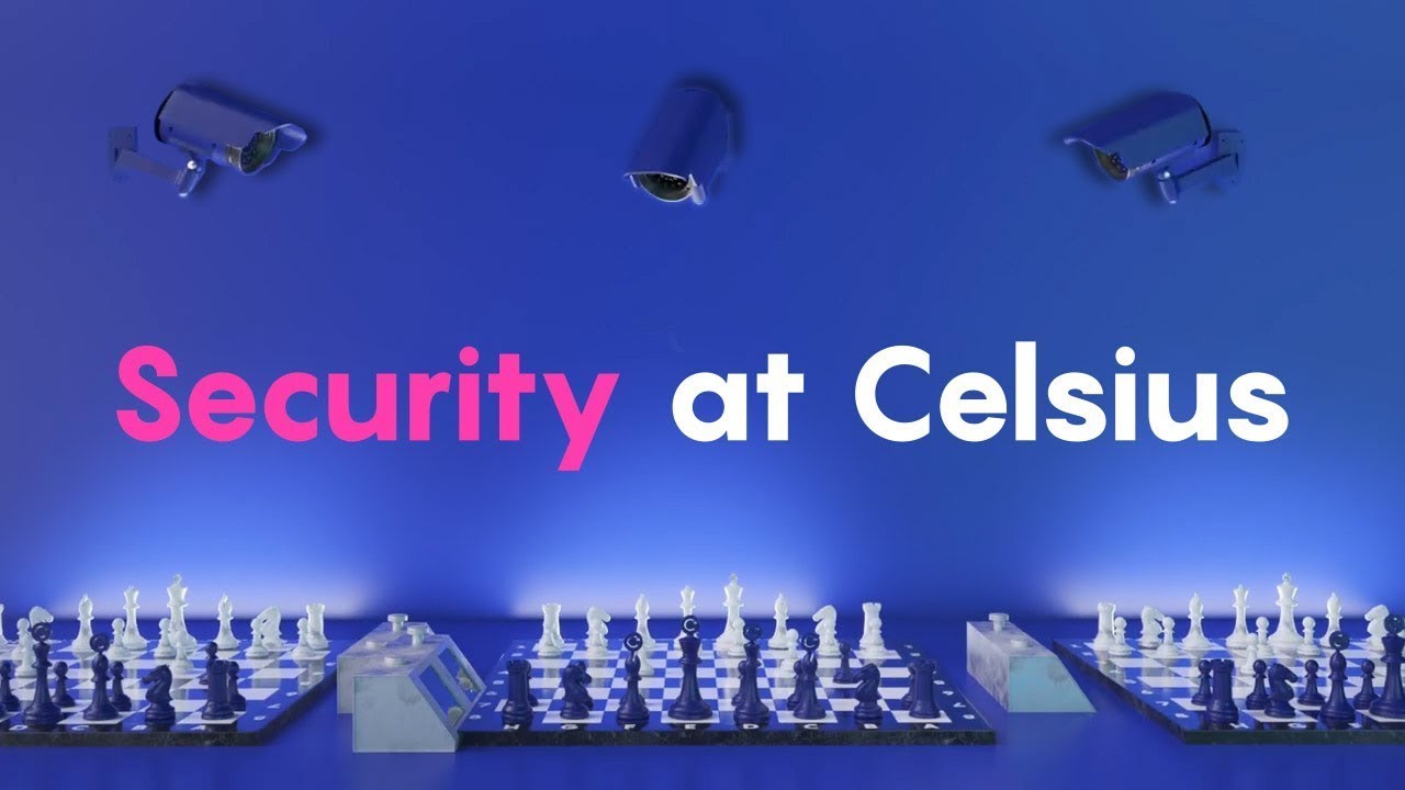
An analogy always helps when you need to make a point without overwhelming your viewers.
Celsius has quite a complex topic about crypto security to deliver, so it compares it with chess to help us understand the message better.
They also use 3D animation with texts displayed on the screen, making the video so high-end-looking and shareable across different digital platforms.
38) Crypterium: Join Shareholders
Crypterium created the video to grow its shareholder community. So, what they need to do is to generate viewers’ trust in the first place and that’s what they did.
They showed the viewers their growth as a crypto business and their achievements using a combination of live-action and 3D animation.
39) SimplyBrand Explainer Video
This video we made for SimplyBrand to showcase their benefits for the target market. We started with a thought-provoking question to hook viewers’ attention and keep them watching the video.
The simple yet stunning motion graphics are best suited for social media platforms and homepages.
It also includes a subtitle and caption to make sure that their dominant target audience understands what the video is all about even when they don’t play it without the sound on.

40) Bibox Video Ads
Most of the quick, social-media-friendly crypto video ads look generic– showing the interface, very upbeat music, sometimes with somewhat overwhelming kinetic typography animation.
But, in this video, Bibox separates itself from the competition.
The visual is exactly like a well-polished explainer video, except it’s actually a 30-second video ad. The animation is simple, minimalist, but unique.
Whether you watch it in a landscape or portrait format, this video is versatile and works perfectly fine.
41) NEXO
The Nexo explainer video uses a sleek 2D character animation style to introduce the platform as an all-in-one hub for managing digital assets.
It highlights Nexo’s key offerings (growing, trading, borrowing, and earning)presented through simple yet engaging visuals that make complex financial services easy to understand.
The video positions Nexo as more than just a crypto wallet, but a comprehensive wealth-building ecosystem for the digital age.
Relatable character scenarios emphasize how everyday users can unlock opportunities with their crypto while keeping security and flexibility at the forefront.
The animation’s polished flow and clear callouts ensure viewers quickly grasp the benefits of an integrated platform. It also reinforces Nexo’s role in shaping the “next generation of crypto wealth,” appealing to both seasoned investors and newcomers
42) Timeswap Labs: Introducing Timeswap
This video might be a bit too long in duration– almost four minutes. But, the good thing is that it doesn’t solely talk about the Timeswap itself. It also educates viewers about Defi and its challenges.
When you help viewers identify their problems, they are more likely to consider looking for a solution.
This is how Timeswap introduced its brand. They made sure that viewers are aware of the problems they are currently facing and offer solutions.

43) Unstoppable Domains: Introduction
Unstoppable Domains make sure the video they created can be well understood by their target users. The narration is conversational, avoiding any jargon.
Not too much is going on with the animation; they keep it simple but effective with a colorful palette. A minimalist line animation, motion graphics, and a bit of screencast animation are perfectly combined.
44) Audius Explainer Video
The trendy color palette makes this video stand out. The animation, voice-over, and sound effects (SFX) work in harmony.
For a brand that provides blockchain-powered audio solutions, Audius doesn’t miss any audio detail on the video.
For instance, when the DJ plays the music, you can hear a record scratch in the background, or when the narration talks about the community, you can hear people chattering. Very well-thought and detailed.
45) Tezos: Designed to Evolve
The concept of the video might seem quite absurd. But you can’t just ignore the seamless transition that makes the visual in the video satisfying to watch.
It starts with a 3D animated Tezos’ logo then transforms into cubes then transforms again into colorful squares– and the shapes transformations just keep going for the entire video.
Not to mention that all shapes on the screen are also perfectly in sync with what the narrator said.
46) Experience Webull 7.0 Today
We usually see this type of video on billboards, ads, and social media platforms. The motions, moving texts, uplifting background noise, and 3D animated elements with a simple screencast animation make the video versatile and can be used across multiple platforms.
Webull keeps everything simple by only highlighting their benefits in a couple of words using blue text that matches with brand color.
47) Enjin: What is Enjin Coin (ENJ?)
Enjin conveys the whole techy explanation as a digital token by using this catchy video. As soon as you see the animation, you will fall in love with this video.
The animation has its own unique style. It looks like that old cartoon we often saw on TV when we were much younger.
Also, the videos start with this ideal situation that their target users have always dreamt of. That’s how you get their attention.
Let’s also appreciate the colorful combination of colors dominated by purple and neon light blue that represents the “brand” itself.
48) Okcoin: Product Demonstration
The big challenge in creating a concise yet descriptive demonstration is not to bore viewers. The screencast animation often looks so plain and cheap-looking. It can be hard to impress viewers using only this type of animation.
But, Okcoin combines it with 3D elements and kinetic typography animation to take the simple and easy-to-follow tutorial to the whole next level.
All of the steps are demonstrated smoothly and engagingly in a 1-minute shareable video.
49) Nansen Cryptocurrency NFT Explainer
The Nansen explainer video captures the complexity of blockchain analytics with clean, futuristic visuals that make data feel alive and interconnected.
Animated flows of tokens and character-like icons illustrate the movement of assets across networks, showing how Nansen helps decode on-chain activity.
The narration positions Nansen as the trusted source for making informed, strategic decisions in the fast-paced world of Web3.
The use of glowing lines and fluid motion conveys transparency, speed, and precision—all qualities associated with reliable analytics.
Through a balance of sleek design and accessibility, the video makes a technical subject approachable for both experts and newcomers
50) Moonbeam
Moonbeam is an Ethereum-compatible smart contract platform on the Polkadot network that makes it easy to build natively interoperable applications.
Now that they understand that blockchain and cryptocurrency have been gaining traction, they aim to boost their awareness using this video.
The soft color palette, easy-to-digest narration, and fascinating animation style (combining both 3D and 2D animation) make this video versatile and shareable.
This kind of video is perfect for the top of the sales funnel where your focus is to boost awareness and attract more customers.
51) How SALT Lending Work
SALT brings the purpose of a crypto video pretty much to the point: a complex and dry topic is conveyed clearly and understandably to everyone.
Modern icons, successful transitions as well as an interesting color scheme that is completely in line with the corporate image make it possible to convey a software solution in a digestible way even to laymen.
52) CryptoWallet: Explainer Video
Starting a video with a thought-provoking question is an effective way to make viewers interested in finding the right answer–it makes them stay longer to continue watching it. That’s what CryptoWallet just did.
Once they have viewers’ attention, they know they have to keep it. So, they go for smooth transitions, a simple but brilliant animation, and a memorable script.
They also use gradient colors as a background of the video that matches their branding color. This way, they can increase brand recall.
53) Welcome to Arbex
Once you start the video, you’ll immediately notice the trendy, eye-pleasing modern color palette and graphics. And we just can’t ignore those details on sound effects that perfectly sync with the visual.
The video also didn’t scream out ‘You HAVE to try it!’ or ‘We’re obviously better than others!’. Arbex starts with a common problem that their target audience may mostly struggle with. Thus, it illustrates how the app can help them solve those problems.

54) PayFbit
As an emerging platform that simplifies the management of crypto and fiat assets, it’s crucial for PayFbit to make sure that its concept can be delivered smoothly. And they did it.
This video does a good job of mixing trendy branding colors and well-thought animations to deliver a quite complex topic. They also use text overlays on the screen to highlight and emphasize their benefits.
55) Crypto Idle Miner – Official Trailer
Remember those Nickelodeon cartoons? This animation just looks like one of them. In fact, this is a game trailer for Crypto Idle Miner from Hora Games.
When other game trailer videos rely too much on the interface and how-tos, Hora Games knows how to make their trailer stand out.
There are some characters involved, but no dialogue is needed. All of the stories are told effortlessly by the visuals.
56) bitHolla: HollaEx Kit
Floor grids, spinning stars, sunset animation, old-school fonts, the video plunges into the world of neon ’80s.
Well, what can go wrong with retro wave animation? It’s engaging, pleasant to look at, and brings a sense of nostalgia.
bitHolla has no words spoken in this promo video. The kinetic typography using pixel-based fonts is effective to help viewers understand what the video is all about.
57) NOVUM
The Novum explainer video transforms the complexities of DeFi into a playful, visual journey that feels intuitive and engaging.
Using a cityscape metaphor, cars navigate through gateways labeled with metrics like “Authority Score” and “High Score,” making abstract analytics concepts easy to grasp.
The animation emphasizes Novum’s mission: helping users maximize returns and minimize losses by identifying the most promising liquidity pools and token pairs.
Its clean isometric design and gamified visuals highlight the idea of turning data-driven insights into a smoother, more rewarding DeFi experience.
The flow of the video reinforces momentum, mirroring the platform’s promise to “add speed” to users’ gains.
58) OVR: What’s OVR?
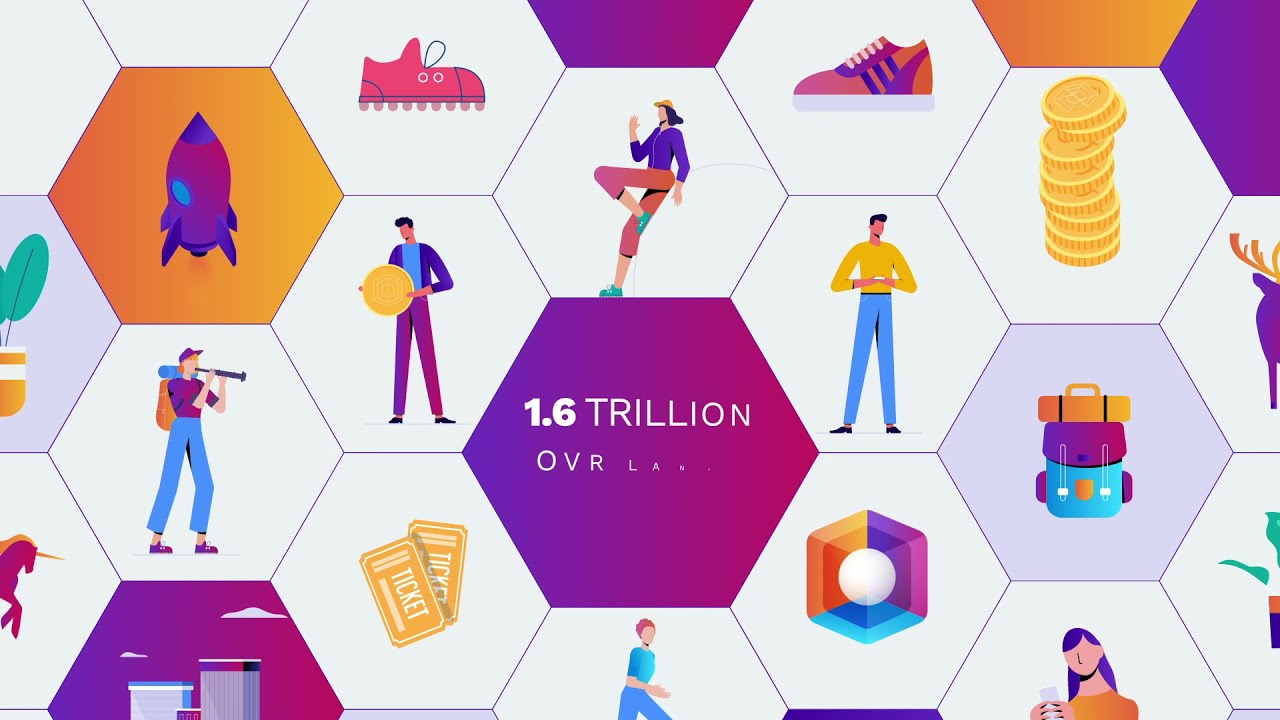
Describing an augmented reality platform that is leveraging blockchain and involving NFTs sounds like a tall order. But OVR makes understanding it a piece of cake in this video.
The video only zooms in on the graphic that is explained by the narration, so it eliminates all the distractions– making it much easier for the viewer to focus on the message.
59) Kasta: Crypto Payment Made Easy
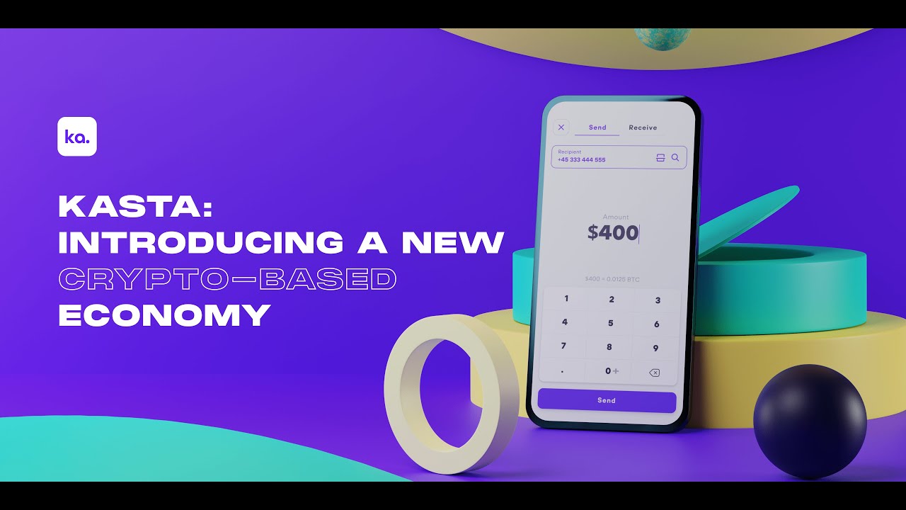
Creating an intro video for a crypto app might sound easy. Well, you can just take a couple of screenshots, add music, insert text, and voila– you can look lazy and just give viewers a reason why they shouldn’t trust you.
Well-produced promo videos like this one take the intro video to the next level. It still uses screencast animation but makes it more professional by adding 3D elements and a well-thought-out text style.
60) CargoCoin ICO Explainer Video
CargoCoin conveyed all the information its potential users need to know in a 90-second explainer video.
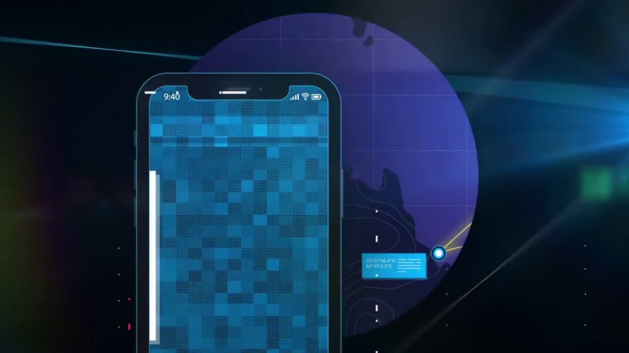
Neon, glowy animation can add a nice, futuristic touch to any crypto video. And it balances the narration that breaks down how this blockchain-based ecosystem for marine cargo shipping works.
All the elements used in the video represent the company itself, from the style of the video to the tone and style of the branding message.
This visual consistency not only increases the brand recall but also boosts the authority of CargoCoin as a brand.
61) OpenVino – Costaflores Organiz Vineyard
We can say that this type of animated crypto video is suitable for all digital platforms, from YouTube pre-roll to even a website homepage.
It’s minimalist but still looks professional and engaging. And sometimes, on this web full of content, that’s what viewers want to watch.
Also, as the world’s first open-source winery and wine-backed crypto asset, OpenVino seems they understand that the idea might sound completely new to some audiences. That’s why they craft a conversational script.
62) UVO Coin
Story-driven narratives are best for engaging viewers of all ages. From GenZ to Baby Boomers, the viewer can follow the explanation and have an insight into what UVO Coin is all about.
All of the crucial information is packed into an engaging story. It states why the cryptocurrency is worth investing in and why the viewers should believe what the narrator just said.
The friendly tone also makes it much easier for us to retain the message without having to rack our brains
63) Cryptonite
The beauty of motion graphics is that when they’re well-crafted, they can be so satisfying to watch. And Cryptonite just nailed this type of animation.
The transition is outstanding– it makes us curious about what kind of graphics we’re about to see in the next second. All of it is done without overwhelming us.
64) Hotelier Coin
Cartoon animation is a fool-proof way to engage and appeal to broader audiences. Hotelier Coin combines cartoon animation with motion graphics to create this easy-to-retain crypto video.
They also make sure that their viewers wouldn’t miss any crucial information about their solutions or benefits. That’s why Hotelier Coin included some texts in the videos.
65) Yanu ICO
This is another snackable crypto video. The reason it’s noteworthy is not because of the animation– we’ve seen a lot of this style of animation, but because it clearly communicates what exactly Yanu ICO is.
As a fully autonomous AI-empowered bartending unit that allows its customers to pay with tokens, Yanu understands some people might be unfamiliar with the concept.
That’s why they’re going with a friendly, authoritative narrator and straightforward script without leaving out any details.
66) Stepcoin Explainer Video
Stepcoin doesn’t shove all the message into viewers’ throats. Instead, they take their time to explain their concept.
The slower pace of the narrator really helps viewers understand better and appreciate the visual too.
A story-driven narration with the main character surely makes the whole message much more interesting and easier to retain.
67) Cashback Coin
This video doesn’t even look like a promotional video. It’s like we’re watching a short animated historical story on YouTube.
Cashback Coin is aware that well-delivered stories are powerful weapons to keep viewers’ attention. And they nailed it.
Just right when they captured the attention they finally introduced the new virtual assistant, Amelia in the last 10 seconds of the video.
68) Avalanche: What is Avalanche?
As a decentralized, open-source blockchain with smart contract functionality, Avalanche doesn’t want to burden its viewers with techy explanations right off the bat. That’s why they use the “less is more” approach for the video.
They keep the visual simple and more reliant on the descriptive, far-reaching script. The visual illustrates just what the narrator is saying. That’s where the explanation is much easier to follow and understand.
Help Your Audiences Understand Your Crypto Business!
We compiled all these blockchain and crypto video examples to keep you inspired and help you get started with your next video marketing campaign, and keep your creative juices flowing.
Simplicity is the key. Instead of creating a long, winding video, it’s a better idea to spread it across several videos.
Breadnbeyond can help you visualize your message and transform long and winding walls of text into flavorful, oh-so-snackable chunks of information.


