How We Achieved This Solution
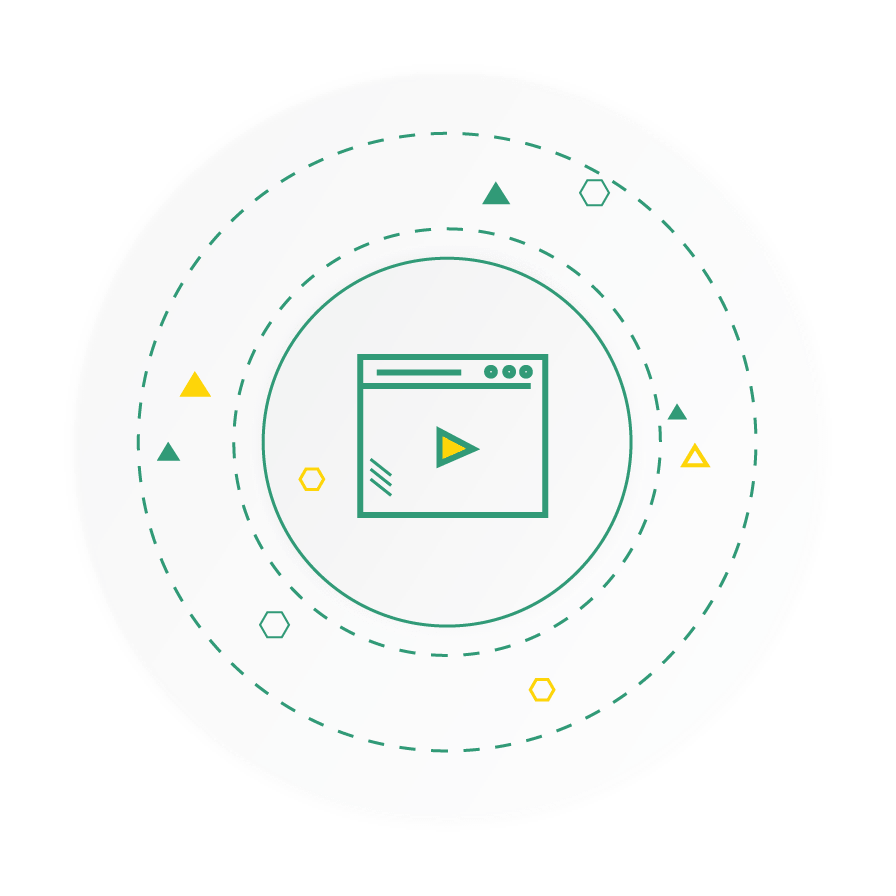
The best way to deliver complex messages like this one is to use a minimalist, sleek 3D animation. The use of 3D elements wasn’t just for aesthetics. It allowed us to present abstract concepts in a clear, tangible way.
We paired these elements with pastel-toned backgrounds to make sure the motion graphics stood out while maintaining a sleek and professional look. Meanwhile, kinetic text overlays and subtle motion cues were incorporated to guide the viewer’s attention and reinforce key takeaways without overwhelming them.
Every visual choice was made to prioritize clarity and user experience so that the video remains focused, informative, and visually compelling.
Notable Features from the Video
The video was crafted in distinct sections, allowing each message to stand alone or work cohesively as part of a larger narrative. It’s ideal for repurposing across platforms.
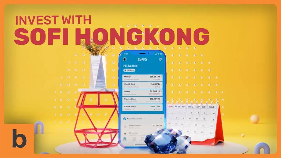
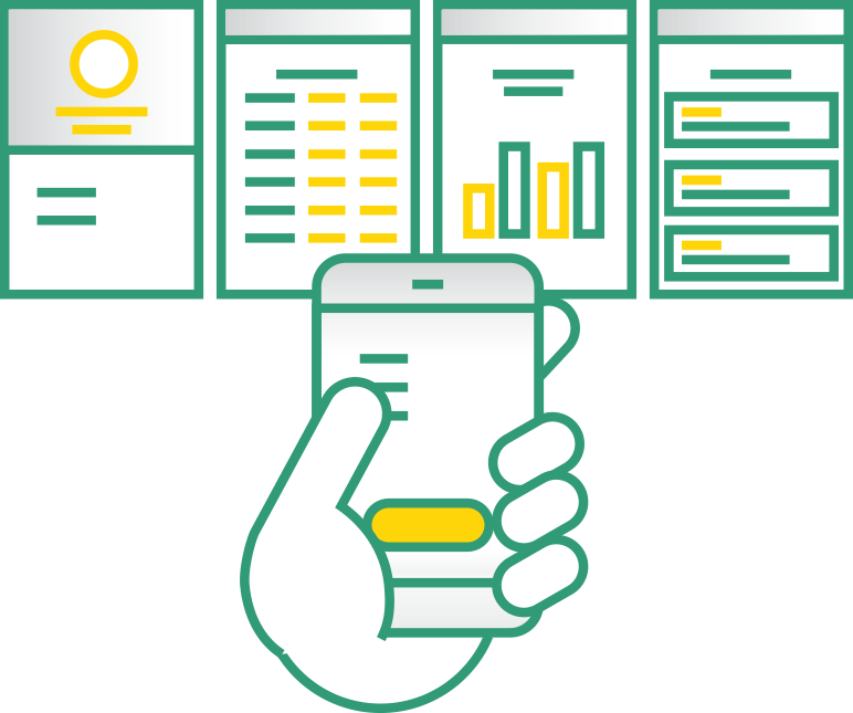
Visual elements were influenced by familiar app and dashboard interfaces, subtly reinforcing SoFi’s digital-first identity and making the experience feel intuitive.
Brand colors, typography, and iconography were thoughtfully embedded into the visuals, maintaining a professional tone while strengthening SoFi’s brand presence.
The pacing, text size, and visual clarity were designed to perform well across both desktop and mobile screens to ensure accessibility and engagement on any device.