Table of Contents ×
- 1 Why Don’t People Understand My App?
- 2 Is My App Really Too Complicated Or Just Poorly Explained?
- 3 What’s the Cost of Confusing My Users?
- 4 How Can an Explainer Video Make App Explanations Clear?
- 5 Examples of Apps Explainer Videos
- 6 Where Should I Use My App Explainer Video?
- 7 Wrapping Up: Get Your App the Limelight It Deserves
- 8 Mini FAQs About Explainer Videos for Apps
People don’t understand your app because you’re too close to it. What feels obvious to you (features, buttons, workflows) looks like a maze to new users. The truth is, most apps fail not because the product is bad, but because people can’t figure out why it matters and how to use it.
I’ve spent over a decade working with startups and established brands in the app industry to make their products click with users.
In this article, I’ll break down why your app isn’t connecting the way you think it should and show you how explainer videos can be the missing link between confusion and clarity.
Why Don’t People Understand My App?
Because new users don’t come with a manual, you need to show the “why” right away. Here are some valid reasons why some people leave before even exploring your app.
You’re Too Close to Your Own Product
After completing thousands of explainer videos for app companies, I’ve noticed one pattern: founders almost always assume their product is “self-explanatory.”
You’ve spent months obsessing over every feature, button, and flow. To you, it’s second nature.
But here’s the trap: what’s second nature to you feels like a foreign language to a new user.
The Story Isn’t Clear
App founders often lead with features instead of the bigger story. Some brilliant apps are packed with functionality, but when users open them, all they see is a dashboard with buttons.
No matter how powerful your app is, if people can’t instantly grasp the why (a.k.a the problem it solves or the outcome it delivers), they won’t stick around.
When I create explainer videos, I always start by pulling that story out of the noise, so users don’t just see what the app does, they understand why it matters to them.
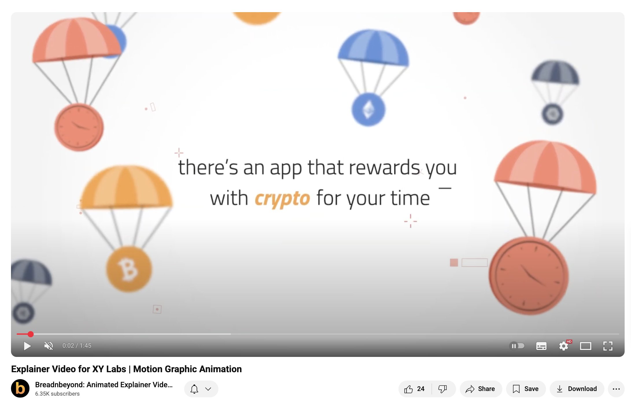
Here’s one example from our project, and I’ll share more app explainer video case studies as we go through this article.
This one is for the COIN App by XY Labs Inc. The first few sentences of the script are: “Did you know that there’s an app that rewards you with crypto for this time all the time?”
From there, the video unfolded in a clean, dynamic animation style that highlighted how the app works and why it’s different.
Motion graphics let us break down something as abstract as crypto rewards into visuals that felt easy, fun, and credible. Showing the earning flow step by step helps users to instantly grasp how COIN fits into their daily habits.
Onboarding Often Misses the Point
Some onboarding is too technical, cramming every feature into the first minute. Others are so vague that they leave users guessing what to do next.
In my experience, the best onboarding is the one that goes beyond “show you around.” It should also deliver a quick win that makes users feel the value right away.
Information Overload
Founders want to showcase everything at once, but for a new user, it’s just too confusing. One client I worked with had built an amazing productivity app, but their home screen looked like a control panel.
During testing, half the users didn’t even make it past the first screen. Once we helped them strip the message down and explain it visually through video, engagement was improved. The app didn’t change. The story did.
Is My App Really Too Complicated Or Just Poorly Explained?
Yes, your app might look complicated, but that doesn’t mean people can’t understand it. The real challenge is making the benefits clear before they give up trying.
Google Play statistics reveal that 68% of apps never hit the 1000 download mark. Here are points to tell whether your app is indeed complicated or if you just haven’t figured out how to explain it clearly.
Complex Doesn’t Mean Confusing
I’ve worked with apps in industries like finance, healthcare, and logistics. None of them is “simple” by nature.
But users don’t need to know every detail on day one.
What they do need is a straightforward way to see how the app helps them.
The Jargon Trap
One of the fastest ways to lose people is by using technical language that makes sense internally but sounds like noise to outsiders. I’ve seen some founders explaining features with industry terms while users just want to know, “What does this do for me?”
Clear Stories Beat Long Lists
An app explained as a story (a problem solved, a life made easier) is far more powerful than a long list of features. That’s why in explainer videos, I focus less on everything an app can do and more on the one big thing that makes people say, “Oh, I get it.”
What’s the Cost of Confusing My Users?
Confusion is expensive. Every time a new user feels lost, you’re losing future revenue, word-of-mouth, and trust. Imagine burning through marketing budgets only to watch those users disappear after the first login.
Churn Happens Fast
I’ve seen it time and again: users give an app less than a minute before deciding if it’s worth keeping. If they feel stuck or overwhelmed, they’ll close it and never come back. That quick churn makes it almost impossible to build momentum.
Bad Reviews Stick
When users don’t understand an app, they don’t say, “Oh, maybe the onboarding wasn’t clear.” They leave one-star reviews. And once those reviews pile up, it’s an uphill battle to convince new people to give your app a chance.
Marketing Money Gets Wasted
I’ve worked with teams that poured thousands into ads, only to realize their biggest leak wasn’t traffic. It was more about retention.
Driving downloads is easy, but keeping users is hard. If your story isn’t clear, all that ad spend just fuels the churn cycle.
Word-of-Mouth Dies Before It Starts
Happy users tell friends. Confused users don’t. If your app isn’t clear enough for someone to explain in one sentence, you miss out on the most powerful (and free) marketing channel you could ever have.

How Can an Explainer Video Make App Explanations Clear?
Because it shows instead of telling. An explainer video takes all the moving parts of your app and turns them into a simple, visual story that anyone can understand in under a minute. Instead of asking users to read or guess, you give them the main point.
Why Video Works Better Than Text
Research suggests that people are up to 2-3 times more engaged with video than text, especially when it’s delivered as a story. The recall might be similar, but the emotional impact is where the video pulls ahead.
Video works because it matches how people actually learn: quickly, visually, and with minimal effort.
Turning Features Into Stories
The mistake many apps make is presenting a list of features. But people don’t buy features. They buy outcomes.
When I create explainer videos, I start by asking: What’s the problem this app solves? That way, the video tells and shows the whole story about how life gets easier once you use the app.
The Power of First Impressions
In the app world, you only get one shot at a first impression. I’ve worked with teams that were spending heavily on ads, but users dropped off at the very first interaction.
Once they added a short video on their landing page or app store listing, those same users started sticking around longer. Sometimes all it takes is 60 seconds of clarity to keep people from bouncing.
Explainers Work Across Channels
An explainer video isn’t just for onboarding. I’ve seen app companies use them in investor pitches, product launches, app store previews, and even customer support.
One video becomes a versatile tool to clarify your app anywhere confusion might creep in.
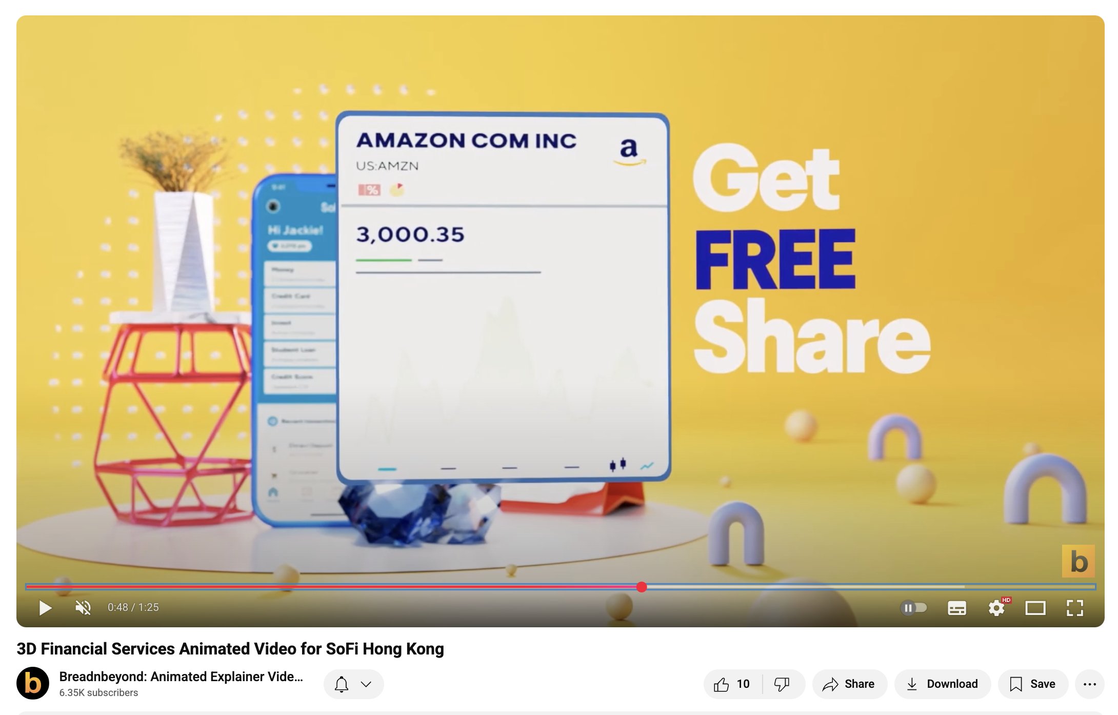
Take the SoFi Hong Kong 3D explainer we created, for example. We relied on bold on-screen text and sleek animation so it acts like a scroll-stopping on social media.
See SoFi Hong Kong’s full video
They also work perfectly on a landing page, inside an app store listing, or even in a pitch deck. The clean visuals and straight-to-the-point messaging make it universal: wherever it plays, people get the idea in seconds.
Examples of Apps Explainer Videos
Over 15 years, I’ve worked with app teams in different industries who all faced the same challenge: their users just didn’t “get it” fast enough. Explainer videos gave them a way to simplify the message, highlight the benefits, and make adoption smoother. Here are a few examples from my own clients.
1) Seruni Mobile
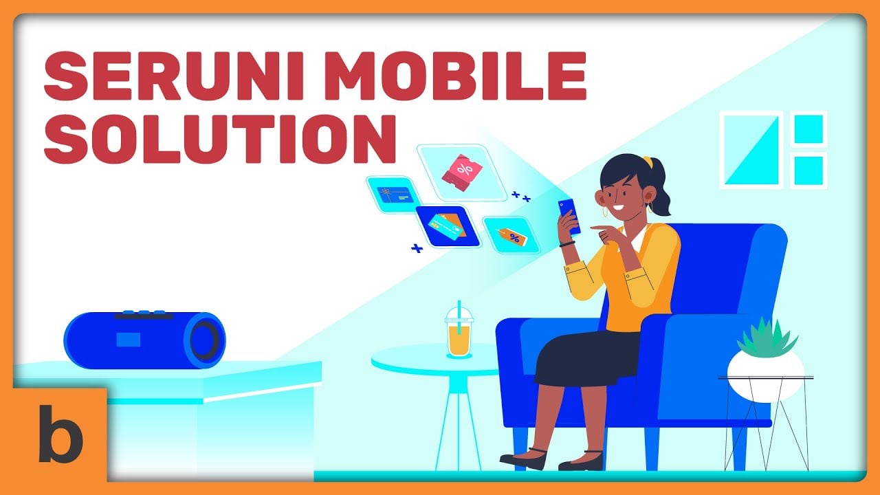
Seruni Mobile International has a strong reputation in enterprise mobile technology. They were behind Indonesia’s first mobile loyalty campaign for a multinational FMCG company.
But when they needed to showcase their solutions to a broader audience, the challenge was clear: how do you explain something so technical without overwhelming people?
That’s where my team stepped in. Instead of diving into code, integrations, or backend features, we created a cartoon-driven explainer that told a simple story.
We showed everyday situations where their mobile solutions made life easier by bridging the gap between technical innovation and practical benefits.
2) HealMate
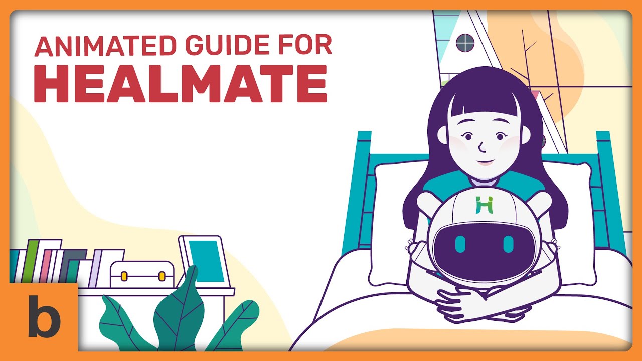
Healmate tackles a unique challenge: helping patients with rare diseases while giving doctors the tools to spot patterns hidden in day-to-day data.
On paper, it’s a powerful mix of mobile app and web dashboard.
Explaining that balance (i.e., how personal logging translates into meaningful medical insights) wasn’t easy.
To solve this, we built an explainer video in a clean, minimalist animation style.
Instead of overwhelming viewers with charts and technical dashboards, we used smooth transitions and simple visual metaphors to show the journey: a patient logs habits and symptoms on their phone, and doctors instantly see meaningful patterns emerge.
This approach kept the focus on people, not just data. That’s what makes the app’s benefits instantly clear to patients, families, and healthcare providers alike.
3) Banyan Security
Banyan Security solves a tough challenge: secure, zero-trust “work from anywhere” access without the pain of VPNs.
But here’s the problem: most security products sound intimidating, full of acronyms and technical terms that only IT teams understand. For employees and decision-makers, the value risks getting lost in translation.
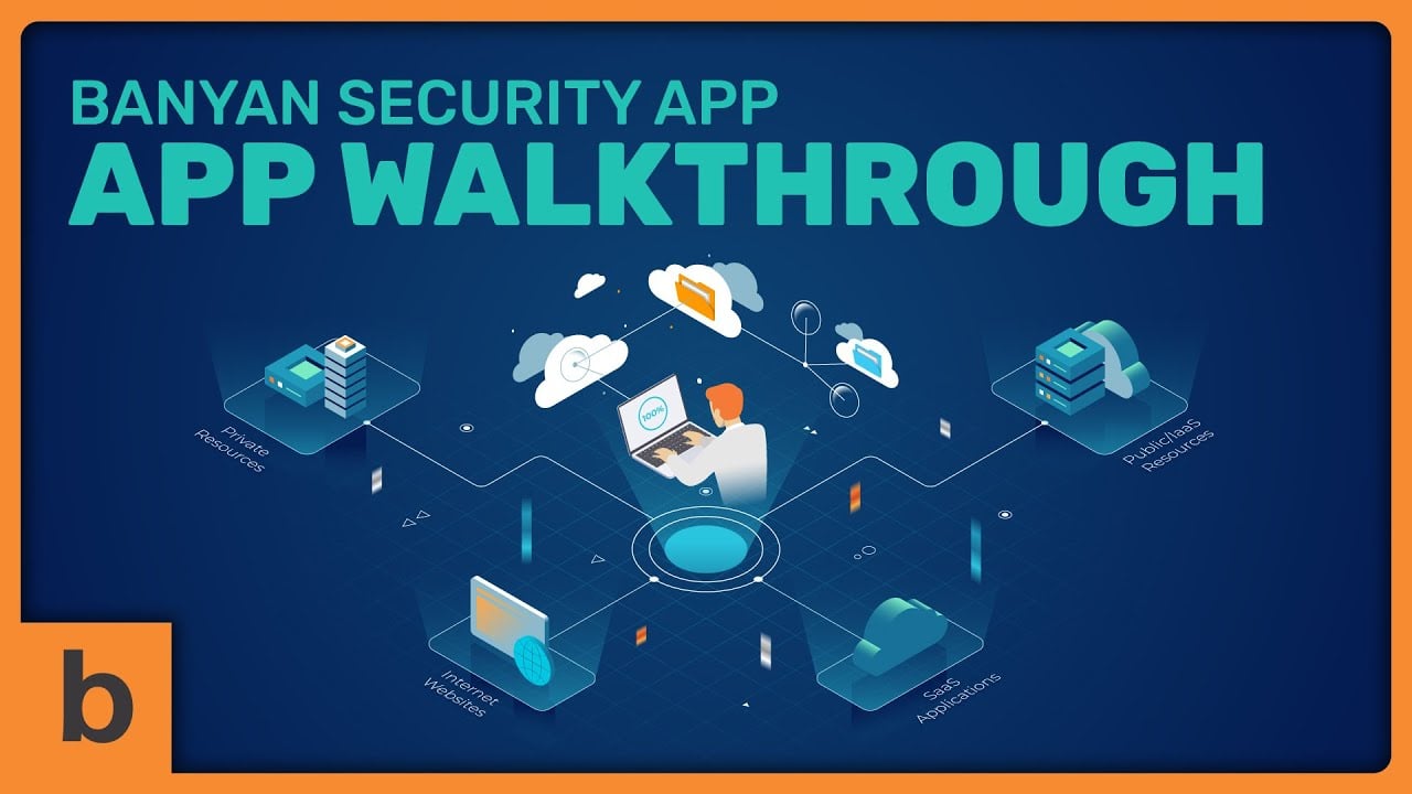
That’s why, instead of going with a dry corporate tone, we leaned into a playful, character-driven animation style.
The mascot character acted as a friendly guide, walking viewers through everyday scenarios (i.e., switching networks, hopping between devices, collaborating with third parties) while Banyan quietly kept everything secure.
Paired with simple visuals (like locks, shields, and data flows), the video reframed zero trust not as a wall of complexity, but as an enabler of productivity and peace of mind.

Where Should I Use My App Explainer Video?
Don’t stop at your homepage. Your explainer video can (and should) live anywhere people need to “get it” fast.
Just like I mentioned before, one good explainer video can be repurposed across multiple channels, multiplying its value way beyond the first play.
The biggest mistake is treating the explainer as a one-and-done asset. In reality, it’s one of the most versatile tools you’ll ever create.
I’ve seen clients use their app videos not only on their websites but also on App Store and Google Play listings, inside their onboarding flows, and even in investor pitches.
Here are some high-impact spots I often recommend:
App Stores
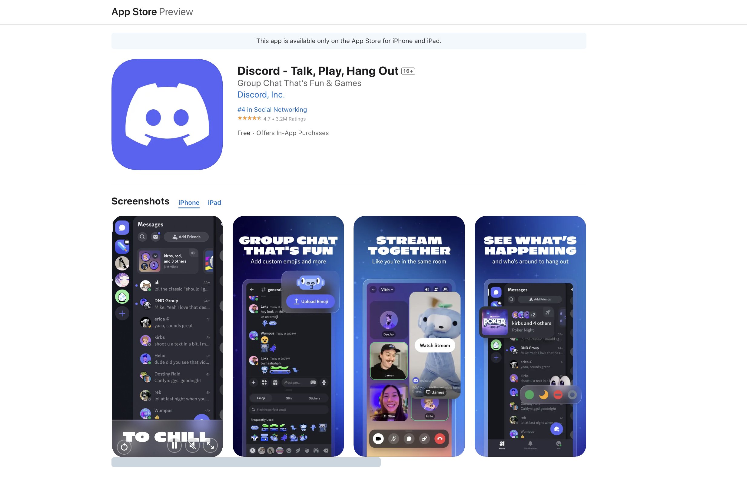
Storytelling can work wonders in other contexts, but on the App Store or Google Play, shorter is better. What really performs well here are quick vertical clips that highlight the actual UX/UI.
People browsing app stores simply want to see exactly how the app looks and feels before they hit download.
Keeping it short and focused builds trust, shows transparency, and reduces hesitation. I’ve found this good example from Discord on the App Store.
Onboarding
Embedding a short explainer inside the app helps new users understand the “why” behind the features to reduce early drop-offs.
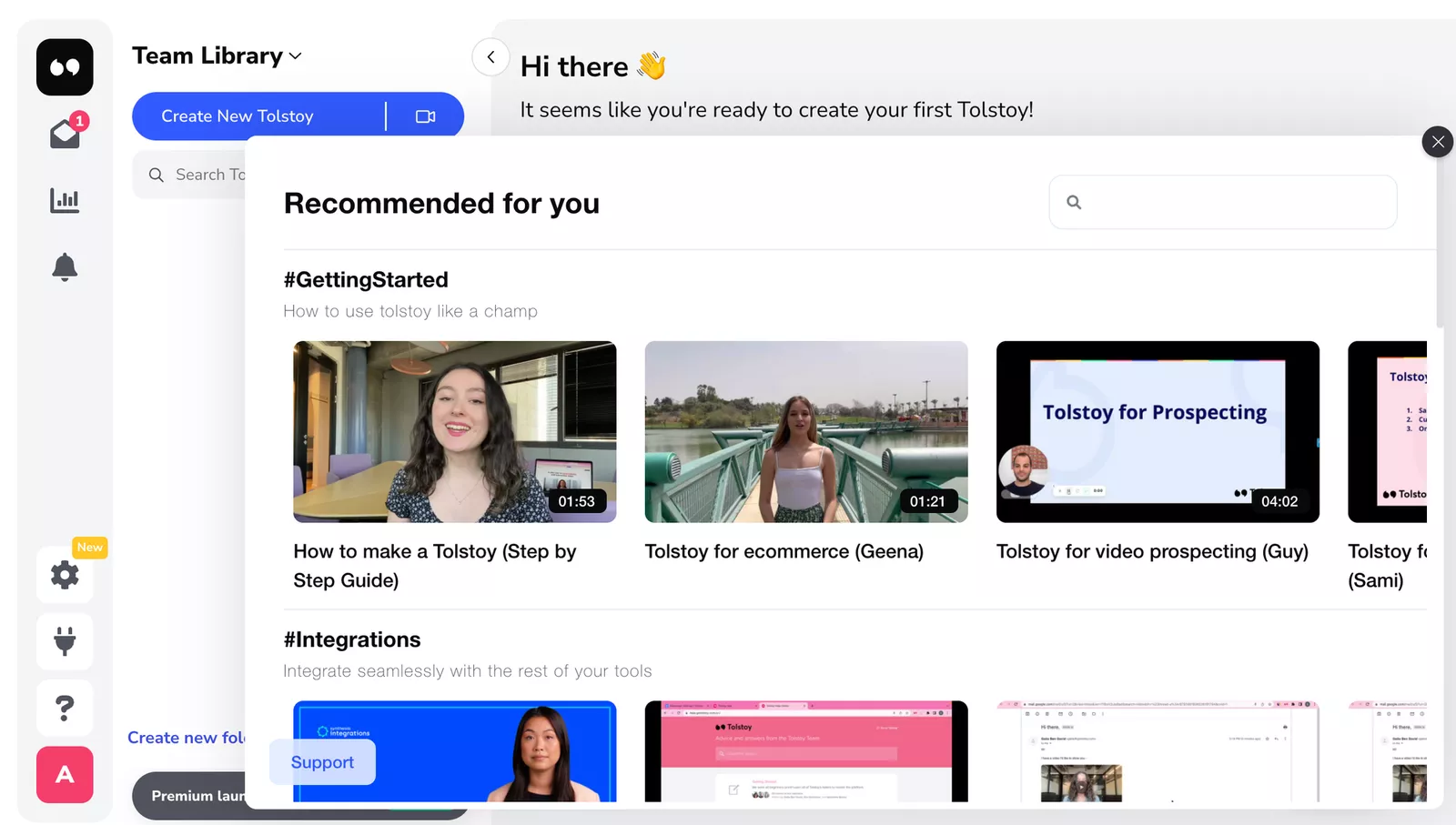
Tolstoy, an AI commerce app, has shown how guiding users step by step with short clips can dramatically improve retention and first-week engagement.
Social Media & Ads
Short clips cut from your main explainer can grab attention in feeds and drive traffic to download.
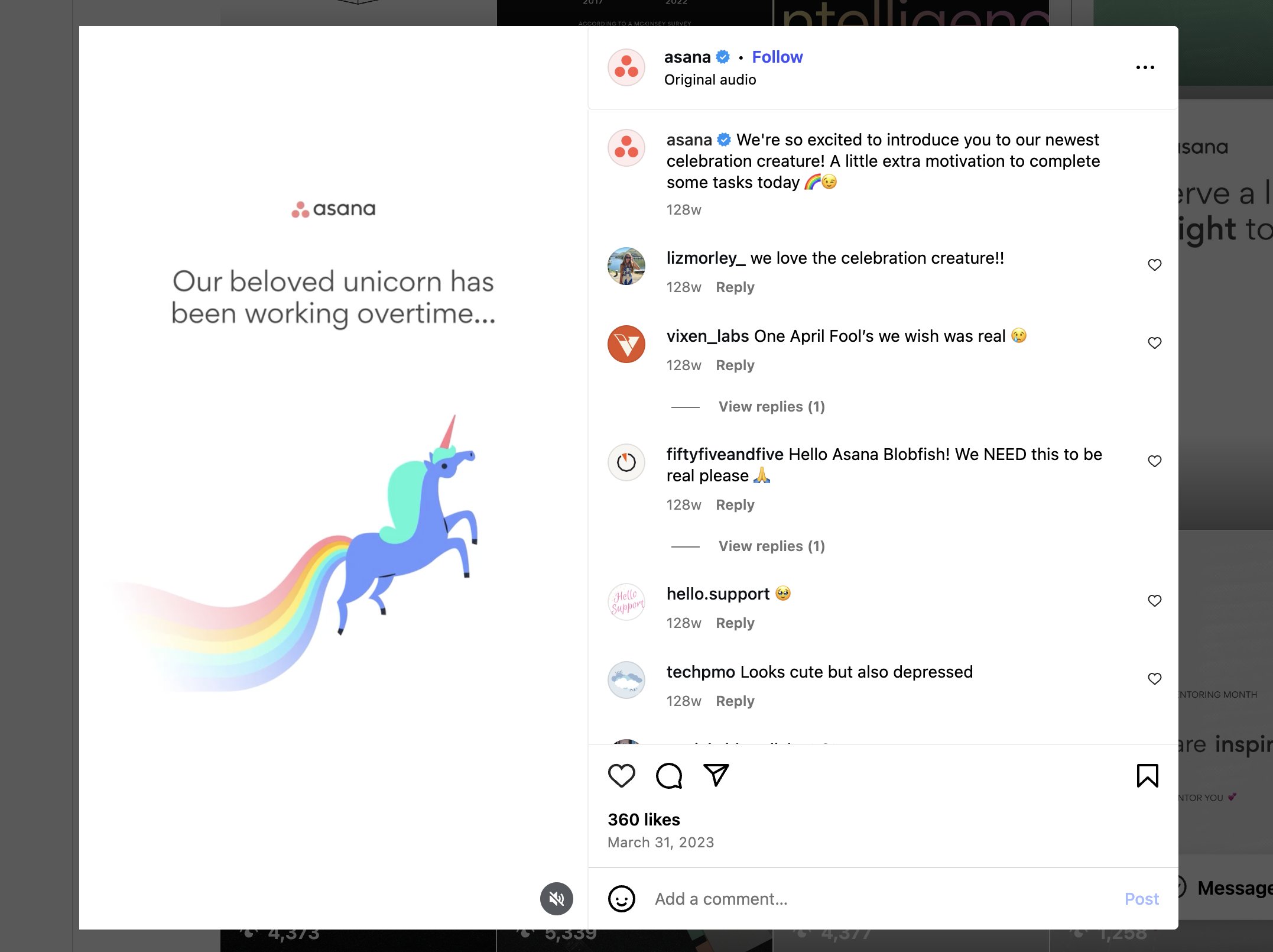
For example, I saw Asana introduce their blobfish stickers on Instagram with a simple but clever motion graphic.
The idea was playful. The unicorn had been working overtime, so now he’s got a blobfish friend to celebrate completed tasks.
The Reel was light, fun, and effortless-looking, but still polished enough to match the brand. That’s the kind of quick, scroll-stopping content that works perfectly on social platforms.
Wrapping Up: Get Your App the Limelight It Deserves
Creating a brilliant app is one thing. Making sure it shines in front of the right people is another. The truth is, even the smartest features can get overlooked if they aren’t explained in a way that clicks.
That’s where a good explainer video comes in. It brings all the moving parts together and presents them in a way that feels simple, relatable, and even enjoyable to watch.
We create explainer videos that can do the heavy lifting across channels, whether that’s onboarding new users, pitching investors, or giving your app store page that extra spark. Your app already does the hard work.
Let our explainer video do the storytelling that gets people to notice, understand, and actually use it.
Mini FAQs About Explainer Videos for Apps
Q1. How long should my app explainer video be?
Most app explainers work best between 60-90 seconds. Long enough to show value, short enough to keep attention. If you need deeper dives (like tutorials), those can be broken into separate, shorter videos.
Q2. Do I need a voiceover, or can it be text-only?
Both work, but it depends on where you’ll use the video. Voiceovers are great for app stores and websites, while text-only explainers are perfect for social media, where viewers often watch without sound.
Q3. Will the same video work for different platforms (social, app store, website)?
You can definitely repurpose the same video, but often it’s smart to create slight variations. Shorter cuts for ads, longer versions for onboarding, or vertical edits for TikTok/Instagram.
Q4. What’s the difference between an explainer video and a product demo?
An app demo shows how your app works, step by step. An explainer tells the story of why it matters by highlighting problems solved, benefits, and emotional connection. The two complement each other. Read more about demo videos vs. explainer videos.
Q5. How soon should I make an explainer video for my app?
Ideally, before the app launch. This is where you have a tool to attract beta users, investors, and early buzz. But even post-launch, it’s never too late to add one, especially if you’re struggling with onboarding or user retention.
Use our video calculator to get a quick estimation of your upcoming video project!
