Table of Contents ×
- 1 Why Does Explainer Video Style Matter in the Healthcare Industry?
- 2 What Are the Most Common Explainer Video Styles Used in the Healthcare Industry?
- 3 How Do You Choose the Right Explainer Video Style for Different Healthcare Audiences?
- 4 What Makes a Healthcare Explainer Video Truly Effective?
- 5 What to Consider Before Creating a Healthcare Explainer Video?
- 6 Mini FAQ: Healthcare Educational Explainer Videos
Explainer video styles for the healthcare industry range from clean 2D animations and motion graphics to whiteboard and 3D visuals. Each is suited to different levels of complexity and audiences. The right style helps simplify healthcare concepts, maintain accuracy, and keep learners engaged without overwhelming them.
I’ve spent years creating animated explainer videos, and if there’s one industry that constantly keeps me on my toes, it’s healthcare. And what I’ve learned from the industry is that the style of an explainer video matters just as much as the information inside it.
The wrong style can confuse, overwhelm, or even disengage viewers. The right one can turn intimidating healthcare concepts into something approachable and memorable.
That’s why healthcare explainer videos don’t come in one “safe” format. Different audiences, goals, and topics demand different visual approaches.
I’ll walk through the most effective explainer video styles for medical and healthcare education, why they work, and when each one makes the most sense.
Why Does Explainer Video Style Matter in the Healthcare Industry?
Because in healthcare, how you explain something can determine whether people understand it or tune out completely. The right visual style reduces confusion, builds trust, and helps complex healthcare information feel manageable instead of intimidating.
In healthcare, audiences are often stressed, short on time, or encountering unfamiliar terminology. So it comes as no surprise that healthcare eLearning videos can increase retention rates by 60-80% compared to text-based learning. This number shows how visual explanations help learners remember more (Chasing Illusions Studio, 2025).
Supporting this, a systematic review found that video-based education for patients with chronic illnesses led to better health behaviors in 56% of studies, including improved treatment adherence and stronger self-confidence in managing their condition.
The same content lands very differently depending on its presentation.
A beautifully written script can still fail if the visuals overwhelm patients, feel too playful for clinicians, or oversimplify something that needs precision. So I’d say style is part of the communication itself.
I’ve also compiled some healthcare solutions or providers that nail their marketing campaigns using videos here: 15 Healthcare Marketing Examples Done Right.
So choosing the right explainer video style helps guide attention, pace understanding, and set the emotional tone. Whether that’s reassurance for patients, clarity for caregivers, or efficiency for healthcare professionals.

What Are the Most Common Explainer Video Styles Used in the Healthcare Industry?
There isn’t one “best” style. There are several proven ones, each designed to support different healthcare topics, audiences, and learning goals. The key is matching the style to who you’re educating and what they need to understand.
I’ve created this quick table just in case you want a fast overview before diving deeper into each style.

1. Character-Based Animation
Character-based animation works best when the goal is to humanize healthcare information. It helps reduce anxiety, increase emotional connection, and make healthcare topics feel less intimidating, especially for patients, families, and non-clinical audiences.
This is often the style clients hesitate to use in healthcare until they see how effective it actually is.
There’s a common fear that characters will make healthcare content feel “too playful” or not serious enough. In reality, when designed thoughtfully, characters do the opposite: they create trust and relatability.
Character-based animation shines in patient education, public health messaging, and preventative care content. Instead of throwing viewers straight into terminology and diagrams, you guide them through a story.
My team and I created this animated video for HealMate:
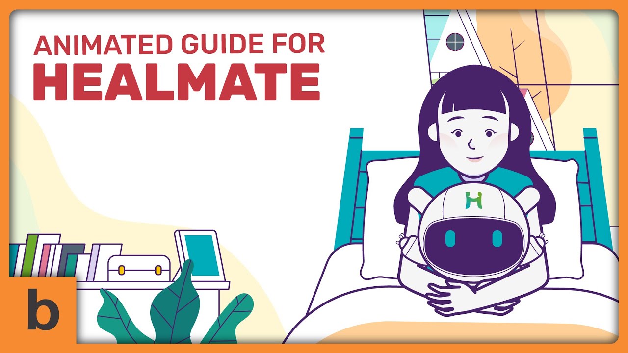
While creating the video, we focused on the emotional pacing. Healthcare topics often carry stress and sometimes fear. We created Celine as a character to allow the audience to acknowledge that emotional reality without dramatizing it.
This subtle storytelling makes complex information easier to absorb because people naturally follow human journeys better than abstract explanations.
That said, this style needs careful restraint. In healthcare, characters should support the message, not distract from it. Clean design, controlled motion, and a grounded tone are essential.
2. Motion Graphics & Icon-Based Explainers
Motion graphics and icon-based explainers are ideal when clarity and efficiency matter more than emotional storytelling. They help deliver structured healthcare information quickly, cleanly, and with minimal distraction.
In healthcare education, this is often my go-to style for explaining systems, processes, and high-level concepts. Think treatment workflows, care pathways, compliance steps, or public health overviews.
Icons and simple visual metaphors let viewers understand relationships and sequences without needing to focus on individual characters or narratives.
We relied on this animation style when we created this video for Telemediclinic Academy:
What makes this style especially effective is control. Every element on screen has a purpose to guide attention, reinforce terminology, or break information into digestible pieces.
For professional audiences or mixed knowledge levels, motion graphics strike a balance between being approachable and still feeling credible.
When motion graphics get overly decorative, they can undermine the message. But when used with restraint, this style turns complex healthcare information into something viewers can scan, follow, and remember.
3. Whiteboard-Style Explainers
Whiteboard-style healthcare explainers are great for step-by-step teaching. They slow the viewer down just enough to follow complex ideas without feeling rushed or overloaded.
I’ve found this style works particularly well for educational content that needs a clear learning flow. We can see them in healthcare concepts, cause-and-effect explanations, or training materials.
The act of “drawing as you explain” mirrors how instructors teach in real life, which makes the information feel more approachable and easier to follow.
Here’s an example of a digital whiteboard explainer video we produced for CDISC (Clinical Data Interchange Standards Consortium):
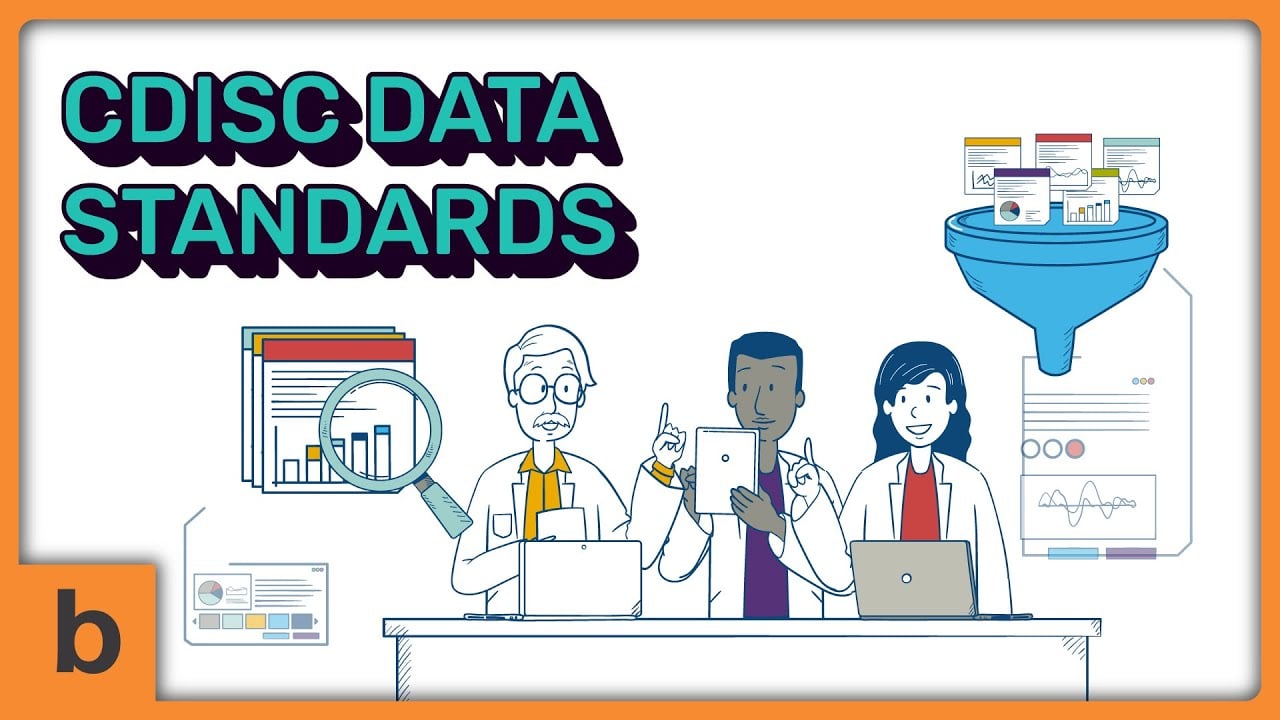
Whiteboard explainers are especially useful when accuracy matters more than visual polish. The simplicity keeps viewers focused on the logic of the explanation rather than the visuals themselves.
That said, this style benefits from clean pacing and intentional sequencing, as too much information too quickly can still overwhelm.
4. 2D Anatomical & Illustrations
2D anatomical and healthcare illustrations are best when precision is non-negotiable. They help visualize what can’t or shouldn’t be filmed, without sacrificing clarity or credibility.
In healthcare and healthcare education, this style is essential for explaining anatomy, physiological processes, and treatment effects inside the body. It’s ideal for professional training, patient education around diagnoses, and any topic where accuracy builds trust.
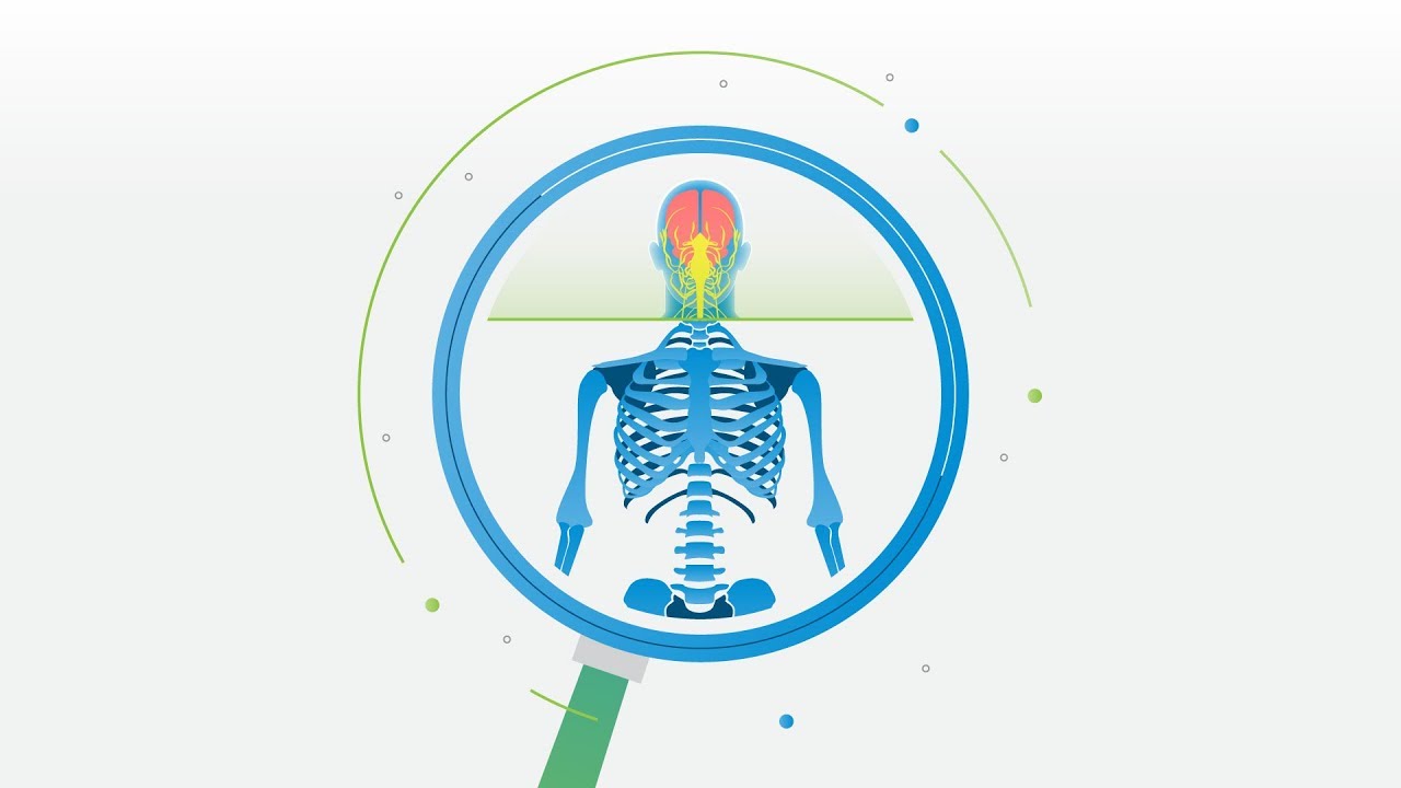
For UC Davis Pathology, we used 2D anatomical illustrations to highlight specific organs and cellular interactions:
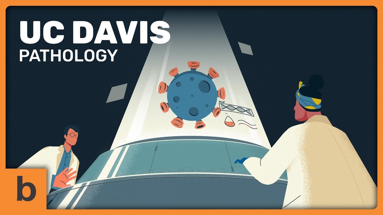
What makes 2D illustrations effective is their ability to simplify without distorting reality. You can isolate specific organs, systems, or interactions and guide attention exactly where it’s needed.
From my experience, it’s often the safest way to communicate sensitive or complex biological information while keeping everything clear, controlled, and respectful.
5. 3D Animation
3D animation is best used when spatial understanding really matters. It helps viewers see depth, movement, and relationships that are hard to communicate in flat visuals.
In healthcare education, I usually reserve 3D animation for topics like surgical procedures, healthcare devices, or anatomy that benefit from rotation and depth.
Being able to move around an object or through the body can dramatically improve comprehension when positioning and scale are important.
That said, 3D isn’t automatically “better.” It’s more resource-intensive and, if overused, can distract from the educational goal.
When chosen intentionally, though, 3D animation adds clarity where 2D simply can’t, making complex healthcare concepts feel tangible rather than abstract.
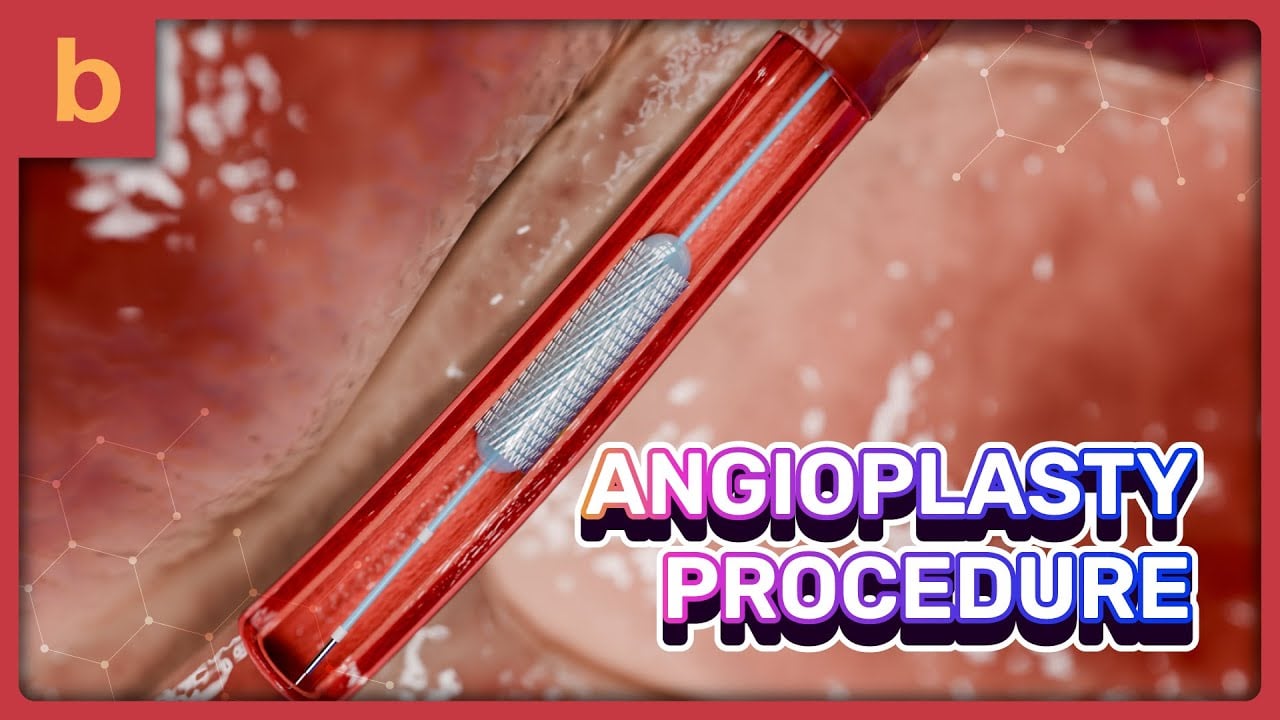
For example, in our How Angioplasty Works 3D animated explainer, we used 3D visuals to show how the catheter moves through the blood vessel and how the blockage is treated. Something that’s much harder to grasp in flat visuals alone.
6. UI / Screen-Based Explainer Videos for Healthcare Software
UI or screen-based explainer videos are ideal when the product is the experience. They help users understand how healthcare software actually works.
We usually use this animation style for EHRs, patient portals, diagnostic platforms, and internal healthcare tools. Instead of abstract visuals, you’re showing real interfaces, real flows, and real outcomes. That immediacy builds trust, particularly with clinical and administrative users who care about usability.
Here’s an example from a video we created for Rater8. While the product is software-driven, we intentionally didn’t make the explainer purely UI-based. Instead, we mixed real interface moments with character animation and motion graphics.
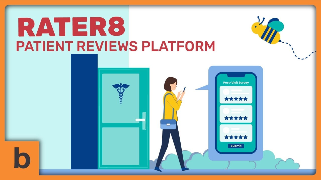
Characters help establish context and relatability, while motion graphics guide attention and simplify what’s happening behind the scenes. The UI shows how the product works, but the supporting visuals help explain why it matters.
How Do You Choose the Right Explainer Video Style for Different Healthcare Audiences?
The “right” video style depends less on animation trends and more on who you’re talking to, what they already know, and how much cognitive load they can realistically handle.
From my experience, this is the question healthcare teams ask most often and for good reason.
A style that works beautifully for patient education can fall flat with clinicians, and something designed for internal training may confuse a public audience.
Choosing the right approach means balancing clarity, accuracy, emotional tone, and attention span.
To make this decision easier, I usually break it down by audience type and learning context rather than by visuals alone. That framework helps avoid over-designing or under-explaining, both common pitfalls in healthcare education videos.
You can see this approach in action in our animated explainer showreel, which highlights a range of healthcare projects to show how different animation styles can be tailored for patients, professionals, and internal teams alike.
Below is a quick reference showing which explainer video styles tend to work best for different healthcare audiences. Use this as a guide to match style, tone, and complexity to your viewers’ needs.
| Audience | Primary Goal | Best-Fit Explainer Video Styles |
| Patients & general public | Reduce anxiety, build understanding | Character-based animation, simple motion graphics |
| Healthcare professionals | Deliver clarity fast, maintain accuracy | Motion graphics, 2D medical illustrations, selective 3D |
| Medical students & trainees | Support structured learning | Whiteboard-style explainers, layered 2D visuals |
| Healthcare software users | Show real usage and workflows | UI/screen-based videos with motion graphics and characters |
| Public health audiences | Educate at scale, improve recall | Simplified animation, storytelling-led visuals |
What Makes a Healthcare Explainer Video Truly Effective?
Systematic research indicates that video-based learning has a significant positive effect on knowledge acquisition in healthcare fields like medicine and dentistry. But the explainer video only works when it prioritizes understanding over visuals and responsibility over flair.
After creating hundreds of projects for organizations in the healthcare industry, I’d say that when all these elements below are in place, the animation almost disappears, and the learning takes center stage.

- Clarity over complexity: The goal isn’t to show everything you know. It’s to help viewers understand what they need to know. Effective videos simplify without losing accuracy.
- Respect for cognitive load: Healthcare topics are demanding by nature. Good pacing, intentional motion, and focused visuals prevent overwhelm and improve retention.
- A tone that builds trust: Whether it’s patient education or professional training videos, the video should feel calm, credible, and human. The animation style should not compete with it.
- Intentional style choices: Animation style is a tool, not a feature. The best explainers choose visuals based on audience, context, and learning goals.
- Restraint in storytelling: Strong healthcare explainers know when to stop. They highlight what matters most and leave viewers feeling informed, not exhausted.
What to Consider Before Creating a Healthcare Explainer Video?
After years of collaborating with teams across the healthcare industry, I’ve learned that the strongest projects come from organizations that are clear about what they need people to understand, and not just what they want to show.
For healthcare teams considering explainer videos, my humble advice is to treat visual decisions with the same care you give to clinical or educational ones. Ask whether each choice supports understanding, respects the audience, and serves a real learning goal.
Mini FAQ: Healthcare Educational Explainer Videos
How long should a healthcare explainer video be?
Shorter is almost always better. Most healthcare explainer videos are most effective between 60-120 seconds, as long as they stay focused on one clear objective. Learn more about the rule of thumb of explainer video length here: What Is the Perfect Length for Your Explainer Video?.
Can explainer videos replace in-person or written training?
They work best as a complement, not a replacement. Explainer videos are ideal for introducing concepts, reinforcing learning, and ensuring consistency at scale.
How early should video be considered in a healthcare education project?
As early as possible. When video is treated as an afterthought, clarity and structure often suffer. Early involvement leads to stronger educational outcomes.
How do you ensure accuracy in animated explainers?
Through close collaboration with subject matter experts and multiple review stages. Accuracy is a shared responsibility, not just a production step.
What’s the biggest mistake healthcare teams make with explainer videos?
Trying to cover too much in one video. Focused explainers consistently outperform overly ambitious ones.